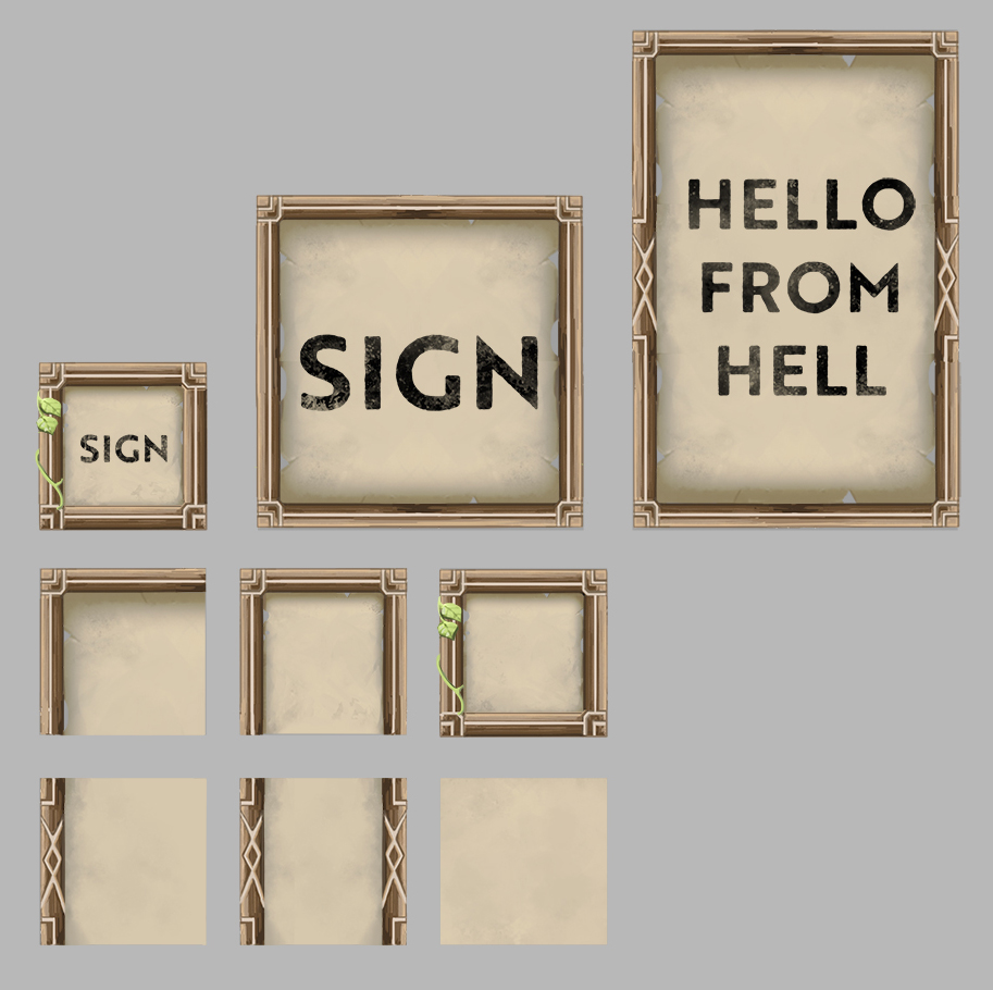
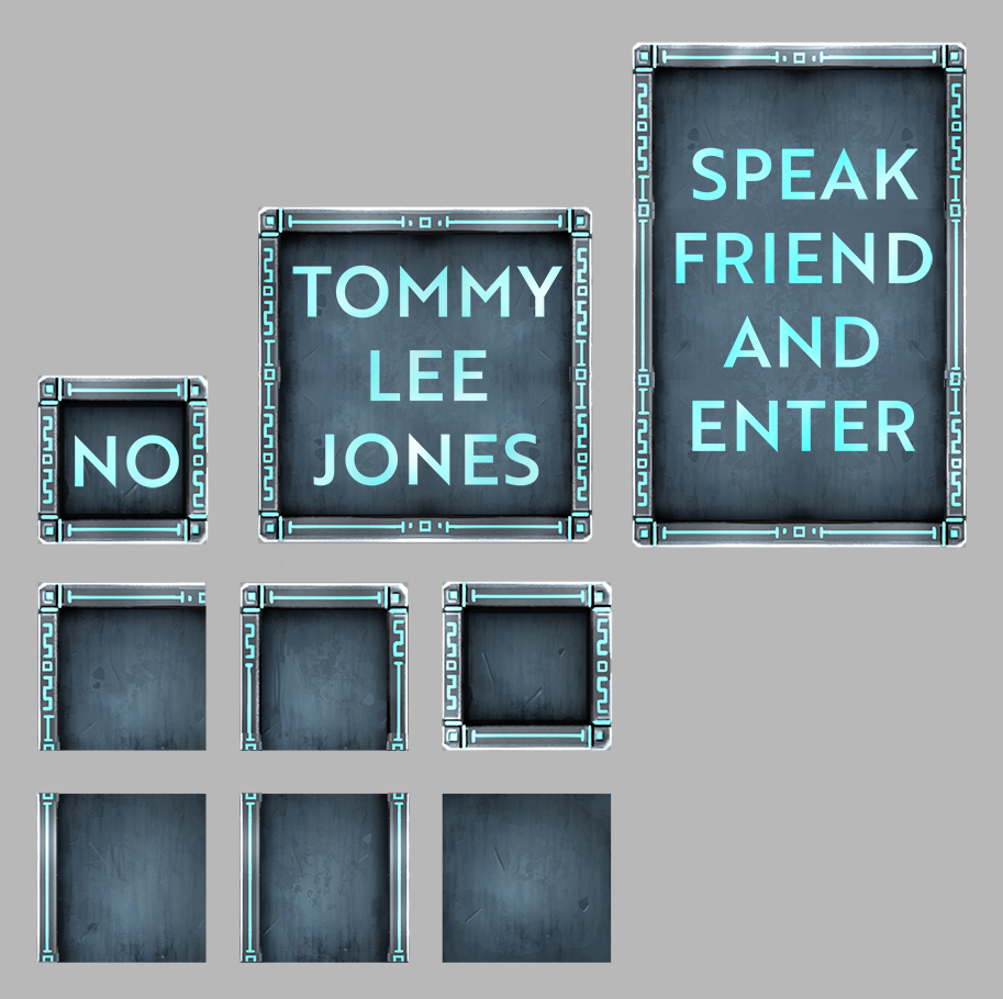
Hello! So I’ve been concepting some new sign frames, made out of different materials.
39 Likes
Doh! These signs are wonderful, You did a great job on these, i can’t wait to get my hands on them  !
!
Keep up the good work!
3 Likes

8 Likes
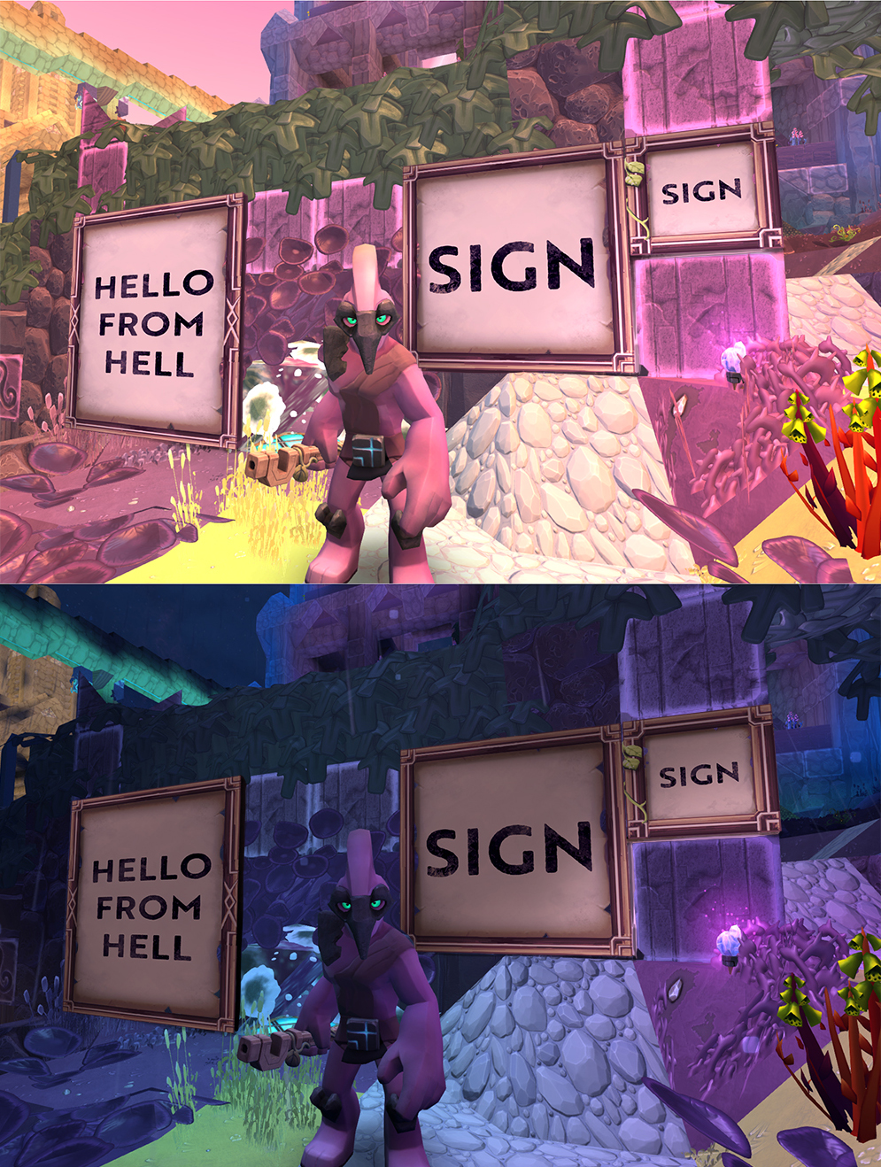
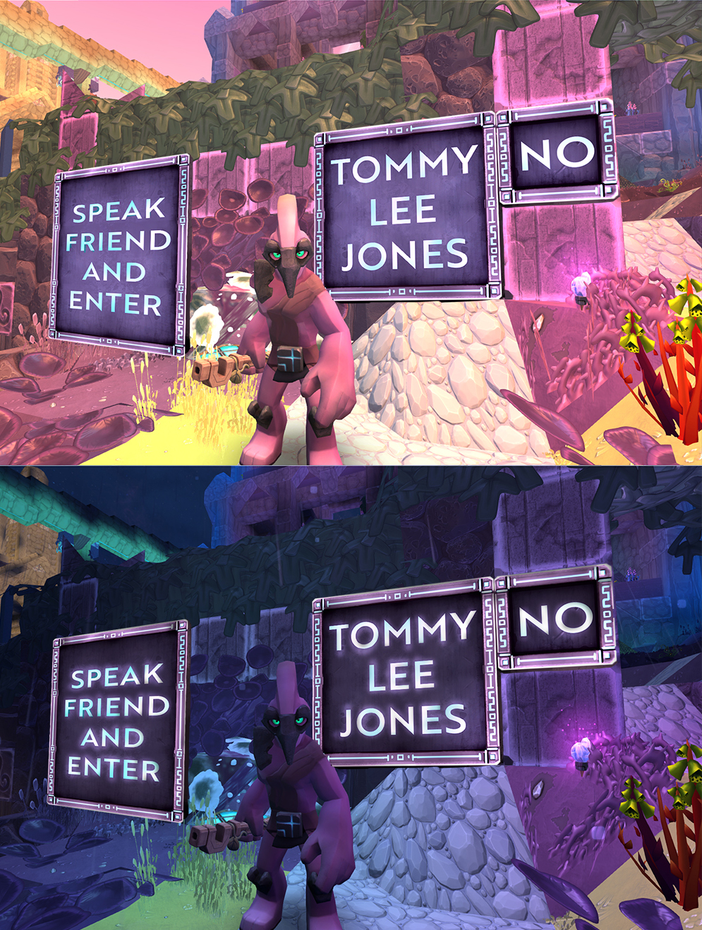
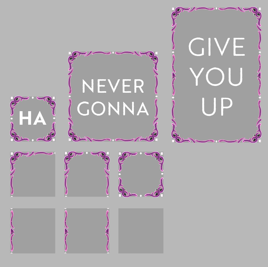
I love the Rick Rolls see threw sign! 
4 Likes
Who doesn’t like a good Rick Roll eh lol
6 Likes
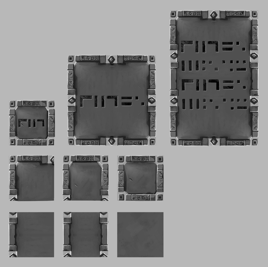
Love the look of the Oortian ones!
Can I have them now… please?!
“Ain’t too proud to beg” 
7 Likes
Looks good so far, not really sure about the font though
“aint to proud to be honest” lol
3 Likes
Nice concepts, especially with the first and second ideas. I added all these under the (Props) section on the archive.
3 Likes
Aghgh Minyi you beautiful person, you! They’re awesome! I particularly like the rune version
6 Likes
They look really great. Guess I will need to learn to read Oortian glyphs;)
1 Like
I’m sorry … but I liked the other ones a lot more. 
They had more personality to them … very tangible, very diegetic … the new ones are just frames and feel disconnected from the world.
I don’t know how to word it right now.
3 Likes
These concepts are for the jumbotron signs that are 1x1 voxel and bigger (2x3, 4x8, etc). The other concepts are for sub 1x1 single voxel signs. (These signs are like to doors - they can be bigger than a single voxel.)
10 Likes
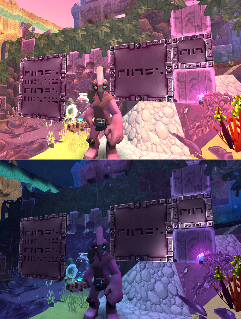
Gotta love the Stone ones.
Are the last ones transparent?
I agree with this.
I want signs that look more like signs - looking like wooden / stone signs.
Although if we had options for both what is displayed here, and what Kirinvar linked - heck yeah!
2 Likes
Looks really good and would love to use these ingame, but I have some little points of feedback as well:
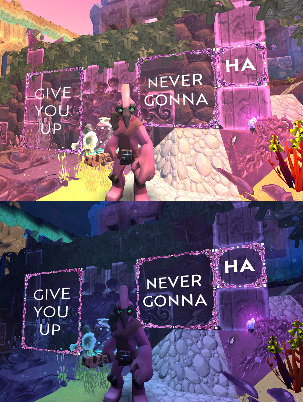
Concept 1
- Like the font, it’s clean but has a little crisp in it as well
- Corners are to straight for me, the overal look is to clean when compared to other in-game textures.
- Sugestion: a little more texture to the background ‘paper’?
Concept 2
- Looks great!
Concept 3
- Nice modern look, think we need some matching modern blocks as well
Concept 4
- Looks really great, but aren’t the letter too clean for this game? Talking espacially about the bold ‘HA’ that’s projected on the metamorphic rock.
- Maybe make the font a little transparent as well?
Other suggestions
- Why are there not signs made out of wood or leaves? Some more natural signs could allow people to build some more nature looking buildings.
9 Likes