Weekly Dev Update: 2016 September 2nd - Secret Features, GUI and more

This week we’ve been working on a crazy new prototype that pulls together a collection of important features: creating Warps, creating Portals, and viewing and then exploring the Boundless Universe of Worlds. This is something we want to squeeze into the coming release of Testing and it’s imminent promotion to Live on Steam. We’re not going to say more about it now - but it’s awesome and you’ll be able to play with it soon. It’s super cool and worth the wait.

The following features are continuing to develop and will be public soon:

  • Trading (Buying + Selling) Plinths
  • Player XP Progression
  • Weapon and Tools Durability

Code
Work started on the “Smart Stacking” feature which allows players to carry many more items when they are of the same kind: for example, rather than each stack of decorative gem blocks taking up all of a slot in your inventory, that slot can also hold another 8 stacks of other decorative gems.

Additionally:

  • The Plinths for buying and selling items were finished off ready for testing, the last feature being the correct categorisation of blocks.
  • Player progression now rewards of coins and beacon plots.
  • Game startup time has been improved significantly by switching some of the file formats to something more efficient.
  • Missing player shadows have been fixed.
  • The alignment of the block selection wireframe has been corrected, and finally
  • Portal transitions have been smoothed out even more.

Design
After returning from sunny Wales, @luke-turbulenz started the week by balancing durability and experience gaining. The rest of the time has been wrangling the skill trees for the progression system, and coming up with some good ideas to bolster the work we already had in that area. More details to follow.

@Tobelawe has been focusing on a world configuration that will be used for the main starting world in the next release. These worlds are reasonably safe and have a good spread of basic resources. Rarer and more sought after resources will not be found there though, so travel to other worlds will be necessary. Also checkout some of the latest biome experiments here.

@olliepurkiss has been catching up on a few outstanding design tasks around beacons, locks, warps and portals, as well as working with Luke and Matt.

GUI
Rob our resident GUI expert has been working on the final look and feel of the GUI.

Taking elements from a range of different visual prototypes titled: Modern Skeuomorphic, Minimal Runic and Bold & Fun, we’re now pretty happy with the results.

Here’s a first look at some of the main screens:

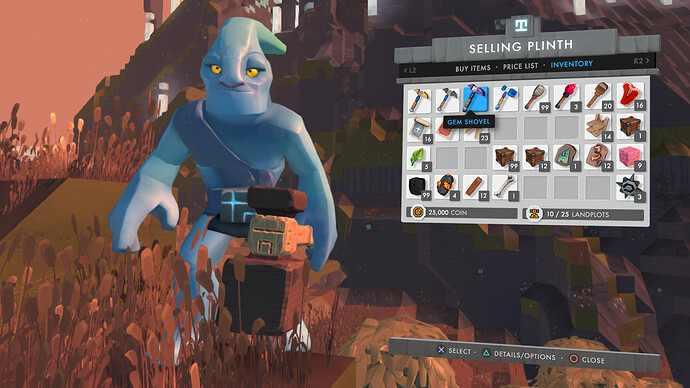
The main player “Inventory” with embedded dual wielding configuration.

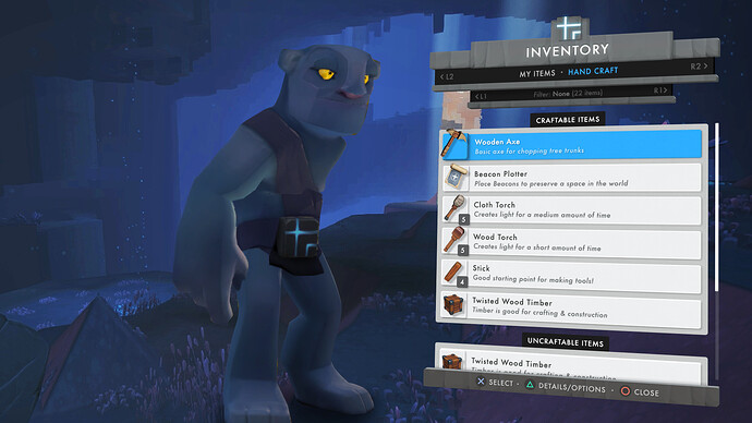
The players “Hand Crafting” interface.

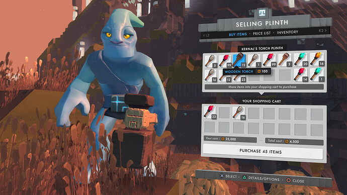
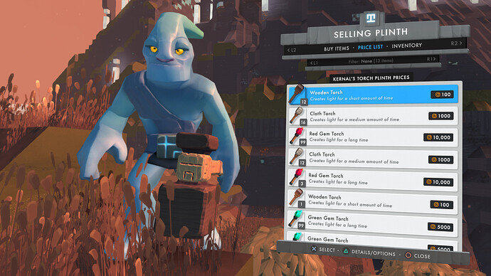
The following screens demonstrate how a player interacts with a shop “Selling Plinth”.

Select the items you want from the shop into your shopping cart.

Review the prices of the available items.

Move the purchase into your inventory.

The following screen demonstrates an updated trading interface.

Art
This week has all been about tools, weapons and creatures.

After reviewing in the assets in game and based on feedback from the community we’ve decided to increase the resolution of our weapons and equipment. We’ve started with the axe and here’s a sneak peek of the gem level.

We’ve been finalising the final progression for our first six creatures. Expect a post on this soon. This includes: creature progression, any environmental enhancement, and any possible exoticness presentation. This allows us to transform a fixed set of creatures into a hugely varied and interesting challenge.

We’ve finalised the Power and Ammo types used in the Slingbox and Lance.

We’ve also been experimenting with the World Builder Prefab pipeline with a plan to create a range of natural props and structures to help decorate all the new biomes.


:baby: :sleeping: :pray: :pray: :pray: :pray: :thumbsdown:

27 Likes

Oho; exciting!

I can hear @Stretchious groan already :stuck_out_tongue:

He’d better be able to pronounce Llanfairpwllgwyngyllgogerychwyrndrobwllllantysiliogogogoch now!

These look fantastic!

3 Likes

…to finally scratch the wooden tools or make them just funny children toys with no real use?

2 Likes

Loving the look of the GUI now - it’s starting to look really REALLY polished!

Are those static item images being used for the GUI now? (or is my graphics card just so dated that mine just looks jagged in game?)

…and is that torch progression I see :open_mouth: That light cube is going to be used a whole lot more now!

[groan] :scream: … Hopefully it will be ok :pray: … as long as it’s still in a format that I can interpret and import. It’s probably more difficult to keep up with the GUI changes on the site (no more redesigns for a while!) lol


On the selling plinths, are the items priced individually or per stack? I’m guessing individually, and that you can hold down the mouse button (in the same way you can in your inventory) to select the number of items you want…

Edit: Oh and …

I know how that feels! It gets easier as they get older!

3 Likes

If I may speculate, it sounds like some sort of Galactic (Universal? Just HOW big is the Boundless universe?) Map showing what worlds and portals connect. I’m excited to see something that shows star systems and territories from a distance and then zooms in on the planet some how. I have no idea what is planned, so I’m eager to see!

Xp progression! That’s exciting!

2 Likes

Don’t worry @Stretchious the majority of the changes so far is moving a lot of our model and animation data from json into msgpack they have plenty of different language implementations so it should be easy for you to parse anything you were doing before.

1 Like

It’s easier if you break it down:
LLAN - FAIR - PWLL - GWYN - GYLL - GO - GER - YCH - WYRN - DROB - WLL - LLAN - TY - SILIO - GO - GO - GOCH

1 Like

Fantastic, that looks really simple to use as well. I’d never considered json to be a particularly inefficient way of serializing, until now!

These look very nice and well done :slight_smile: Keep up the good work! :smiley:

1 Like

Loks amazing as usual

Really great news!! And super artwork @ GUI, very nice. Just the GEM-gripstick at the GEM-axe is awful xD make it stone or would please… haha

Bit confusing the way it’s written. Will there be one world on which everyone starts? Or what I understand: one configuration that creates similar worlds (planets) and a player can choose on which of these to start?

Last but not least a question I had all the time in my mind… Do we have to physically travel via portals from the first planet / world we started to other worlds? That would be my preferred way. makes us unable to explore everything to fast via porting to unseen areas :smiley:

1 Like

I agree that the shaft of the gem axe looks a bit odd. Makes it look like it’s made of candy instead of a gem. I think stone or a metal would be better.

1 Like

I liked the old concept art for the handles imo.

Don’t remember if it was wooden or stone though :/.

7 Likes

Great job Wonderstruck! On those screenshoots game looks sooo unbelieveble good! Hope to see release in next few months. :slight_smile:

2 Likes

I peed my pants a little (ALOT) and I started crying. This + The Gamemaker Humblebundle made my life a better place.

1 Like

I appreciate you like the old exploration @Nyuudles :slight_smile: but i’m happy with the current new progression where we see material chances across the entire tool. Is going to be rewarding with the players and is visible from both first person and third person. Special materials are going to look fabulous on them! :spy:

8 Likes

Well now I think I take my opinion back o-o. That gleam handle looks lovely!

3 Likes

I think we shall all stop for a second and appreciate how the golden axe have the text: M. Alloy

I can feel the beautiful lack of gold in the progression tree.

4 Likes

So that means Wood is still on the table? 0.o
Maybe a better question for @james or @olliepurkiss.

1 Like

Indeed is a better question for them. :smiley:

1 Like