Where they kinda blend together like this?

The “Order Wheel” tab in the Boundless Colours spreadsheet is kinda ordered like this:
I wanted this and didn’t get what I needed from the order wheel so I used the color sheet mentioned above and tried ordering it myself about a month ago. I assigned each color a number and each shade/tint a number and ordered it that way. It’s a little subjective because it isn’t just color changes, it’s saturation changes, and you can’t just take the hex numbers and order it that way.
Within each color I went from light to dark.
This is going into my color app next with the actual boundless order. I think it will be super handy for everyone.
Aw thanks! Not gonna lie, it took me several hours over two days so I’m glad it can be useful 
I’m still hoping to find an order that is “color spectrum” style.
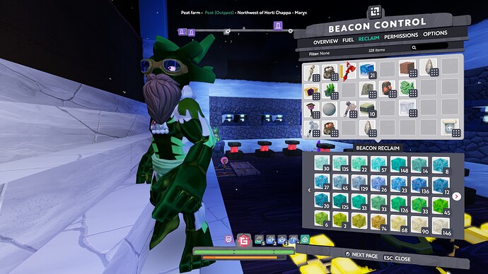
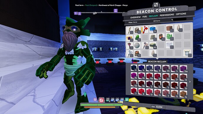
If you put one of each gleam in a storage in a throwaway beacon and then reclaim it, the reclaim will be sorted semi-chromatically.
I’ll post a picture in a bit
just a few examples so as not to clutter the thread… as you can see, it’s not perfect by any means, but i think its as close as you can get organizing them this way.
You aren’t going to find a smooth transitioning spectrum as the colors are in 3 space. It has to do with the brightness of the blocks, so you will have multiple strings of colors that blend smoothly and have to chain them together.
Their is a color tunnel in TARDIS Norkyna that has the best continuity that I’ve seen but it still has multiple ribbons.
Edit:
The image in this post has a pretty good visualization, you just have to imagine that the brighter colors are out of the page towards you and the dark colors are deeper into your screen. It’s hard to organize a sphere into a line without having some wonkyness.
I gotta find the google doc we made, but we started one of these in Kindred Bay on Sorissi. Also sorted by saturated to desaturated colors.
Will link the doc when i find it
WARNING: Rather geeky answer follows
The “Colour Spectrum” from the original post only shows colours with (let’s say) maximum luminance.
There are also all those same colours tending towards white, and tending towards black.
The “Index” tab on the colour spreadsheet shows a smooth progression, but each hue is repeated amongst colours closest in luminance to it.
There’s no single rainbow progression for the colours in boundless… or in any set of colours unless they are all of equal luminosity.
I want that spectrum, now 
Did someone say geeky answer… hold my 
As part of creating the original base palette (with the aim to distribute the colours evenly across visual perception) we took the following collage image, and remapped it to colours available in the palette. You’ll note the colour distribution image at the bottom of the collage.
(Note this is a nearest remapping, it’s doesn’t perform any dithering which would vastly improve the output to match the input.)
(Also noting that this palette was designed to work with dynamic lighting so that lighter colours could still be brightened by lights, and darker colours could be shadowed by lights. So the palette ultimately has a compressed pre-lighting-luminance range, to allow for the widest possible post-lighting-luminance range.)
(Oh, and this might not be the final palette that went into the game. It went through quite a few iterations.)
Found the reason this new update is getting such a ‘thorough’ pass! It is 8 almost though here. a bloody mary isn’t terribly out of the question… or maybe just some whiskey in my coffee. I build better that way anyways.


