I think the design intent is that the button is only about the permission and not about the protection zone, since that is still always on and cannot be turned off. The only difference is that everyone gets the permission now per default.
Totally agree that it is far from obvious what it’s doing. I always double check the permissions tab to see if everyone in the list has gotten the permission or not.
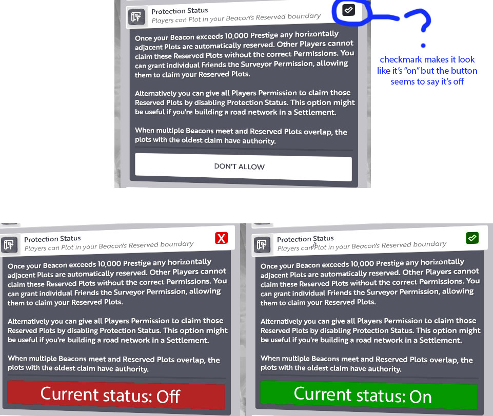
The gray oneliner below the title that tells you if other can or can’t plot is also helpful. But I agree that the rest is confusing. It’s also miscommunicated that you can turn off the buffer, while in fact you can’t. You only give permissions on it.
I think suggested button design would be more clear. Before warping status got these cross icons it was really unclear that when it was on and when off.
This Protection status title was confusing with icon, but luckily text description is clear
Maybe there could be better title word to describe it.
This is no different that some of the other features like “people warping to the beacon” so I can completely understand why the did the code this way. It keeps it in align to their current way of communicating on/off type features.
Personally I would always just have preferred a little on/off switch on the UI or the ability to check/uncheck the box on the first screen. I don’t really see a need to go in and select it unless they are worried that people might accidentally check/uncheck and want things to be like two steps.
There are a lot of little UI features and stuff that could use some work. Many feel two first generation pass versus more refined. We do need more refinement like the post suggests.