Dear Boundless Community,
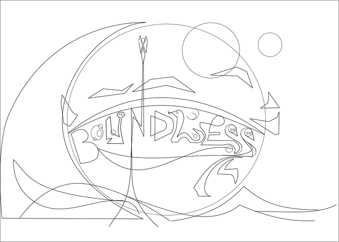
since I’m such a fan of working with vector based graphic software, I could not resist sharing a very, very early version of what is supposed to become a Boundless logo.
The reason I do this is because I’m not really a fan of the Boundless title. I’m very sorry to say so, because I know the delevopers have put so freakingling much work into this game so far that it is almost blasphemic to say so. BUT this doesn’t mean Bounldess is a bad titel for a game, because if it will become an good or even excellent game, the name Boundless merely becomes a minor label and as for it pronounciation - it does sound good. It implies infinte and or unbound capabilities which maybe are restricted to mabye only one’s phantasy. However, I also am a fan of symmetric logos - the current Boundless icon is not any more as in comparison to the former Oort one ( ![]() ) which I personally found a bit more simpler and aesthetical. So it might be my own personal crude opinion and maybe the majority of the community doesn’t share. Which again is the reason I thought I’d just take a personal challenge and try to squeeze the Boundless experience into a logo or graphic artwork which for me is more compelling and doesn’t sound as vague as “Boundless”. This is difficult, because my personal expectations to art often don’t equal the result of my own prowess and talent. So it might turn out a disappointment for not only the community, it also could disappoint my own exptectations which are caused by phantasizing about a logo too much.
) which I personally found a bit more simpler and aesthetical. So it might be my own personal crude opinion and maybe the majority of the community doesn’t share. Which again is the reason I thought I’d just take a personal challenge and try to squeeze the Boundless experience into a logo or graphic artwork which for me is more compelling and doesn’t sound as vague as “Boundless”. This is difficult, because my personal expectations to art often don’t equal the result of my own prowess and talent. So it might turn out a disappointment for not only the community, it also could disappoint my own exptectations which are caused by phantasizing about a logo too much.
Well - a lot of lazy talk from me - Actually I do it because it is fun and an evolving process and I really enjoy sharing with you all. So if you like you can give feedback anytime - I really appreciate tips, constructive criticism or creative feedback. In the end it should become beautifully colored with soft colour gradients and one or the other quirky idea in it, be it in the letters or out of the world of Boundless or builds or elements fro the game
The main work so far got into the double S (the cranes) and I’m very proud of the idea of making a two headed crane a double S.
So you can see now the graphic still is merely anticipational, And if you like I’ll continue working on it, otherwise it would not make too much sense for me if I’d be the only person who’d like the graphic in the end ![]()
But if I’ll achieve a finished artwork and it is just only one who feels inspired or who benefits from it for the game - well then task accomplished ![]()
Thank you very much.


