I have to acknowledge that I am color-palette challenged. My mathematical mind thrives for the architectural aspect of building, but all my artistic creativity went into music, not visuals. My builds usually look okay but color coordination is a challenge for me.
I am currently working on on my mansion, hence it is ornate. I liked the black wood so I started building the first floor ceiling with it. My walls are sandy brown. I will have white marble banistered stairs that wind around large light-brick columns and several chandeliers hanging. My concern is that the black ceiling against all of this really turned the tone quite dark. Is it a bad idea to go that dark if the overall theme is ornate as befits a mansion? Should I tear out the ceiling and go with a light brick? I honestly don’t know what to do. Thanks for any suggestions.
I would say if the black is so dark that detail is lost…which I found with black brick then maybe ammend the ceiling detail to add more lighting, perhaps a couffuer ceiling or a light ceiling and use the black mats to create a chiselled ceiling rose design?
Also pictures would be great I remember you announcing the mansion build sometime ago when you were recruiting builders would be great to see it.
P.p.s. can’t wait to see what you had in mind for nixia I believe your in our discord now
Chiselling an ornate design into the ceiling could help, maybe some gleam crown moulding. Using light colored accents can really brighten up the place. If you were going for opulence, refined gold, silver, or titanium might make some nice accents too. With pictures though, I think we could give more specific advice easier.
For the mathematical minds, there are certain color combinations that just work as well. In general, using complimentary colors for shadows in art works well. Not sure how it works in building one way or another though. Here’s a little link if it helps at all.
Can I post links to other sites? Sorry if not 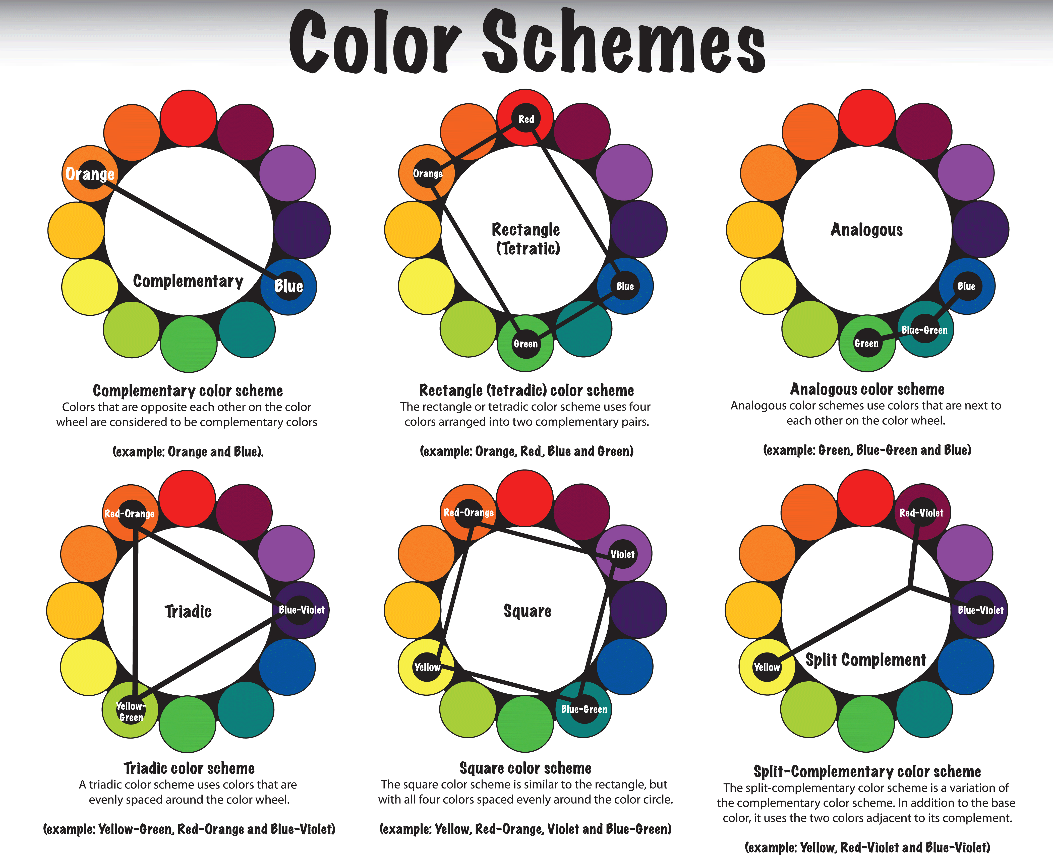
A site that will help you choose a color palette. I recommend to learn more about color harmonies
https://paletton.com/#uid=30y0u0kllllaFw0g0qFqFg0w0aF
If you go with a lighter brick it will show detailing (chiseling) better than a dark color. In the end all that really matters is do you like it? If you posted a pic of the room it might make it easier to make suggestions.
I know I have started to do walls and ceiling two blocks thick so I can have different colors for interior and exterior walls and the ceiling on one floor are not the same as the floors on the level above. It also give me the ability to chisel the walls, floors and ceiling without worrying about making a hole into the next area.
Similar to @HABABAS, I use this sometimes:
Your example is more convenient and understandable. Such things are taught in art universities, but it is quite possible to mostly understand in practice
Anything I would have suggested has already been said.
However I will second chiseling a design into the ceiling. I think that’ll really make whatever color you choose really pop too with the black background.
Choose a bold (matching) color so it doesn’t get blended into what’s already there.
Light or sky blue colors would go well.
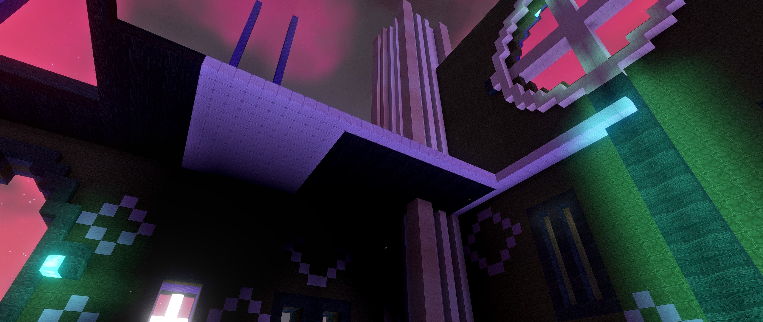
I am so glad I talked this out with you all while I was at work today. I thought it over and I think I avoided a HUGE mistake. Here is a picture of the WIP floor 1 ceiling change that I am making. You can see the black wood is just too dark, I am replacing it with that soft meta. I am so thankful for the help as this will save me about 20 smart stacks of the wrong color placement ![]()
OMG Thankyou!
I think that it all depends on what you want to pass with the architecture/colors of your home. The way you place the colors can change the perception of the room. For example:
-
Light colors on walls and ceiling, dark colors on the floor: The space gets bigger.
-
Dark colors in all surfaces compact the environment and make it feel more cozy.
-
Dark toned walls with light toned ceiling and floors: the horizontal lines are highlighted, making the room seem more alongated.
-
Ceiling, floor and back wall with light colors, side walls with dark colors: the place feels narrower, higher and deeper.
-
Back wall with dark tones, ceiling, floor and side walls with light tones: the space doesn’t feels as deep as before.
-
When only the ceiling receives light colors, it creates a cave effect, where the light is only coming from above.
-
With light tones only on the floor and in the back wall: you decrease the height of the space.
So, using these tips, you can change the sensations and impressions that the room gives. One thing you definetely want to keep in mind is the contrast and relation between the colors. For that, you can use the amazing guide that @HABABAS posted.
Of course, that’s not all. Dark colors, in general, make the enviroment to feel more cosy. As does the use of a small height. Bright colors make the place feel more clean, less cosy, etc…
Anyway, hope this can help a little!
This is a tremendous help. I may need to change this thread to a design guide. That info is something I did not know but makes perfect sense. Very interesting.