I whas like wut when i saw the oicture first then i read the comments and now im even more wut
All the GUI will be stylised like that right? I would love that look (toggle 3d and 2d version), and to see these as signs, woah 

in game DDR here we come ![]()
4 Likes
I’ll just add the updated version and the new tokens to the collection aswell 
That would actually be awesome^^

Four weather types (Sunny, Rainy, Storm,
Snowy). if you have icons i assume that the weather might matter

Agressive and Passive creature (The ones
you call predator and herbivore right?)

Chests


Increase/Decrease (Most likely used for
things such as plinths when setting the price)

Forge (Crafting) and Blueprint (As in
drawing an area of something)

Ruins

Axe (Left) and Shovel (Right)

Hammer (Pickaxe)

“City” (If they make a system
which can check the size of beacons)

The icon for the Ingame Clock (whether it
uses real or ingame time, Most likely ingame time to see when it goes
dark"

Bombs (Zelda style bombs. Think they were
hinted at some point already)

Statistics (Either for stats, but i think
it might be for Plinths so you can see how much you have sold, bought etc)

Either the “Greetings” Emote or
the icon to open an Emote wheel.


One is Potions the other is coinpurse (not
sure which is which)

“Owner” of the beacon (has a name next to
it)

Some sort of checklist.

Chat and voicechat related (VOIP anyone?)
The rest are fairly all covering and hard to decide what is.
7 Likes
![]()
Forest/nature
Also is that a computer: ???!?!
![]()
1 Like
I think maybe swap shovel and pick (imo, maybe not), but besides that seems like really good guesses!
I’m impressed these seem to be more intuitive than I had thought.
7 Likes
I like this icons realy, i like simple & clearly Designs in Icons, and think it fits well with the rest of the game
I do not like when too many embellishments around the icons or in it.
1 Like
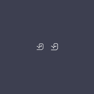
Tried some body parts for air, health and stamina properties, not sure how successful my curled bicep is (hard to do with only 90 or 45 degree angles)

6 Likes
The bicep looks a little … odd … more like a tentacle (sorry!)
Maybe rotate it 90 degrees counter-clockwise? So it’s more like this…

3 Likes

Good suggestion this works a lot better now. Really need to sit up straight when I’m working…

6 Likes
I reckon get rid of the inside bit of the fist too, might look okay?
1 Like
I had that same thought too … more like this?

I tried just cutting straight across as well, but it made it look too blocky
5 Likes
You’re hired! 
4 Likes
The hand scale is better, I think the extra curl helps with readability at really small sizes (one of my test cases). Here’s an update (mine on left)
3 Likes
True, it does lend it a little more definition at smaller scales, but I’m still not sure of the amount of curl - for me it looks a little excessive.
… nope, sorry - I just stared at this for like 2 minutes until everything else went blurry and I prefer the one on the right (not just because I made a minor contribution towards it!), as it looks more like a clenched fist to me.
3 Likes
I also prefer the one on the right!
1 Like