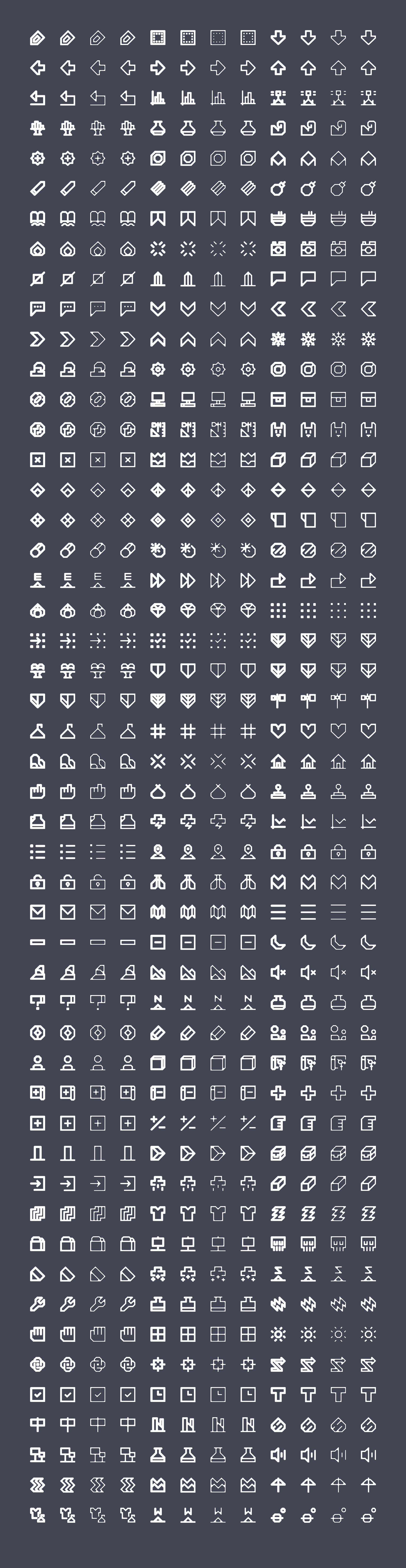
We use various weights for icons presented at different sizes. With a single weight/thickness linear resizing of line-based icons often doesn’t always work as lines can become <1 pixel. Making these lines thicker for all icons can make them look chunky or clumsy at larger sizes.
I see what you mean by “clumsy”. The thicker ones are a lot less easy to tell what they are than the thinner ones; atleast at their current size. I’ve seen this occur within Adobe Illustrator (a la “Scale Strokes and Effects”) is that what is being used here?
Thoughts aside, most of these icons are looking pretty good, can’t wait to actually see them in the game UI. I added the image to the collection.