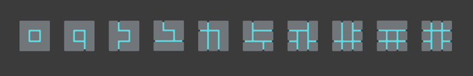
The Oort glyphs are the in-game discovery mechanism and help form the long term narrative of Oort Online. You’ve already seen some of them showing up in the world’s textures, character and prop models, and art concepts. Expect to see them in many more places in the future. They’ll be showing up in the worlds but also in the game’s GUI. With this in mind, we’ve been playing with a few glyph font ideas.
Below are a few early (non artist) prototypes. We’re sharing a few bitmaps here, but we actually generate everything in scalable vectors for the in-game and in-GUI fonts.
Firstly the primitive glyphs that the players can use. (Looks like you need to work on your handwriting.)
Now a few mathematically precise equivalents left behind by the Oort.
Let us know which you like and if you have any interesting ideas for alternative font styles.
(And no - Comic Sans is not a valid suggestion.)
UPDATE 1: It’s worth adding that the Oort Alphabet is not the same as these Oort Glyphs. The alphabet is a direct mapping between the English (??) character set ABCD, etc. Where as the Glyphs are more like Kanji, with each Glyph representing a word or meaning. Player created content, player names and places will use the alphabet, where as the lore system uses the glyphs. (If that makes sense.)
I favor easy to understand when it comes to fonts. Every font can loosely be described in low resolution pixels. I like the idea of taking a real font and Oortify it into a block type. The original block concept was great in mathematical terms but reading would have to be computer assisted.
That said, Oort will be multilingual, so any choice will have to be computer assisted anyway.
One idea is out of the old time printing press book. When certain letters are adjacent, replace with a more seamless character. For example when two f’s are combined into a much closer character.
I think the first 3 examples are the best, the others seem sort of filler, but I do see some potential for the 4th one. As for stylizing to other types of fonts, I like Origin and Arual for smooth, thin, and simple.
for me there should be multiple fonts, all depending on what they are on.
so for example a playerwritten glyph would be one of the first 2, very clean and square. while in temples they might have been ‘‘hand drawn’’ which makes them not perfect, and instead becomes somewhat uneven. there could be even more situations like that. just my opinion though
I think they all look nice, though comparatively the last looks out of place. Honestly I think they Xs and Os feel like they are changing the meaning, while the others are just stylizations (word?) which is not bad; it could be nice to have some choices for stylizing maybe post-1.0. I think 2/3 will be the easiest to read overall though, with 4 being close behind.
For the precise glyphs, the two filled in ones seem to fit best. Of those two, I (slightly) prefer over , even though it seems to break the whole cube-voxel mentality. Some misc notes:
outlines are going to be hard as a font (glyphs will have to be large on screen!)
The x feels out of place
has more visually distinct things going on; I suspect it’d be easier recognize at a glance (if that’s a goal).
Is interesting for the same reason, but the square & elbow blend together too much.
If you do end up going with right angles, put more margin between the different features so it doesn’t bleed together at small sizes!