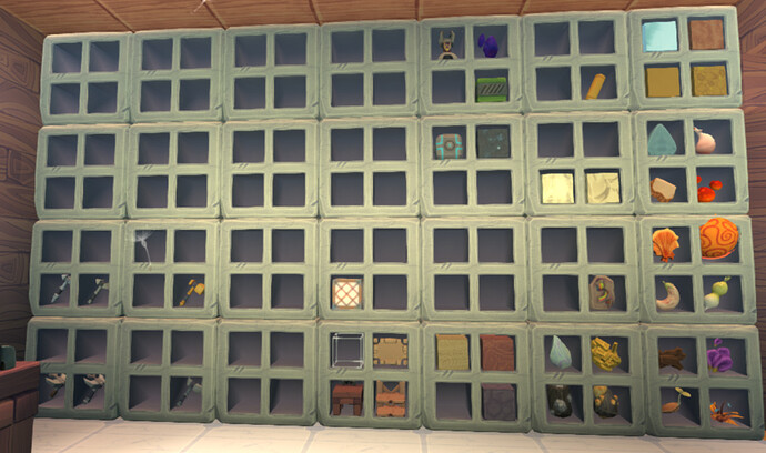
With all the new item types we have now, I decided to expand my storage wall:
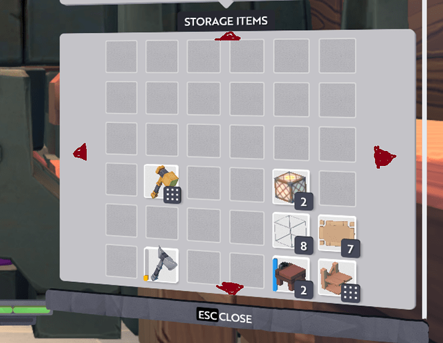
I know this is still quite modest compared to some warehouses I’ve seen, but for now it is enough for me ![]() One thing that slightly annoys me though is when I open the storage interface, I can only access the 6x6 grid centered around the block I opened. If I want to access a slot outside the grid, I have to exit out and open a different storage block, even if the slot is just barely outside the grid. I think it would be nice if there was a way to ‘scroll’ the storage interface while inside it. Not like a scrollbar, but just directional buttons that would take you to the interface for the next storage block over. I created a high-quality mockup of what this might look like:
One thing that slightly annoys me though is when I open the storage interface, I can only access the 6x6 grid centered around the block I opened. If I want to access a slot outside the grid, I have to exit out and open a different storage block, even if the slot is just barely outside the grid. I think it would be nice if there was a way to ‘scroll’ the storage interface while inside it. Not like a scrollbar, but just directional buttons that would take you to the interface for the next storage block over. I created a high-quality mockup of what this might look like:


