I’d really like to see a higher variation of flora in all different types of biomes. Especially for the leaves and tree trunks, right now it just seems like there isn’t enough variation. From a visual standpoint I like the look, I think more ambient FX would really help it.
I’m honestly starting to agree with @vastar on the new artstyle Not sure if I enjoy where this is going.
Still excited for the release though! Keep up the good work
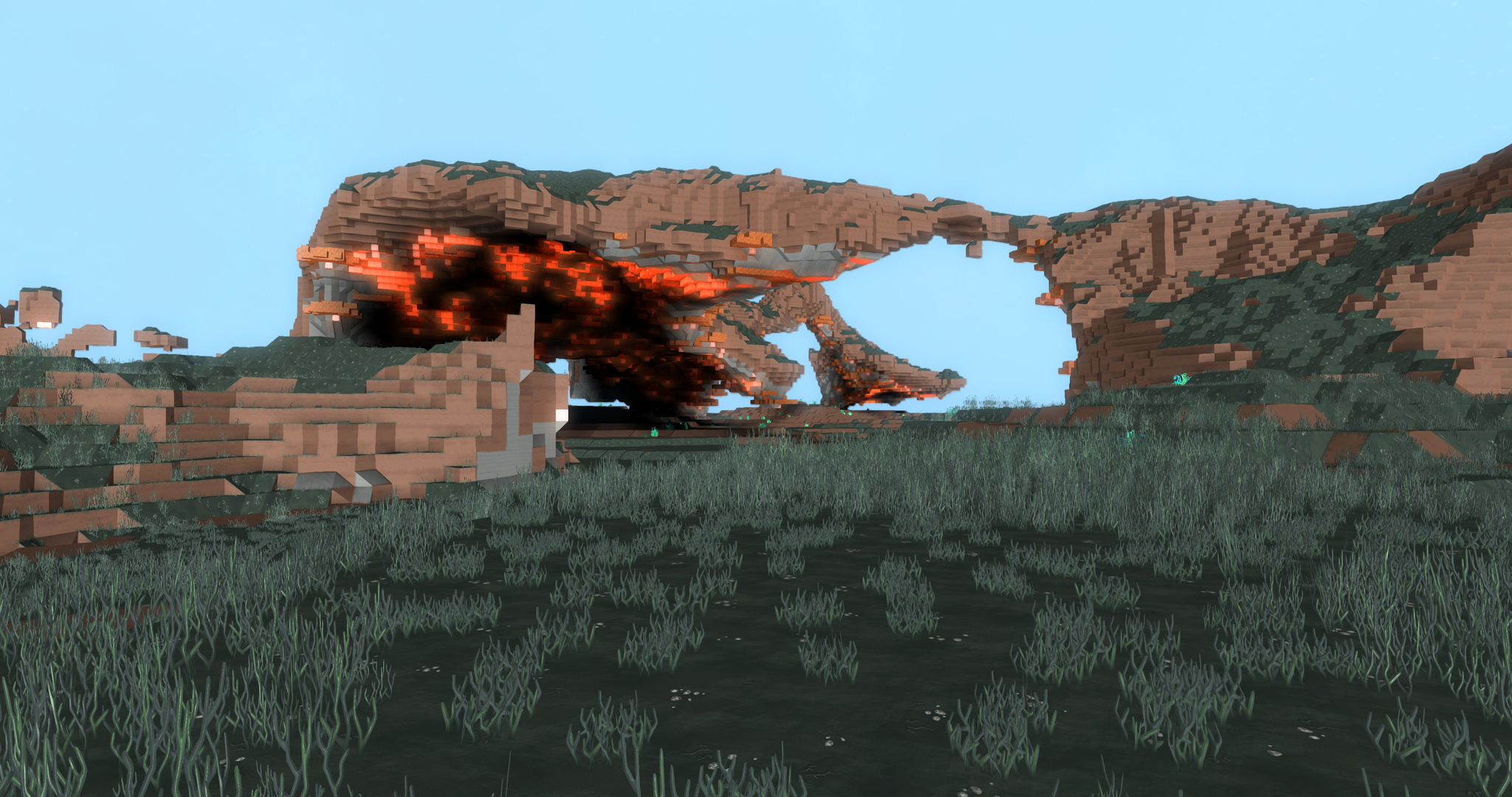
Don’t mean to alarm anybody, but your crystal torch is on fire…
Disregard, I see that you’ve already been notified!
On a side note, I don’t really know what art style changes you two are talking about… I personally love the new gleam textures, much less repetitive! I also appreciate how the tools and items have a visual progression in quality of materials!
The previous textures were “low contrast” and supported a “single tint colour”. As we vary the tint colour per world, you can’t rely on the colour of a block to know the material. And as the texture were low contrast it was also hard to distinguish the block by the detail in the texture.
The previous textures were presented in a world with a balanced palette (people may remember the block depots with the minor colour variations) and a balance sky and world lighting. This made the world and blocks look balanced and cohesive.
The New textures
The new textures are now “higher contrast” - so that it’s easier to distinguish the block type by the detail. They’re also thematically styled to be consistent with the other visual elements in the game: characters, creatures, props, visual effects, etc.
The texture detail must convey the material without colour and shape. This requirement figuratively tasks our talented artists to create assets with both hands tied behind their back. There are many amazing looking modern games that achieve much of their beautiful visual look with colour and shape alone (and no detail) - for example The Witness and Firewatch.
So it’s actually an extremely hard challenge. But we’re taking on this challenge because we want every world to be coloured differently, so that every world is as fresh and original as possible.
The new textures support a “triplet colour tint”: a low light colour, a colour, and highlight colour. (I think this is particularly clever.) This means that we can vary the colour across a block more creatively. This can be used (as before) to tint the block with a single colour, or more creatively tint shadows and highlights separately. A subtle purple hue in a shadow balanced against a orange glow in the highlight. Pretty!
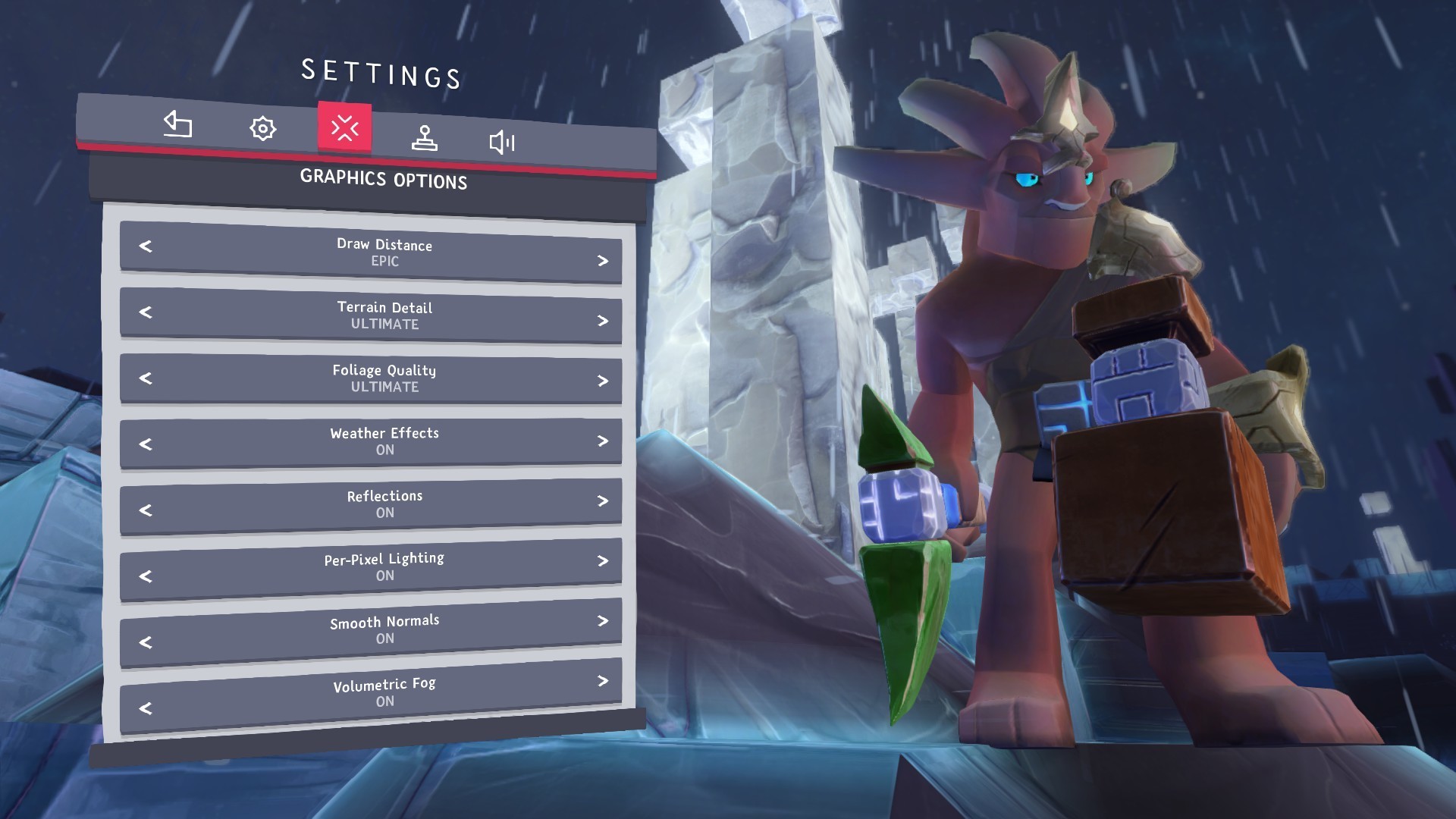
(This triplet colour can be seen in the World Builder block colour selection.)
The new textures are much quicker to create. So we can make the 100s of blocks and variations required.
We’re yet to present the new blocks with a balanced set of world palettes, and sky and world lighting. The game is no-where-near the final visual balance and polish. This will make a massive difference to the presentation of the game. It will be night and day…
We continue to review and iterate the block textures to make improvements based on community and internal feedback - keep it coming. Are there particular blocks that you think need attention?
My aim here isn’t to say “stop complaining” - we really value criticism. But rather to explain the challenge we’ve taken on, why we’re doing it, why we think it’s worth while, and that it’s still a work in progress. In closed game development you wouldn’t normally see these stages where the game doesn’t look it’s best.
tl;dr
The game will look much better once all the components are balanced and polished.
Additionally - amusingly I forgot to say that the whole purpose of this system is to allow players to harvest blocks from other worlds and bring them home. Without this requirement - none of the above would be required. Blocks would be painted with colour.
Don’t get me wrong the new textures are great! The new gleam is amazing. IMO they are just way too “crowded”. There’s too much going on in some blocks. I also really REALLY dislike the new models for everything.
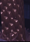
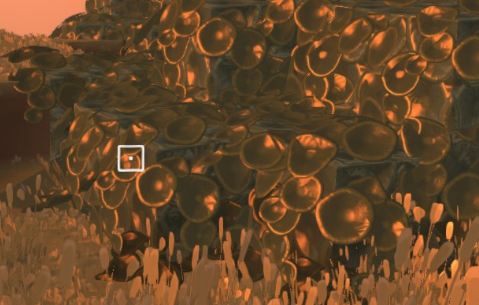
just look at the loss of details :c
Oh, I see. I thought maybe y’all where referring to more recent texture updates since you brought it up again. Personally, all of those textures have grown on me! I’ll agree to the pebbles being high density, but IIRC they changed that recently? I don’t recall right now.
As for tools, I’m not seeing the loss of detail you refer to. The glow on the glyph is gone, but it looks like that is more of a progress thing, and higher tier tools will have the glow again. It certainly looks like the tools have been subtly tweeked.
Over all, I’m satisfied with the quality of the textures, I’d just like to see more varients, especially for trees, leaves, and grasses.
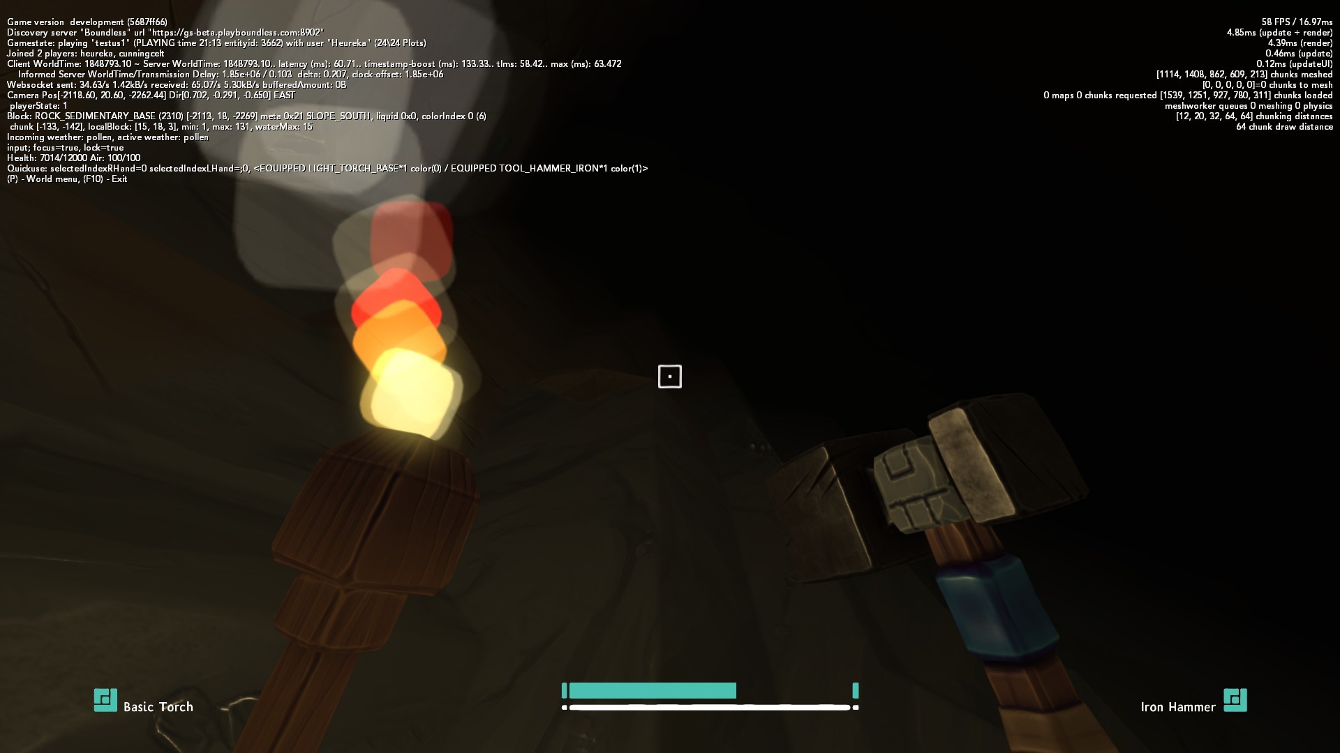
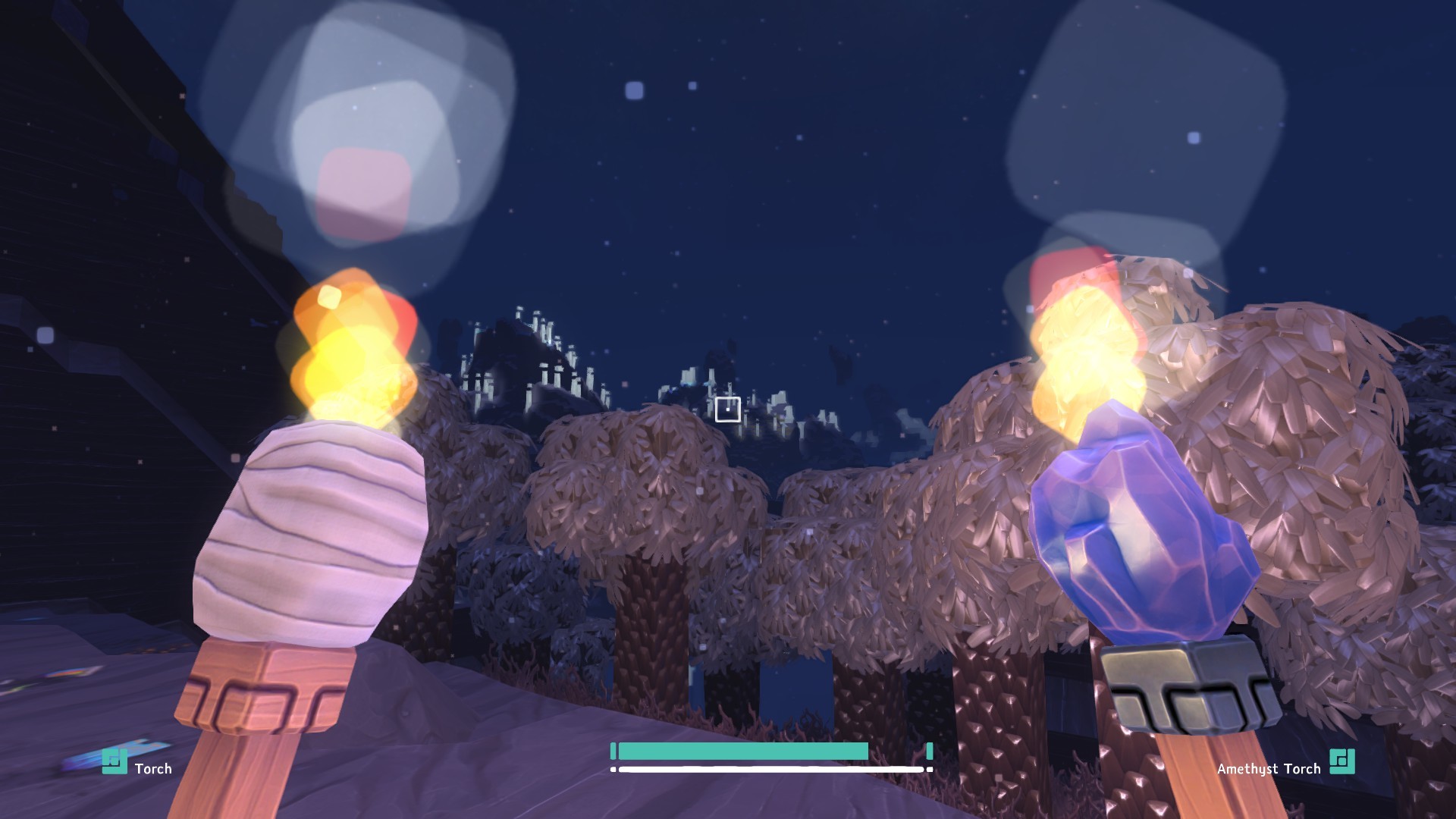
I’m liking the look of the top half of the new torches, but something about the middle section doesn’t quite sit right with me. It might be that it’s only using a 2x3 instead of the 3x3 grid for the glyph… although I can see where you were going with it…
… the 3 dots at the top being the flame (or the part that emits light).
Incidentally, are you going to start spawning the gems in game soon, so we can test these new torches first hand? I’m hoping the gems are something that you can introduce into the existing world using the resource regeneration.
Most of the issues with textures that people are bringing up I have either become used to, or they’ve fixed elements of them.
A couple of things I would like to point out are (note: it’s 6am and I just woke up, so I might sound grumpy, but these are honestly just tiny things and I love all the updates recently):
A) The cloth on the torch looks super low quality (unless you plan to surround it with fire with new FX). Compared to the gem torch, it almost looks like it is from a different game!
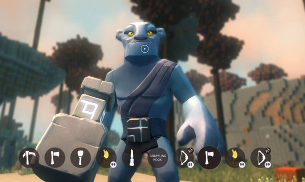
B) Can we bring the size of held items down a lot? They’re starting to take over the screen!
C) @Predatoxic’s image posts brought to my attention the lack of depth of field now. I can see it’s still there but nowhere near as good as it used to be!
D) I know we’ve had the discussion of see-through leaves a tonne of times, but I noticed that Thorns (and obviously glass) are see-through, so I’m wondering why leaves can’t be again?
So I have a couple of dumb questions. Can we actually mine the gems to make the gem torches? And how are we suppose to get spark to make the gem torches?

 Not sure if I enjoy where this is going.