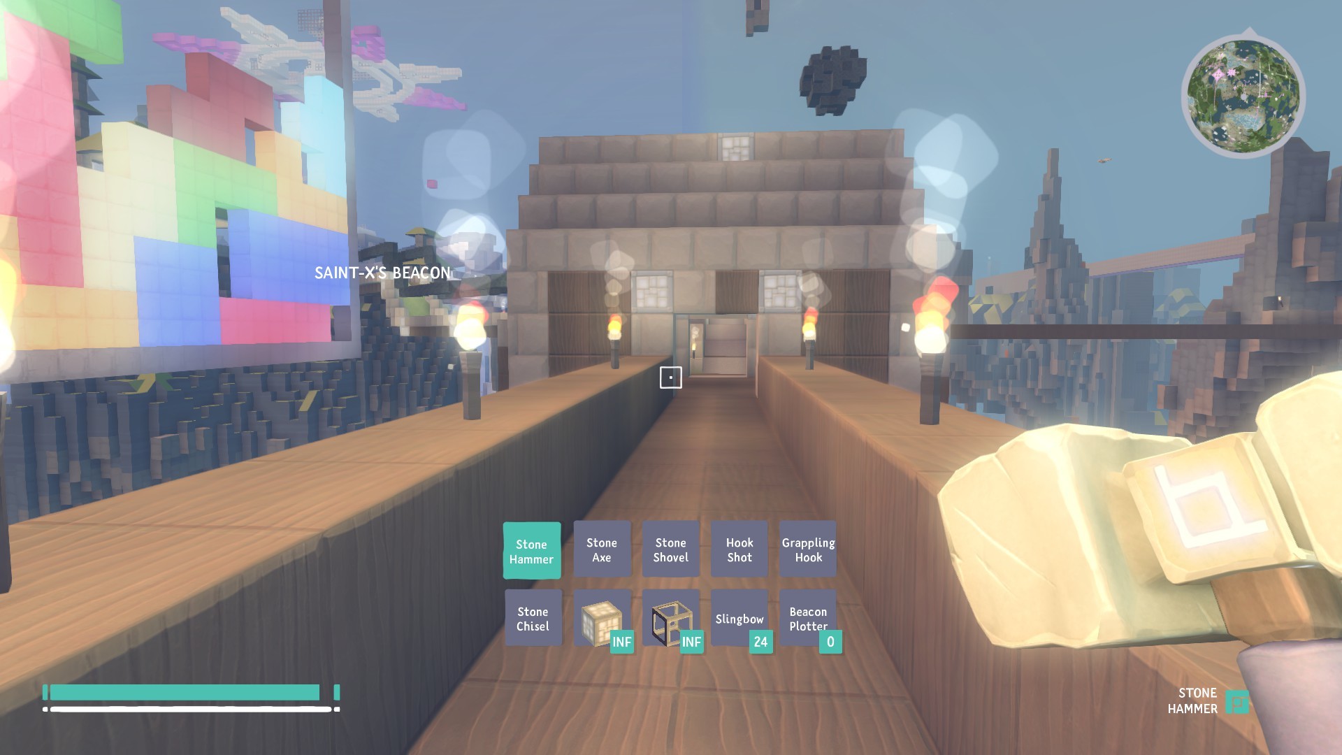
I know that these are still being worked on, but it feels incredibly awkward for me to use the toolbar and inventory system.
The toolbar being two separate rows that you can’t see at all times is distracting, and I definitely feel that one row is easier to use. Maybe have the toolbar still visible but just minimized when you aren’t scrolling through?
The inventory itself is really distracting since it flips your view around and takes a noticeable delay to open and close, both of which are kinda annoying. I don’t particularly like how shift clicking makes stuff go to the crafting window, but there could be a different hotkey for moving stuff between your toolbar and inventory that I don’t know about
I feel like the view looking straight at your character is something that would fit in an equipment menu, but in the inventory it’s just distracting to me. I like the keys that let you switch between inventory and crafting, and I like how you can hold it down to show both side by side, and I feel like ease of use keyboard shortcuts like that are a good direction.
What do you guys think about the current way the inventory and toolbar work? (~’.’)~
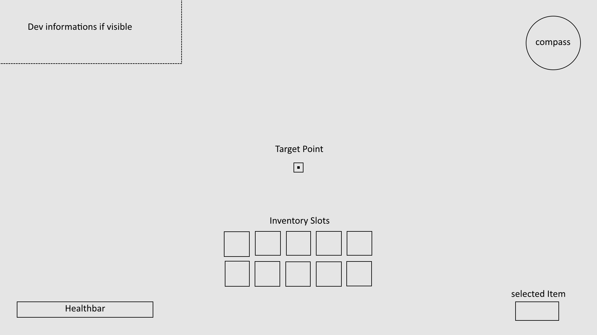
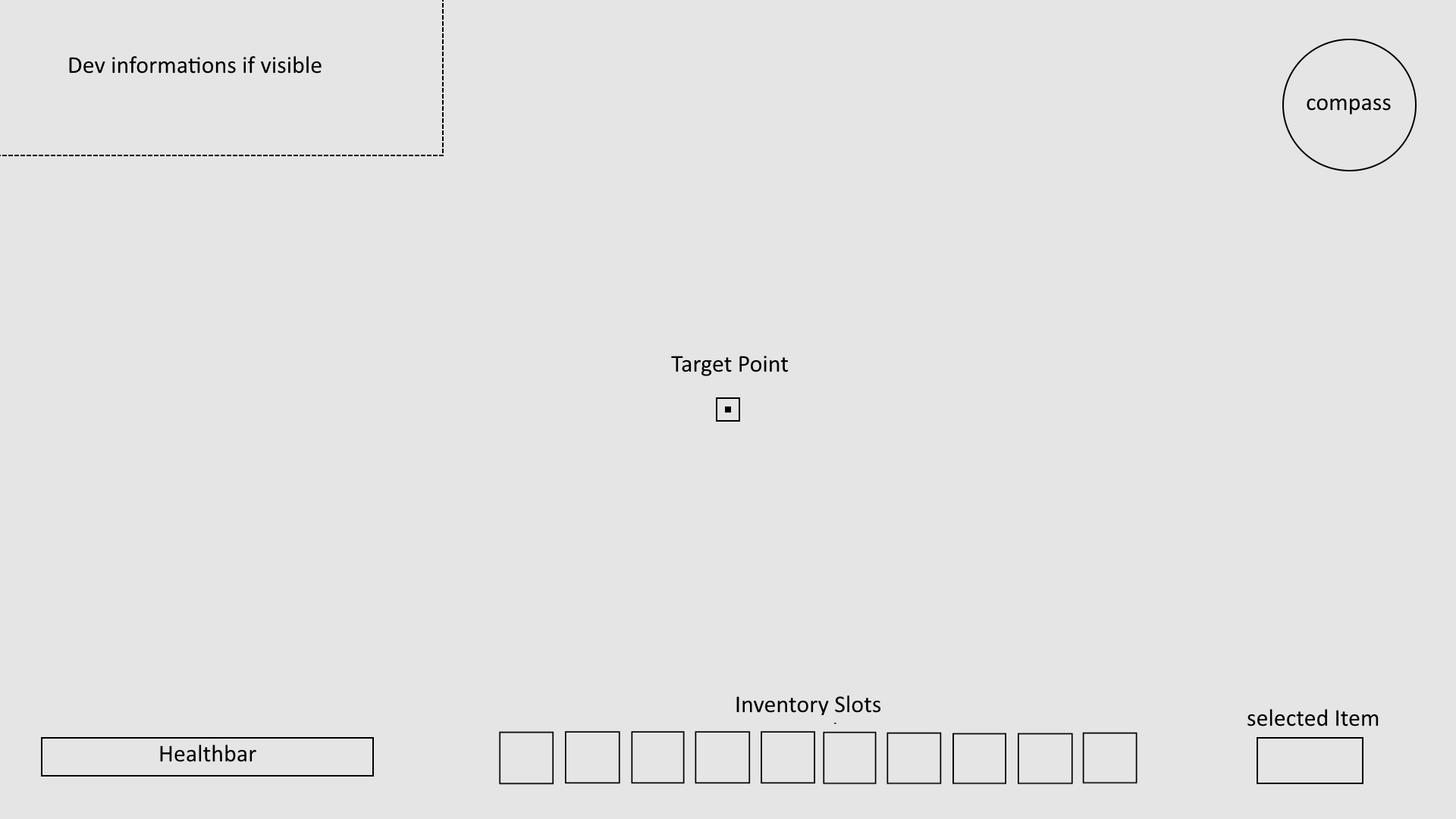
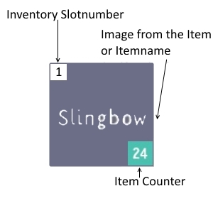
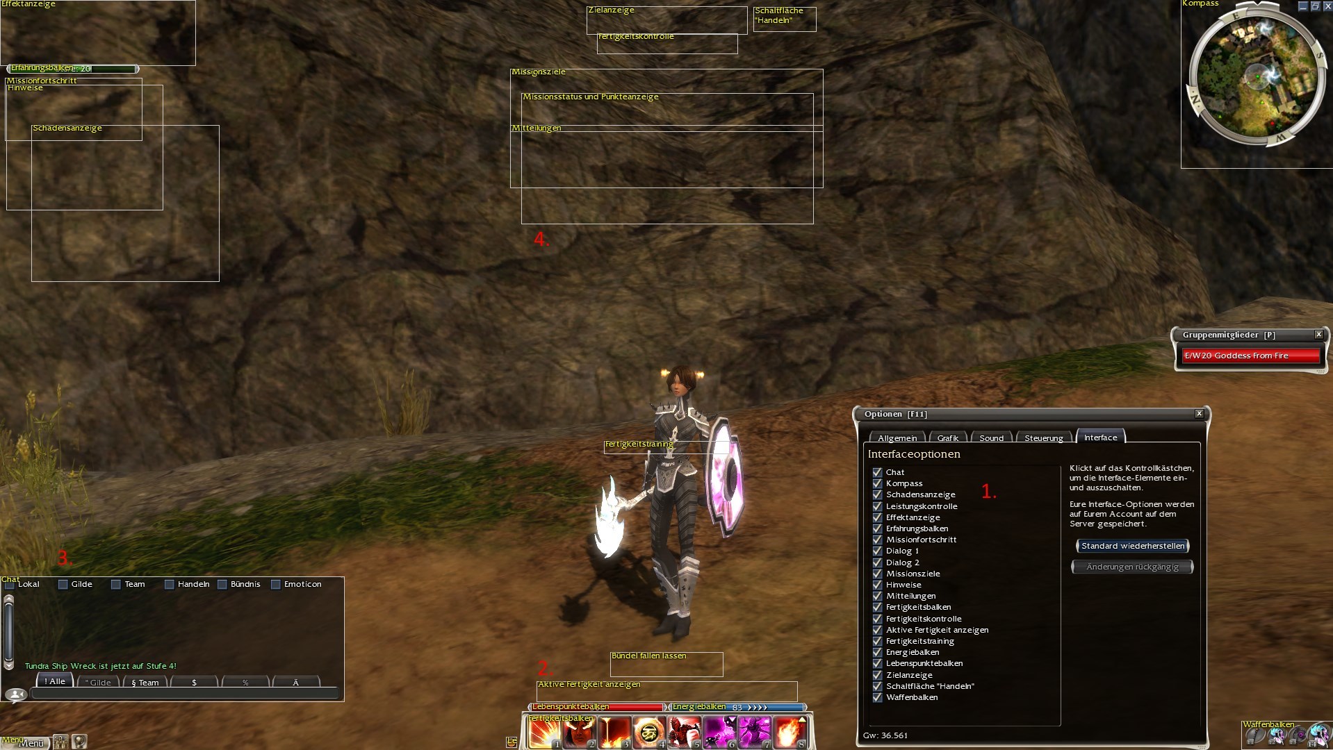
maybe the dev`s can make the inventory be modular like in Guild Wars, any player can move any information like healthbar, inventory slot etc wherever they want and can make it smaller and bigger (later i will add here some pic from it)
or like in wow(you can edit overlay/inventory via addons)
the guild wars 1 interface, you can edit without problems nearly all position and size.
the skillbar, like in boundless the inventory slots
the chat (like in the most mmo, but this is pretty good)
this boxes are the placeholder for not visible slots atm, you can move the placeholder anywhhere and you can edit the size (atm i have no target so its only the target placeholder visible)
ok so now i must go eat, later i add some information more
The way the interface is sorted right now is okay with me. It should be a bit more palyful nonetheless.
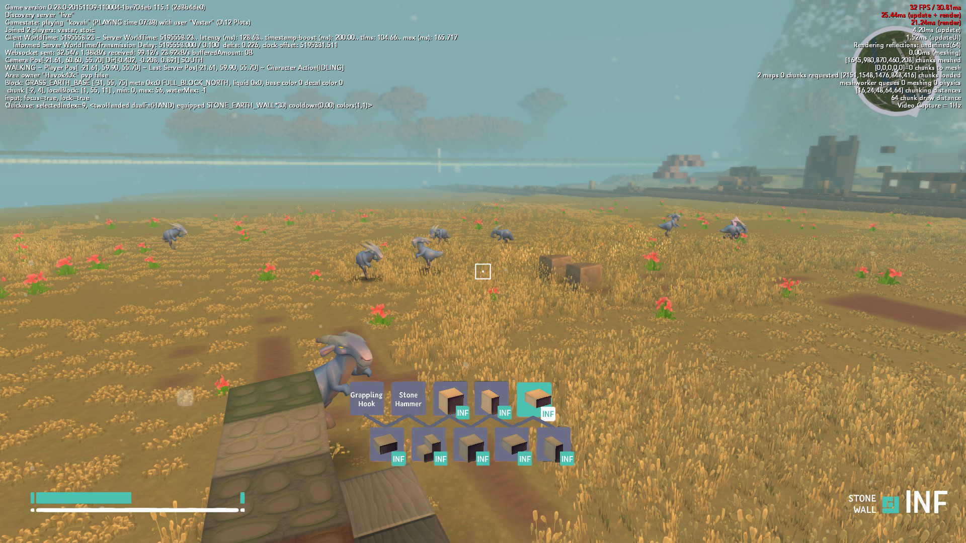
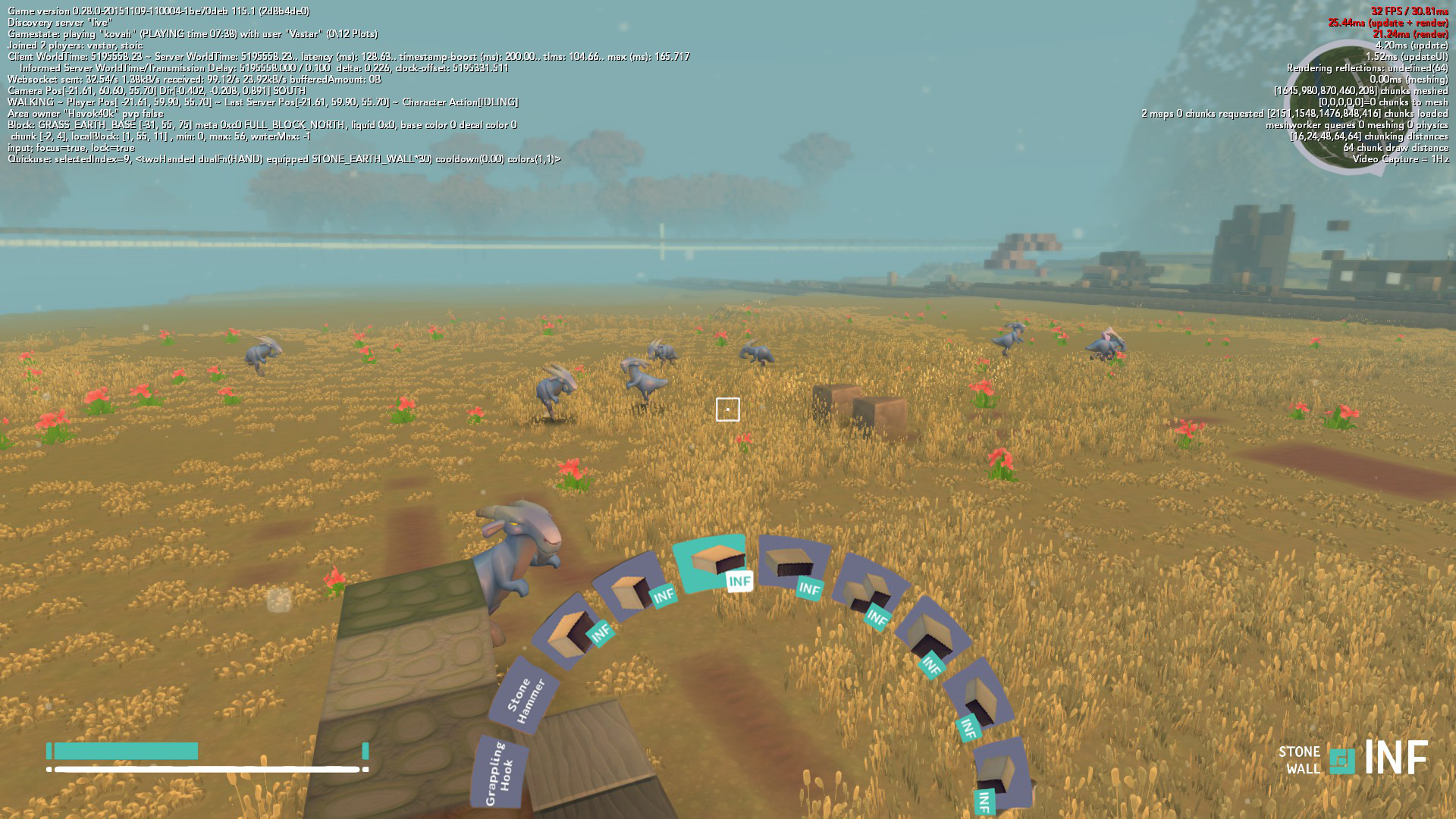
All in all good. The item bar nevertheless could be circular. Meaning when you turn the mousewheel, items rotate in a circle around a center spot, while the item for equipping is highlighted.The probelm with this is, the circular arranged items must vanish after equipping an item. Therefore you loose oversight. And if you leave the rotation menue visible it could disturb the view into the landscape.
I think they went for two separated hotbars because of the planned ambidextrous system. But I totally agree with you, after playing countless hours into the new update it still feels awkward to have 2 hotbar rows.
I think it would handle better if the two rows were shifted a bit like this:
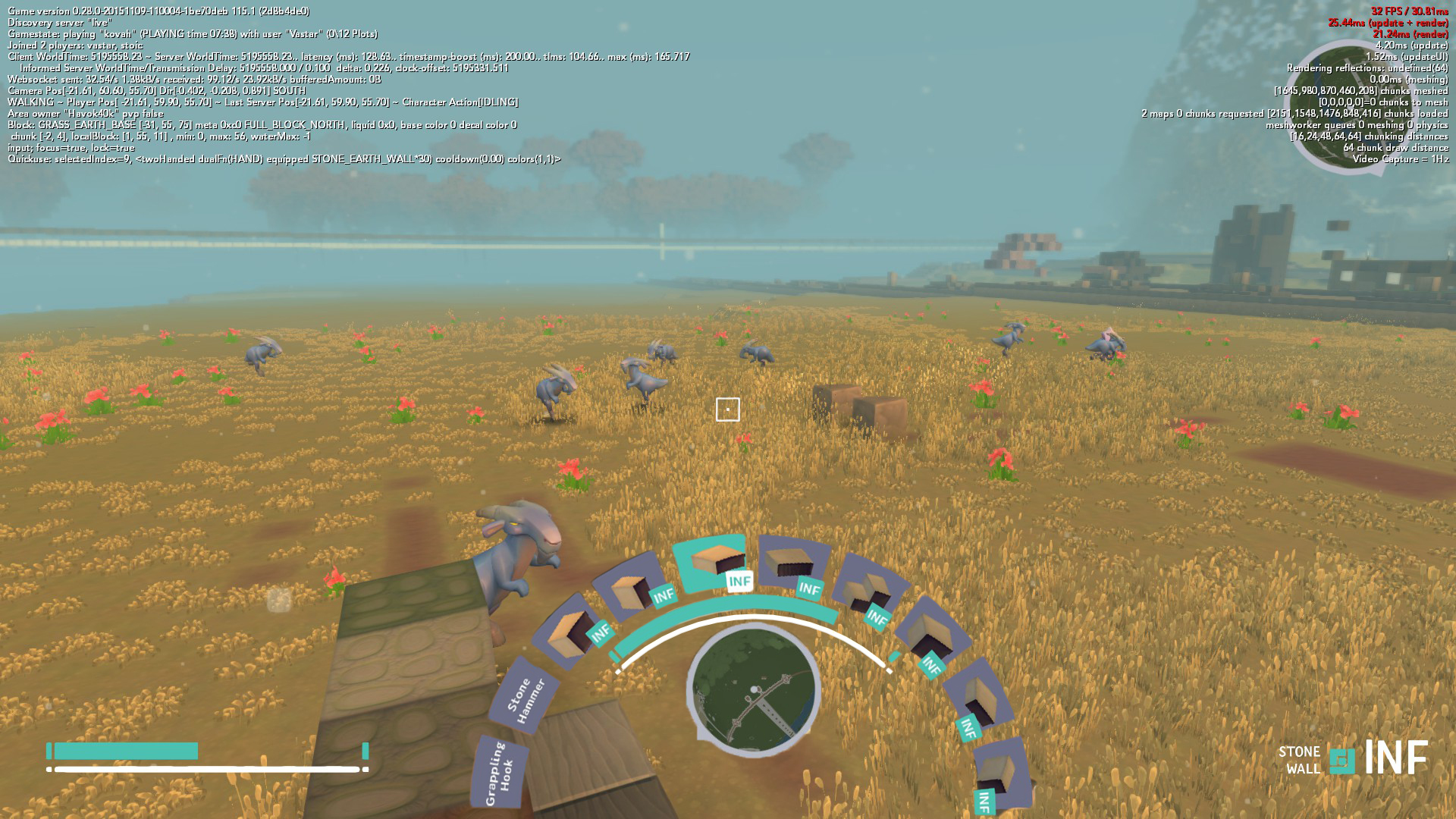
But @Bokke s suggestion of a circular hotbar also sounds like a very good idea, in my opinion it should only be a half circle, so it doesn´t take up as much space on your screen:
I also don´t like the disappearing hotbar we have now tbh. Imo a slider in the options that lets you choose a transparency ranging from 0% to 100% would be the best and simplest solution.
Hopefully the upcoming C++ port will reduce that delay (But I think that we´ll never get completely rid of it. It´s a common issue with 3D inventories in games that don´t pause e.g. The Division).
Besides that I really like the current crafting/inventory UI.
But my biggest problem with the new crafting inventory is that they took away my beloved garbage inventory slot
The delay when opening any of the GUIs is a known issue and something we intend to eliminate. The GUIs should snap open and not cause any stall once they’re finished.
The C++ work will definitely help. Beyond this there are additional optimisations we can make.
I would not like to have it as a ring or half ring, but to have it flat on the bottom on the screen as a single row would be great. May be we get some options to play with when editing the layout of our HUD?