I want a bright red (probably “Red”), a maroonish and a darker maroon as a swatch that all look nice together and go well with gold filigree and refined gold.
What do people think?
I want a bright red (probably “Red”), a maroonish and a darker maroon as a swatch that all look nice together and go well with gold filigree and refined gold.
What do people think?
With gold I tend to go for darker or fuller colors.
In boundless terms hot, strong, dark, night.
The standard colors like might work to but most of the time i find it to bright in contrast with the gold.
Crimson maroon etc. Should use very bright reds the light tinted ones would not accent the .metal
Give me specific fave colors  please and thank you
Does anybody think anything that’s reddish but not named “red” is a good pick? That’s probably a good starting point.
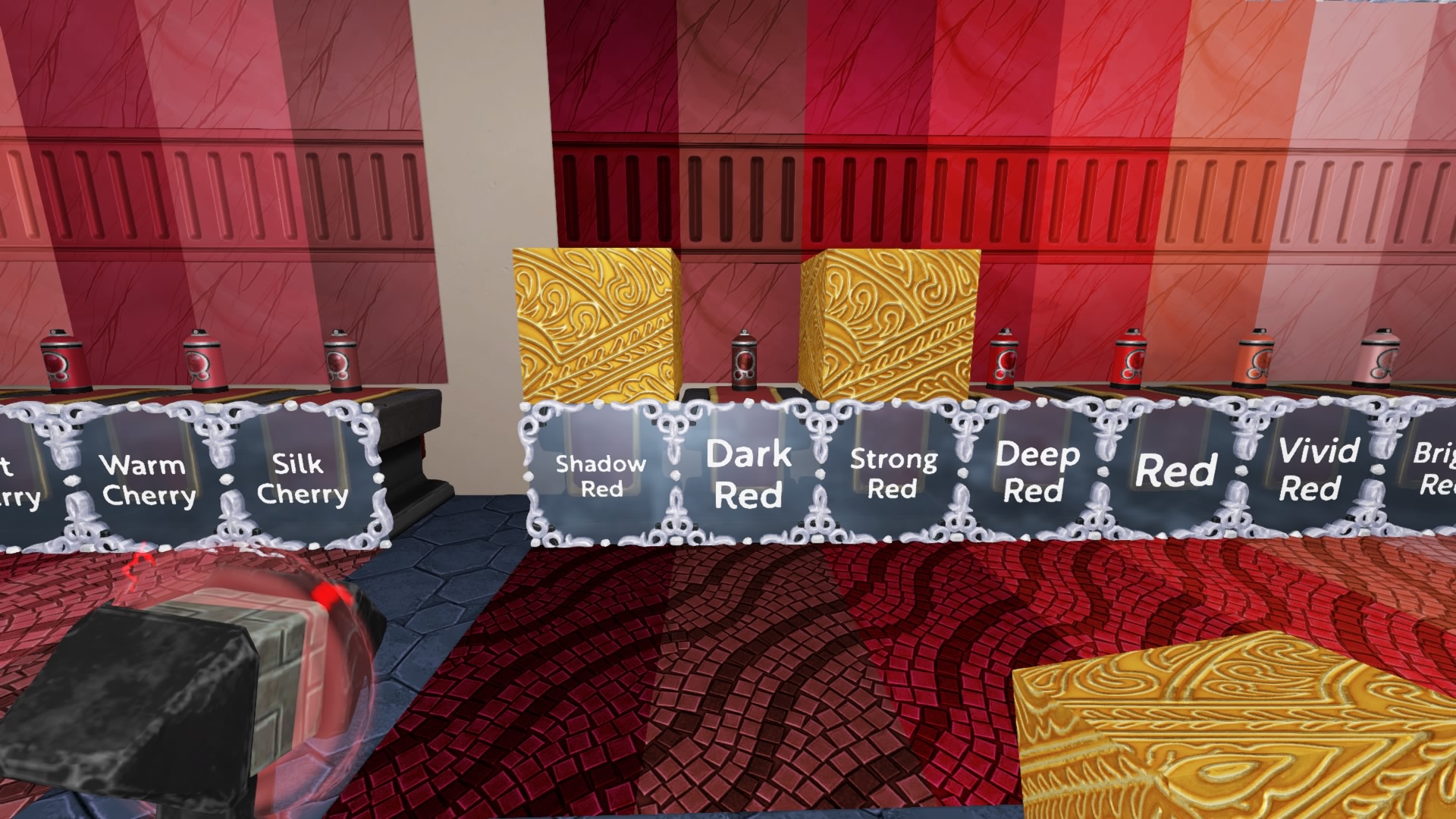
I was leaning towards deep red as the main “lighter” red, strong red as the main “darker” red, and dark red for shadow accents.
Agree with econodog
Spent a while looking at these in game tonight
Shadow red is slightly purple in game and doesn’t look as good with gold. This is more noticeable with stone signs than in econo’s screenshot. Strong red looks better I think. I’ll have to look at the cherries though too.
@DKPuncherello if i may ask where are you going to use it inside (dark) or in open air (outside licht can touch it)?
Just curious.
Outside
Happy to show you in game if you’re online
Ill come by later. 
Gold looks cool with cherry and more pikinsh reds