Art: Sketches for a new Hero Image

We’re in the process of creating a new Hero Image for a coming update to the website and Steam literature. (This was the original hero image at launch last year.) We want something that reflects all the latest updates. We thought you might like to see some of the extremely rough and early sketches during development. They might be early, but they still look super cool. At the moment we’re working on framing and attempting to capture an inspirational feel.

Let us know which you like.

22 Likes

OOOOH! I just found a new desktop background :wink:

My favorites are 1,3,4,9 and the perspective of 11 but not so much the color.

4, 7, 11 feel most inspiring to me.
4 Has a great sense of exploration.
I threw 7 in there because while it’s not one of my over all favorites, it has a great feel of vast scale.
11 Looks like our hero’s just stepped out of the portal and into a dark, possibly hostile world and they are ready for a fight.

2 Likes

Yassssssss!!
These all look great!!!
Personally I like 1-3-4-5-6-7-8-9-10,because they all show how vast the universe and worlds of Oort can be.

1 Like

10>4>5>rest imo

I’m going to assume that you guys might separate the scenery and portals as their own seperate image. They’re both so amazing in their own way! Plus they’re really hard not to choose both :sweat_smile:.

  • My thoughts on these:

I think combining the lighting of the background in 1 with the foreground 3 would work together nicely.

The colors of 4 feel industrial and smoggy, but 5 looks more open and welcoming for me :smiley:.

10 and 12 have got to be my favorite for the portal backgrounds. They both have this mystery feel to it. I’d definitely want to explore what those floating ships may be.

4 Likes

Ooh! They’re all so good! I’ll criqique each one:

1: That bloom coming from over the structure looks really cool, but maybe try some other colors/shades of green for the grass

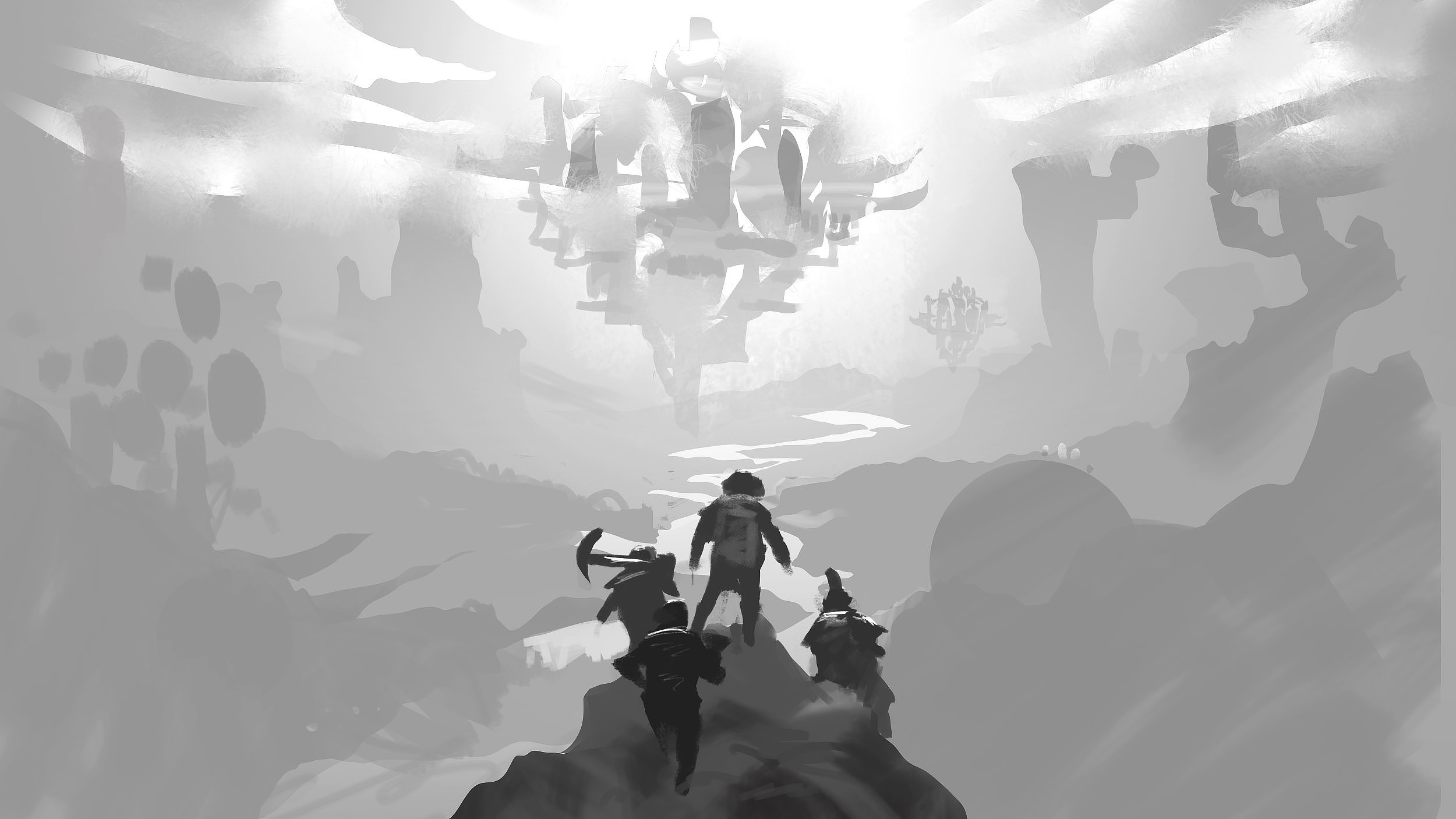
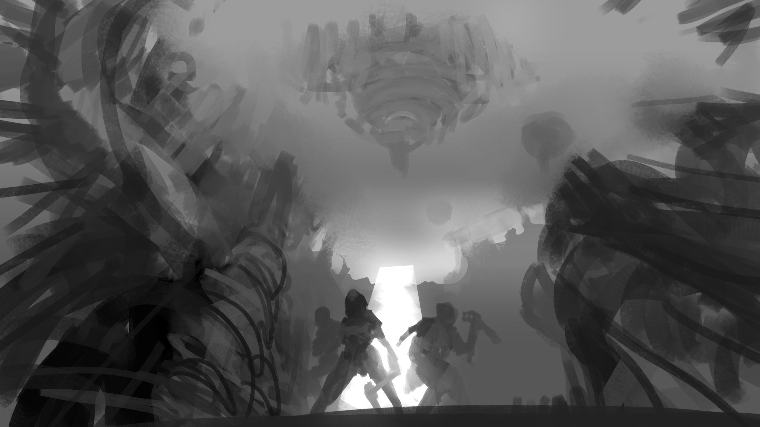
2: Having it in black and white is definitely interesting, but I feel that you couldn’t fit in as much overall detail with just that.

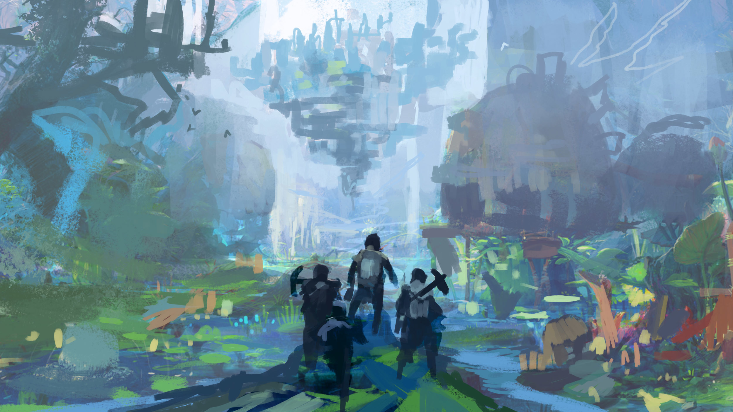
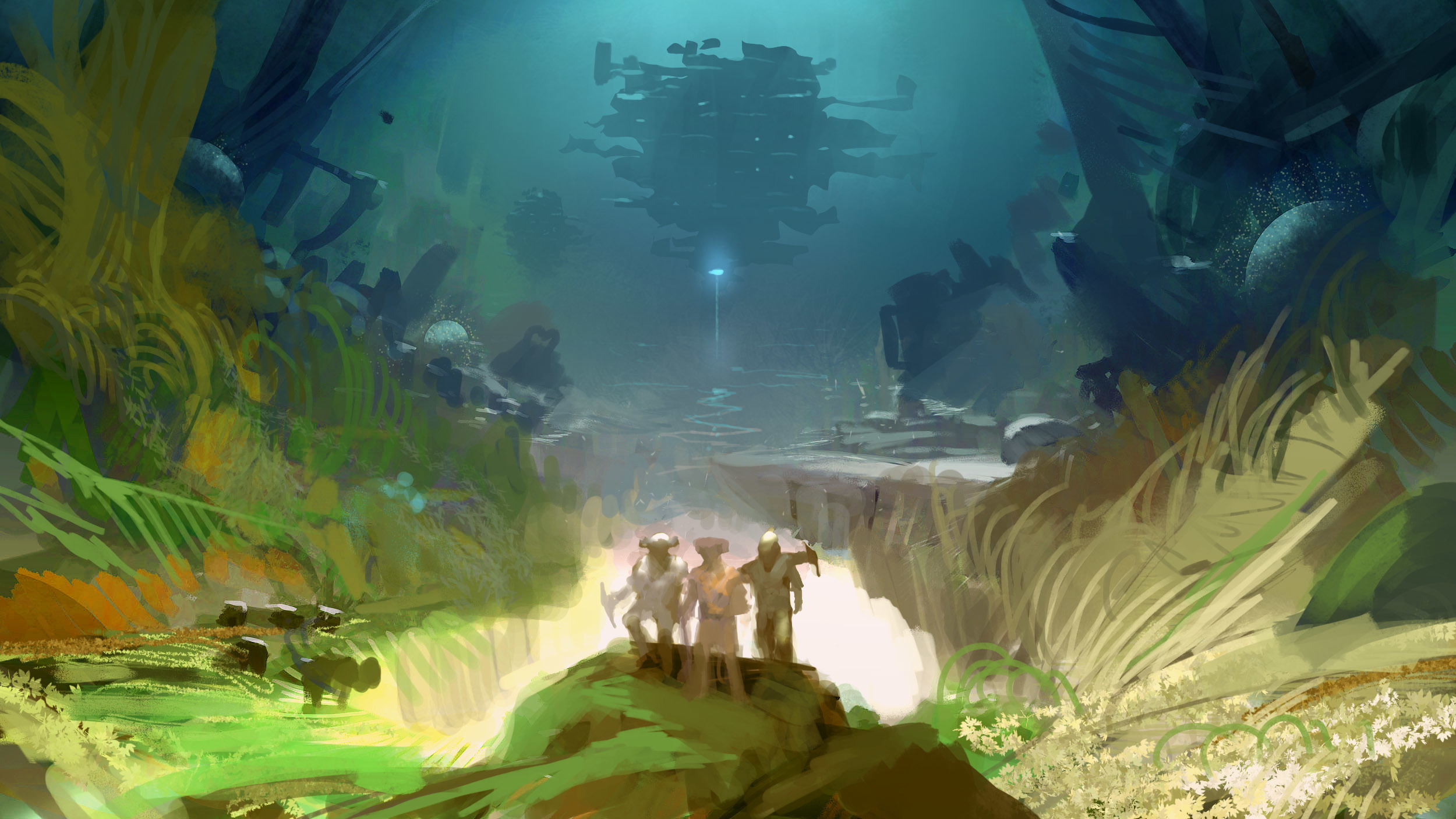
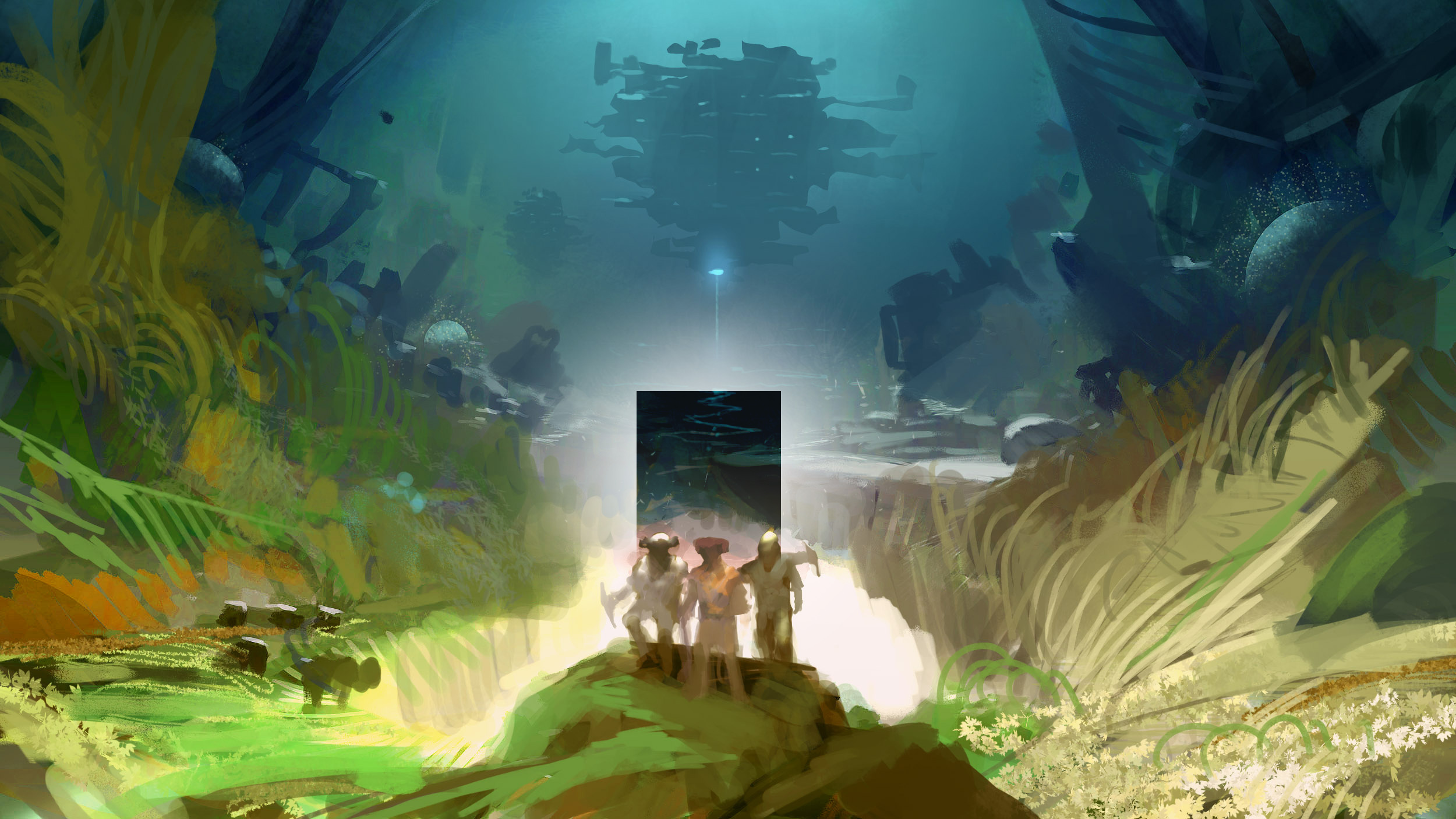
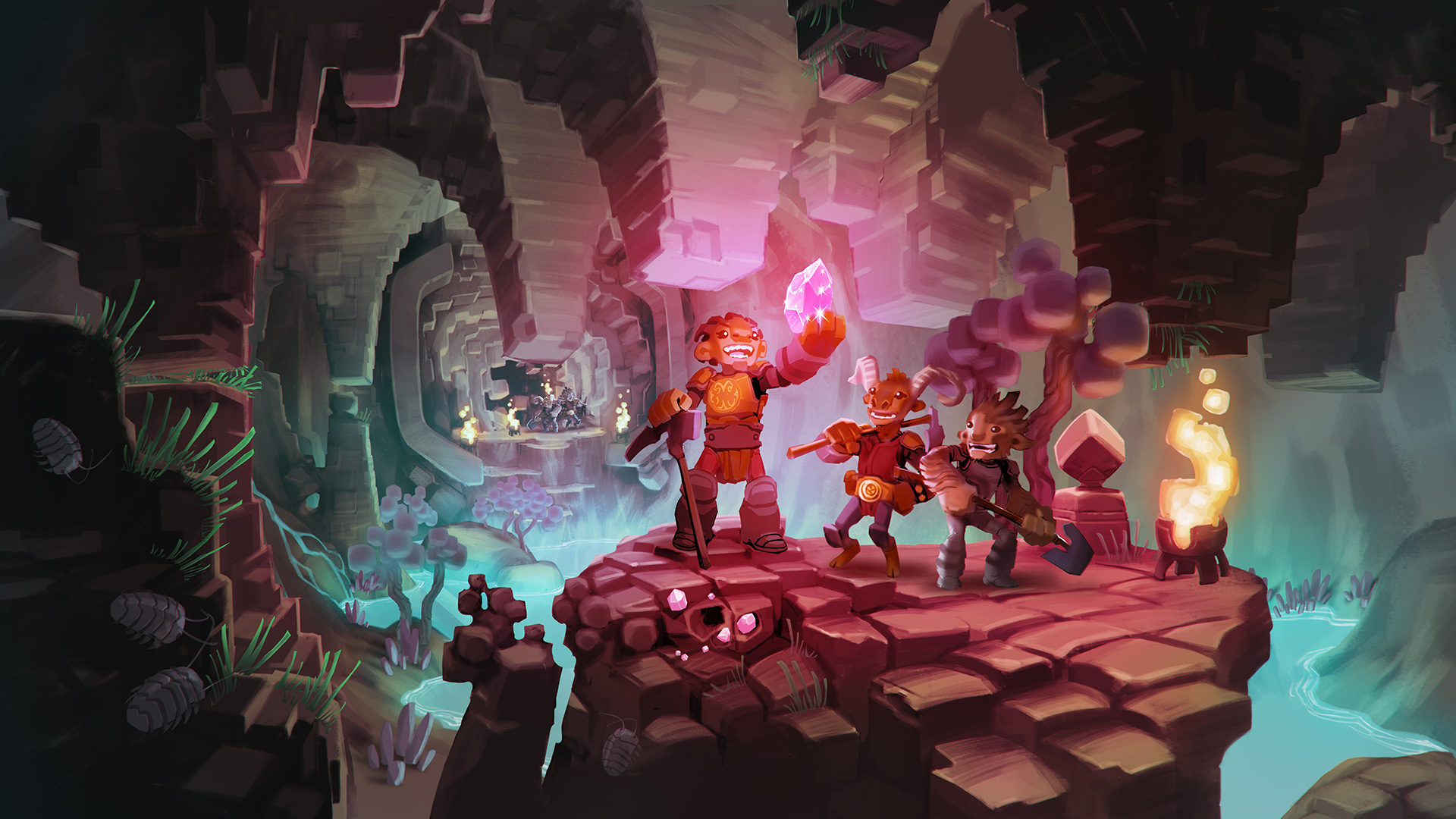
3: This one is my favorite (other than 10). It looks so lively, like a semi-underground city, I’d love to see some more detail put into it.

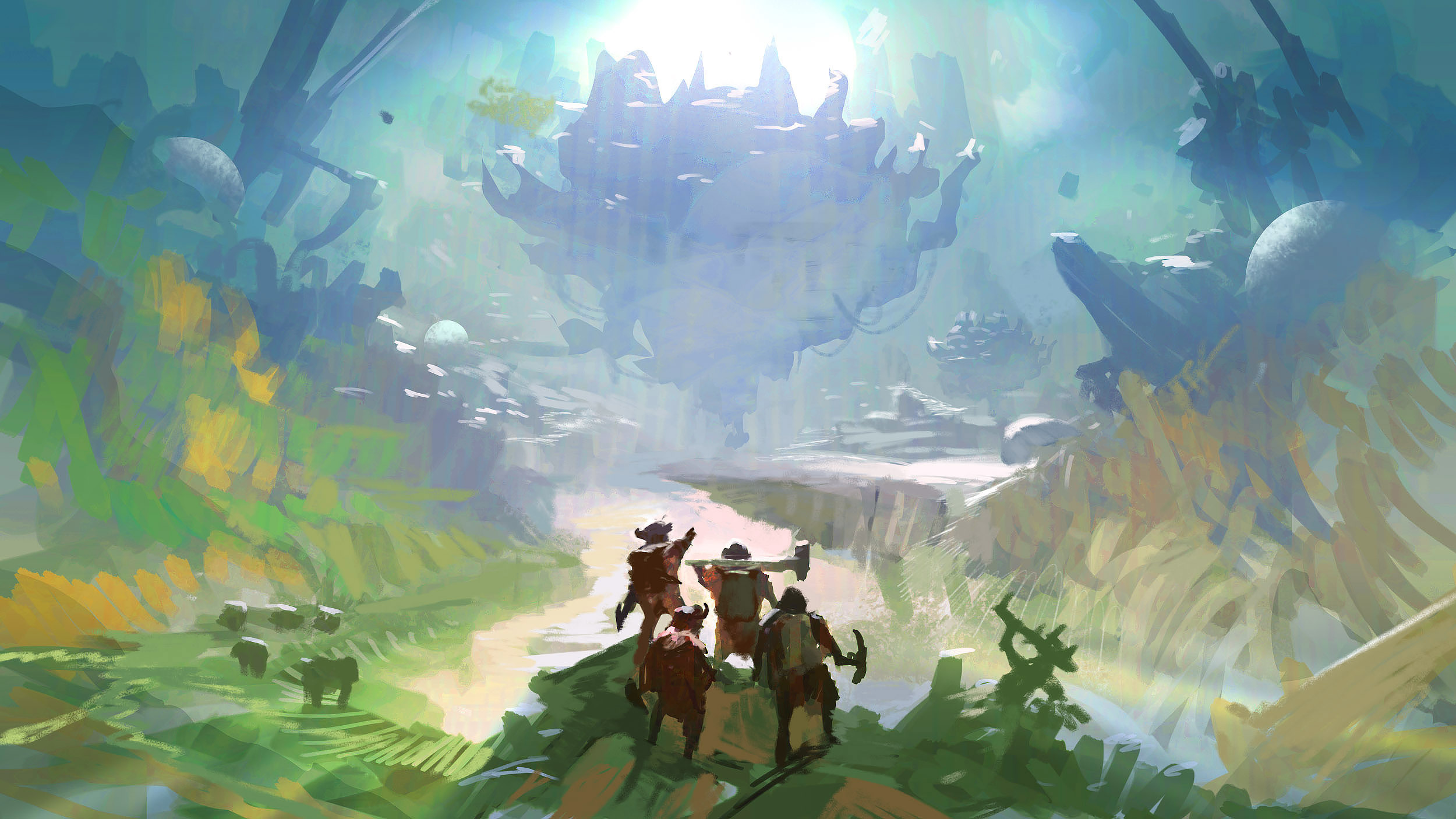
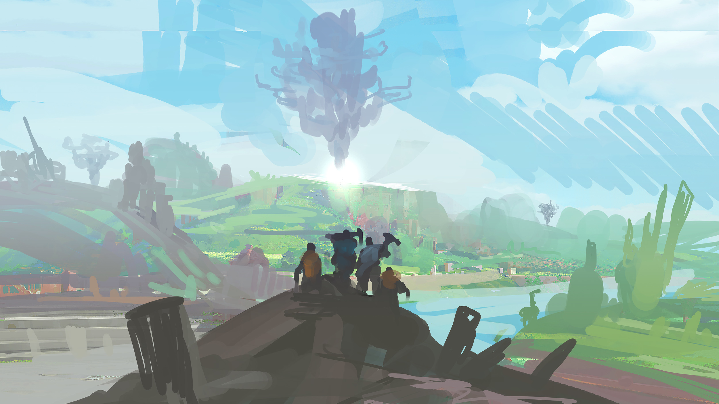
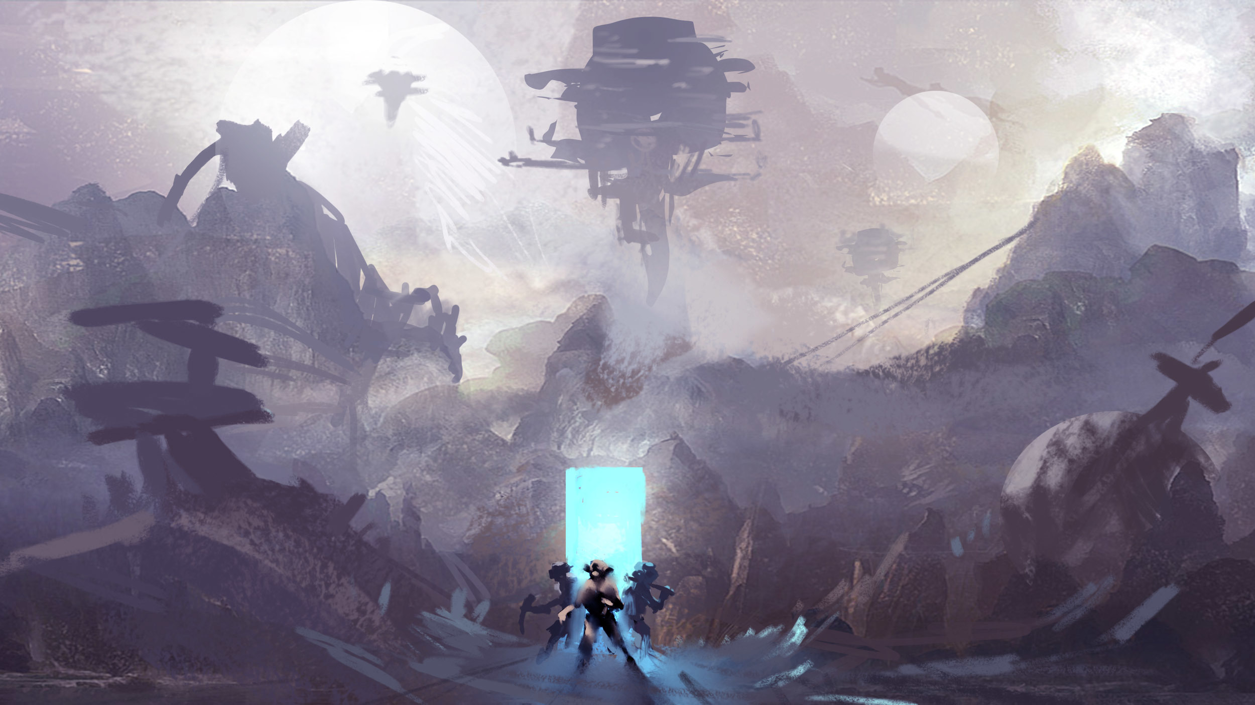
4: The “grand-scale” look of this really shows. I especially like the use of atmospheric perspective on the further away things. I think just adding a bit more stuff in the foreground could improve this one.

5: This one seems like a recoloring of 4. Same comments for that, but I do like this coloring more than on 4.

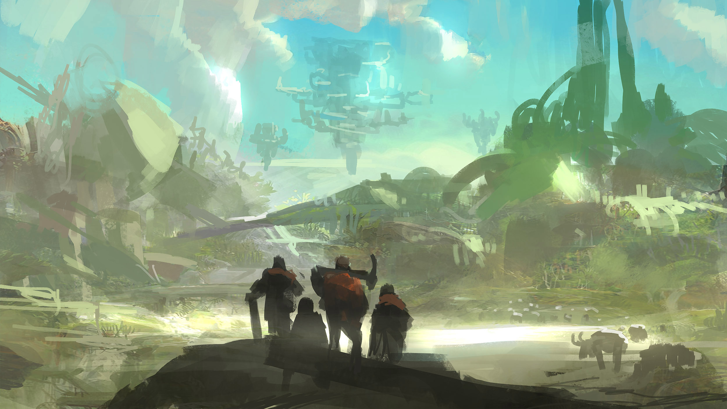
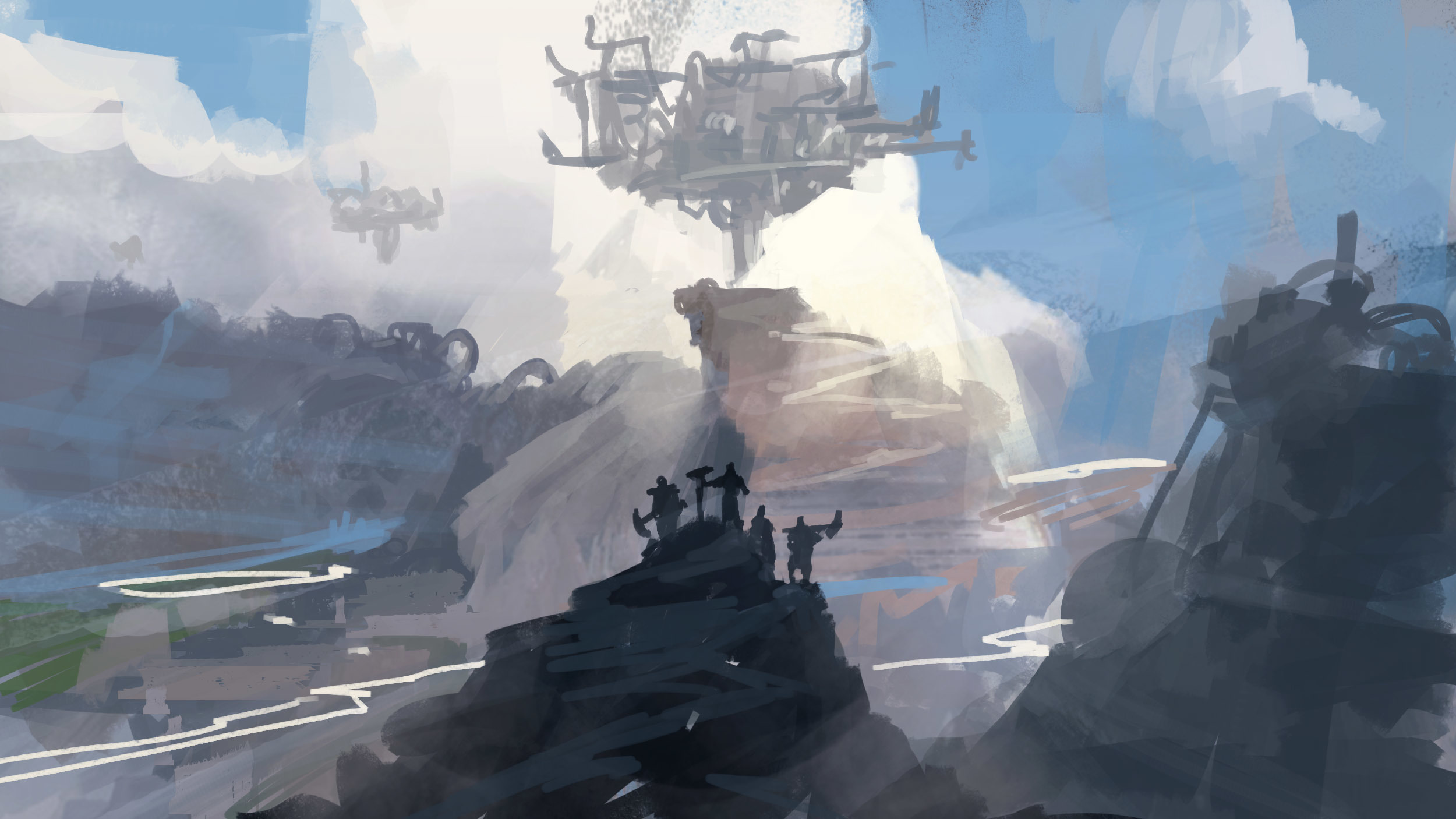
6: As I’ve said before, adding some more detail could really show how cool this one could look. If the clouds were softer and partially transparent I think that could look cool as well.

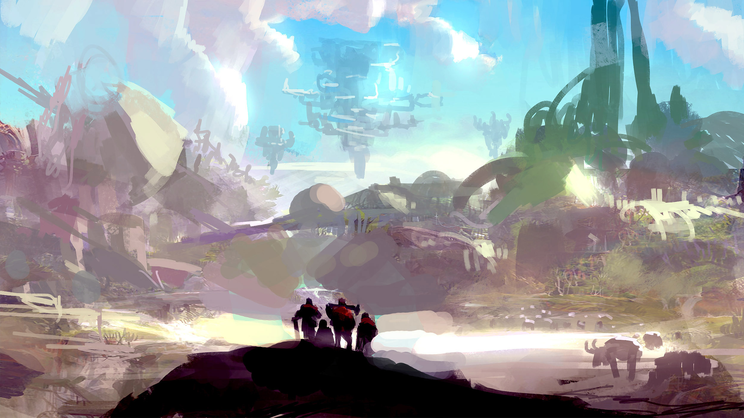
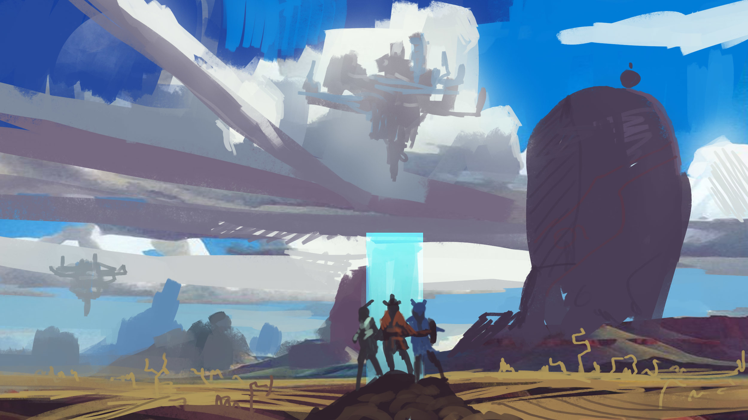
7: I’m gonna admit, the center structure looks like the flying spaghetti monster. I think the mountain below it looks really cool as well, and the big shadow coming across the characters.

8: The characters facing the “camera” is an interesting change. Also that beam coming down from the back structure. The colors on the background areea really cool, particularily the cyans & blues, but I think that the other greens don’t look good at all.

9: This one sort of looks like you just photoshopped in a strange image behind the characters, I don’t think it looks that good…

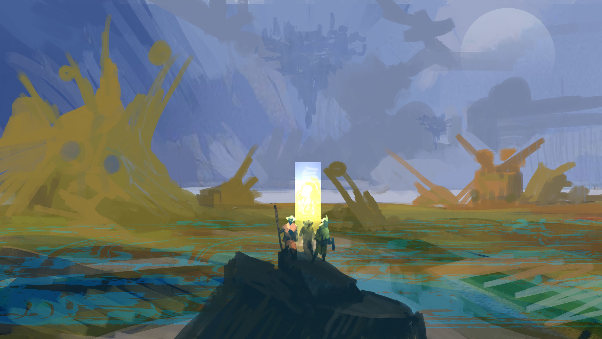
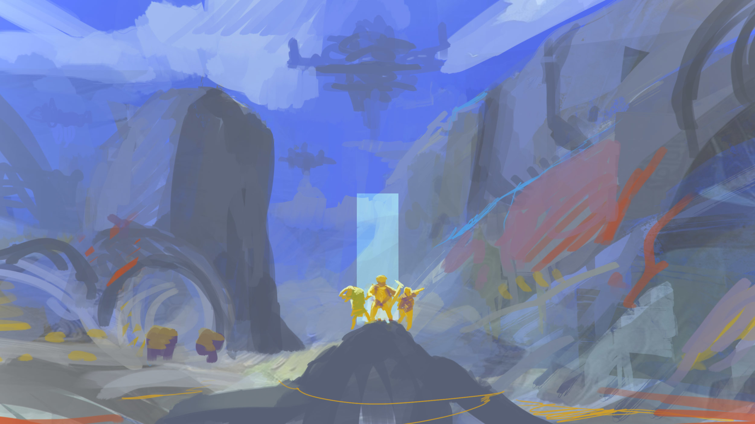
10: My other favorite. The characters coming out of the portal are simply amazing, and their god rays coming out from it are spectacular. I also love the contrast between the blue/black of the characters, and the darker purples in the background. I can see there’s already a lot of detail in this one, but it would be even better to see this one more fleshed out.

11: This one doesn’t really seem like the “Hero” theme you’ve been going for to me, but I do think that the characters coming out the portal look pretty nice.

12: I’m not going to lie, these colors are a bit sickening. The contrasting use of turquoise and dark amber just doesn’t work. Though again, the characters coming out the portal look very nice.

13: The colors on this one are very strange to me as well, they’re just too vibrant in some places. I do think the ground and cliffs look right, but the sky doesn’t fit very well.

14: Just like the previous 2, the colors are off again, but the characters look cool. I like those circly arches to the left, too, sort of like that one scene in Avatar (If you know the one I mean).

Overall, nice job, but a lot of the coloring could use some work. 3 & 10 are the best to me, and I’d like to see a lot of thse a bit more fleshed out. Hope you find this useful :smile:

2 Likes

Beautiful!!!

1,3,6,10,11 mashup? Perspective on 11 is great, but doesn’t really give the same sense of scale as the others.

1 Like

#9 had the most positive reaction from me.

*Side note: That structure in the background appears in all of the samples. Is there something lore related with it?

1 Like

Alright
are you ready for this?
You probably aren’t
Please sit down I’ll wait…

Ok?
Good

Look at #10
https://forum.oortonline.com/uploads/default/original/2X/8/849bfd9f045ba859aea73ecf310017702cc07511.jpg

That’s no floating Island in the background

It’s a TITAN

:sunglasses: You’re welcome :kissing_heart:

1 Like

This is so fantastic. I tend towards 3, 4 and 10.
But they’re all very, very beautiful.

I really like Nr 11 ^^

I like 1, 4, 10, and 13.

Seems like 4 and 10 are getting a lot of love from people.

I didn’t really like the more non-colored gray ones,because I don’t think that’s the look Oort should be going for. Oort is a colorful fun world,with a hint of danger and thrill and a dash of adventure and exploration. At least that’s how I see it.

They grey sketches are for shape and composition.

4 Likes

I vote for #9. I love the colors and the portal with the characters walking towards the viewer is striking. I also love the beam of light emanating from the bottom of the floating island. These are all great work!

2 Likes

photo 10 ! for me is the best.

Quite frankly shocked at the lack of analysis of these images. The forum speculators aren’t on top form today.

2 Likes

Well, as you said, they’re pretty rough. It’s hard to determine what is a structure, a tree, or a particularly dense cloud.

That being said, the big floating structure is featured in every image in a similar shape / style, so it’s importance is unquestionable.

Ladies and Gentlemen, this may well be our earliest tease of an Oort Temple / relic / city.

6 Likes

I was thinking this as well. Seems like a handy place to capture and beaconize for base of operations.

2 Likes