No. It doesn’t kill the game. It just screws up people’s builds on the live servers right now; which isn’t important come 1.0.
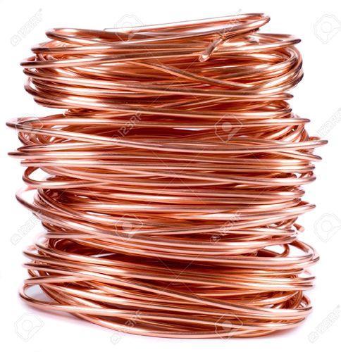
I would like copper blocks to and items go go back to their original orange-ish color though. It doesn’t really make much since to make it change color based on a world’s color scheme but then again this is not knowing whether or not there will be a color I like that I will be able to mine up potentially in large quantities.
I will have to disagree. If all the starter worlds are going to look like they do now, then the developers could have a problem. The videos and promotional materials all show a more vibrant universe. People will come in and feel like they are not in the game they bought. If it is fixed/changed/tweaked now, then they avoid that issue.
Kill might be too strong, but I think it will hurt sales and play. I know I will be very hesitant to build anything significant on a planet that looks like the current starter worlds.
I think with the new lighting system not fully implemented, it hurts how the colors are.
Also, I can agree that it’s a negative to get rid of any sort of popping feel and look of any color in the game. Right now stuff is flat. I don’t expect this to be the case at launch.
It’s pretty silly to say that it would kill the game considering the one game Boundless is constantly compared to has far worse in terms of graphics. So yeah, it’s a strong word cause it’s the incorrect one to use.
I really doubt that the devs are going to launch a product where the colors are an overall downgrade from what we had before.
I think the issues is the definition of downgrade. I know I feel it is a downgrade and I think you do based on your comments. There are people that think it looks more “real”. I can understand that but at the same time, we are in a fantasy universe and look like felines. We already have animals (cuttles), plants (inky leaves) and rocks (gleam) that do not exist in the real world and are in colors that are not part of the real world. The developers are not setting Boundless in the real world so I am not sure that it needs to look like the real world.
If you read the reviews of Boundless a lot of them comment on how much they like the look of the game. I wonder if they would say the same now? I would not have.
I know it makes me sound like a hypocrite when I say this but I don’t care if it’s a downgrade in graphical color. It won’t stop me from playing the game. Hopefully what vivid coloring comes back to the game like we had before 195.
That does not make you a hypocrite. Not liking this one aspect may not be enough for you to not want to play. I am not sure what you like to focus on crafting, building, selling? That might make a difference.
For me, right now, I would want to make some significant changes to my build so it looked better to me. I am hesitating since the developers have said they are looking at this and I want to give them time and see what they do before I make that time commitment to rebuilding.
Well for me the world /build / color / lighting those affect really a lot, since one of the major reason i like this game is the world was very beautiful. If they choose this color set at 1.0 i will leave the game for sure. Because now the graphic is way too minecraft…
All of them. I like the entire gameplay loop of Boundless since all three of those feed into one another like a brilliantly crafted positive feedback loop that let’s me play manufacturer, contractor, and merchant all at the same time.
Since I have a general idea as to how I want my new projects to be built out of, color wise, the only thing that really upsets me is how Copper blocks are all reddish now instead of the sexy orange that it once was. All the other metal blocks are the same color so it’s a little strange why Copper got changed completely. It almost looks like a random overly red rusty color.
I would totally be down for a blackish tungsten metal color though.
That light pink is not as pink. Depending on light and angle it can appear as such but it’s still white enough. It’s like with diamonds. Primary white but with some pinkish shading.
The color of Titanium and Copper are my biggest issues that revolve around color at this point… The rest isn’t that big of a deal and when the new worlds come online they are the colors they are suppose to be we have no past experience to say otherwise…
But real world experience will tell us that the color of titanium and copper are wrong!
From what I know both iron and copper can have traces of other metals and don’t really come in pure form. That means both show certain range of shades. Copper can be orangey and redish as well and that shows in copper made products.
Te same for gold which is on redish yellow side in pure form and what we know from jewelers is often colored gold. So in game we could get away with different hue for gold as well as its easy to justify anything between almost white through pinkish yellow to near red.
But the new color looks very red, just like ruby!
And moreover, the actual copper mine is actually either malachite (cyan) or a mixed minerals (dirt yellow)
New texture render seems to over-enhance the contrast and color saturation, making the entire screen look very uncomfortable