Sure thing!
Before getting into the details of the specific items I raised in my previous posts, I just want to share a few quick comments:
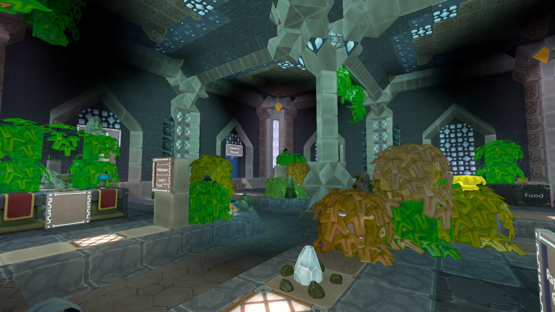
- Firstly, great job! My overall impression is that the graphical quality of Boundless has vastly improved with these lighting changes.
- Specular highlights look more plausible and aesthetically pleasing.
- Materials appear to have more depth, especially in areas that are not lit by the sun. The ‘directionality’ of light interacting with surfaces is more noticeable. The effect of normal mapping appears to be more consistently visible than before.
- Did you tweak the filmic tone-mapper? It seems better to me - like it’s a bit more filmic and less linear.
- Metallic surfaces look better. The titanium tools, for example, look great (where previously, they didn’t look particularly metallic).
- The availability of per-pixel lighting at all distances is a massive improvement.
Ok, on to the specific points (in the same order I raised them in my previous posts):
Bloom
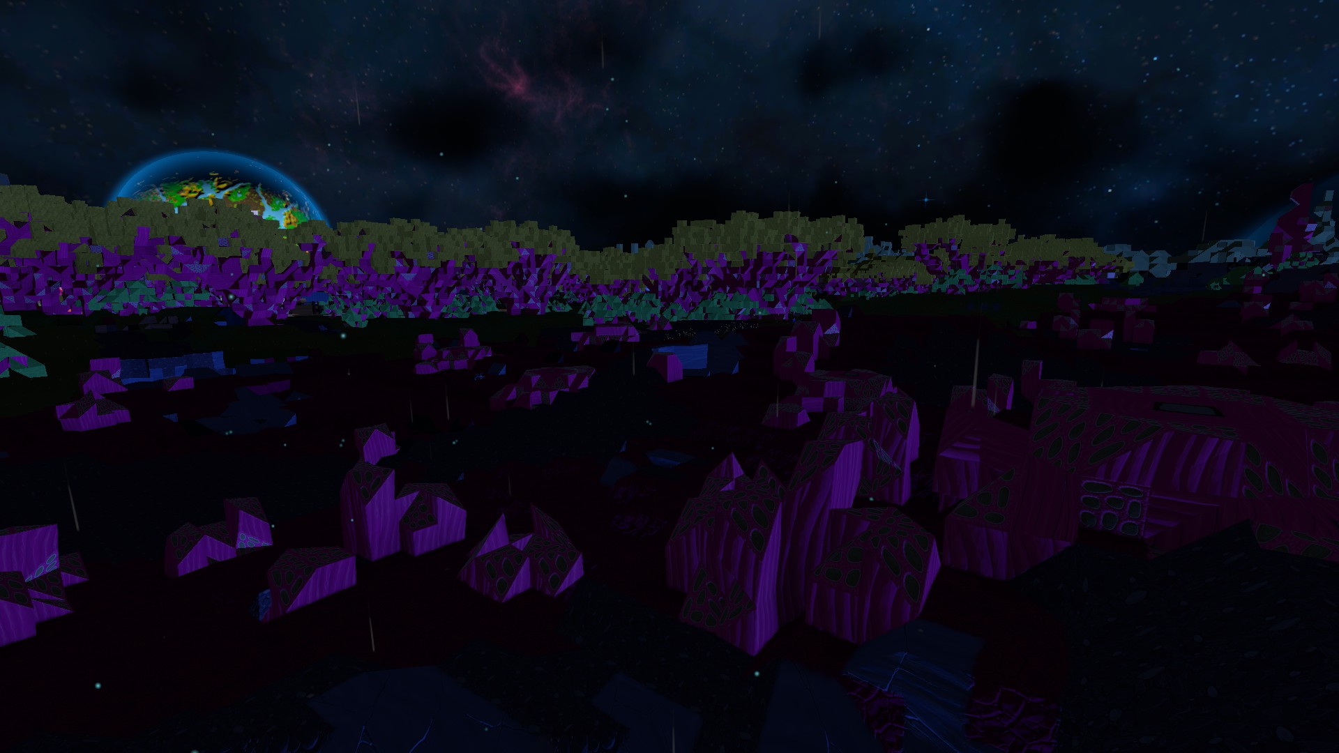
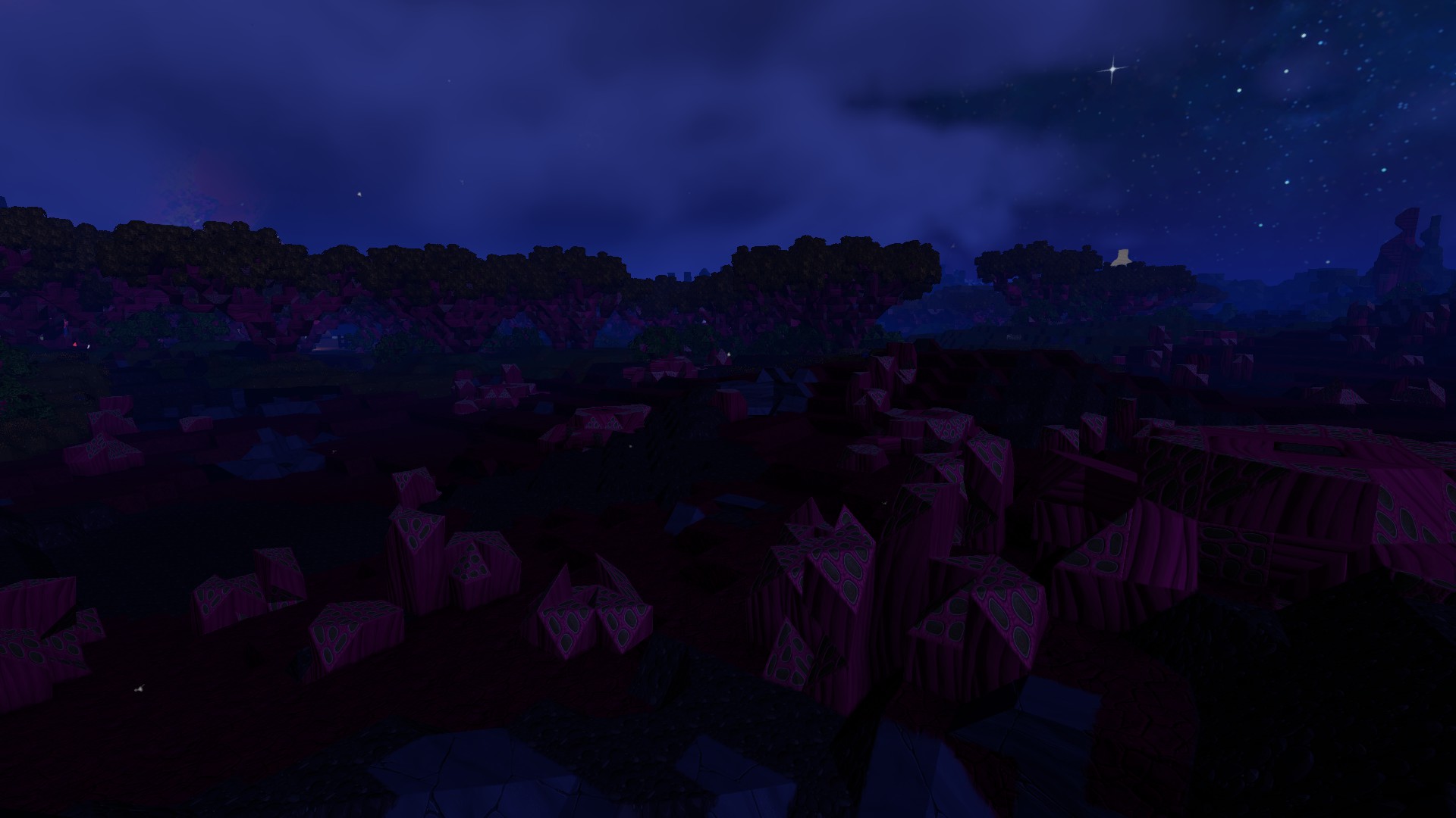
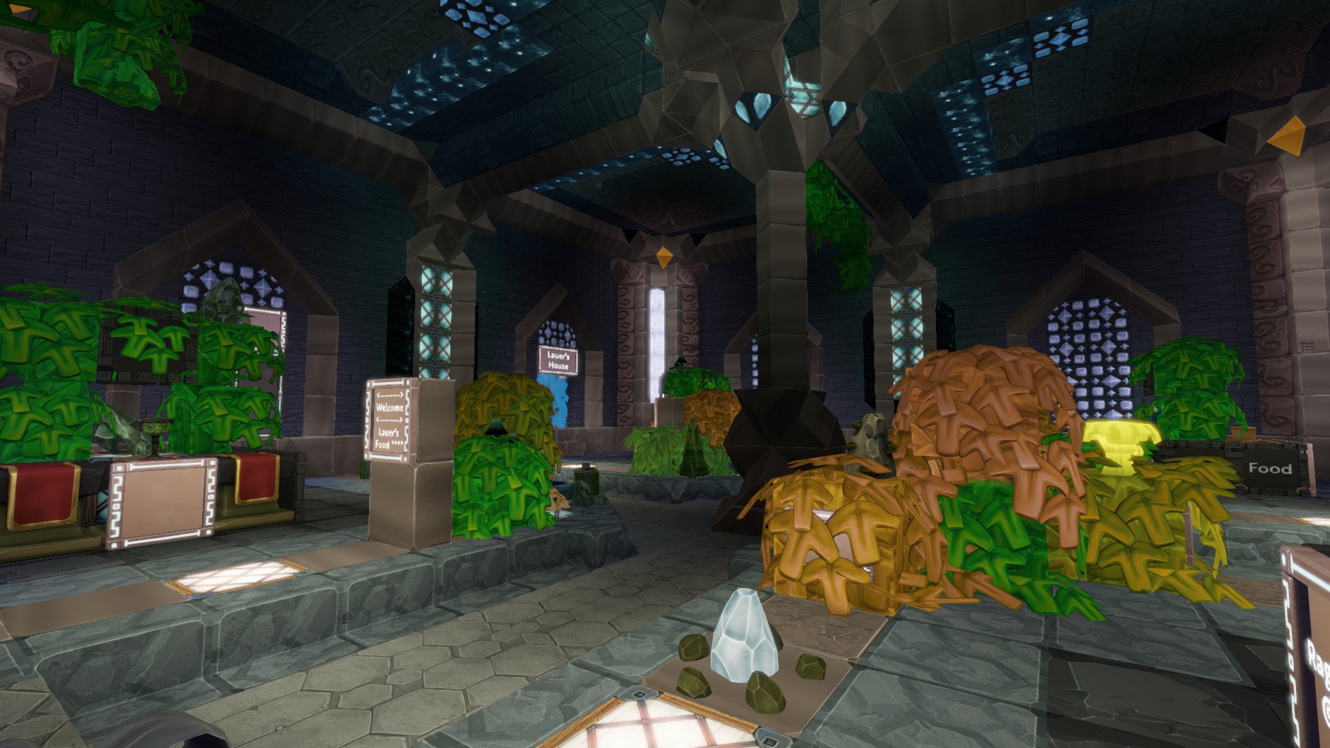
The bloom is definitely better now. Previously, only the very brightest surfaces (white or nearly white) would cause any blooming. Now there is nice, colourful bloom coming from most bright surfaces. It’s nice to see a variety of gleam blocks glowing properly now, as well as bioluminescent plants creating a bloom effect at night.
With that said, it’s still not as good as I think it could be. One of the changes that I don’t like is that the radius of the blur appears to have been reduced. It was small before but now it’s really tiny. If I had to guess, it looks to me like the current bloom effect in Boundless is made by taking a single copy of the main-rendered image at one-third of its original width and height and applying the tiniest of blur operations (a small box blur, perhaps) before adding it over the main-rendered image.
I believe some people have complained about “blurriness” since the lighting update. When people complain about bloom effects having the side-effect of “blurring” the final image, I think that it’s often the result of:
- using too small a radius on the bloom effect, and
- using only a single linear blur or Gaussian blur.
Bloom may seem like a simple effect but I think there’s more finessing required to build a good bloom effect than just one quick-and-dirty blur. To make the effect feel natural and unobtrusive, you’ll need to try and simulate the way light scatters inside a lens. The way that light diffuses outwards from a hot spot in the image needs to have a particular ‘falloff’.
That falloff is not the same as a single linear or Gaussian blur. I don’t know the correct mathematical terminology (exponential? quadratic?) but my understanding is that a good bloom effect will diffuse light outwards from bright spots in a non-linear ‘decelerating’ way. The initial falloff will be fast but it will decelerate and continue to spread light quite far from the bright spot.
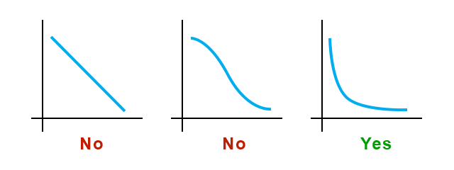
I don’t think that a quality bloom effect can be achieved with the single Gaussian blur operation. For example, the documentation for the Unreal Engine talks about combining several blurs:
…we combine multiple Gaussian blurs with different radius. For better performance, we do the very wide blurs in much lower resolution. In UE3, we had 3 Gaussian blurs in the resolution 1/4, 1/8, and 1/16. We now have multiple blurs name Blur1 to 5 in the resolution 1/2 (Blur1) to 1/32 (Blur5).
We can simulate this idea in Photoshop:
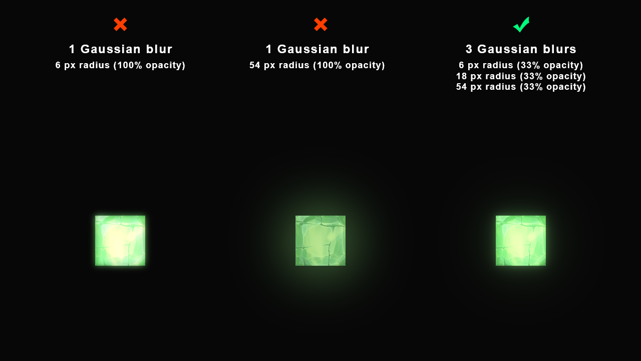
I think that the option with 3 different blurs is the only one that looks like a plausible, pleasing glow.
(By the way - due to the fact that these example images are quite dark, please click on them to view them at full size and with the dimmed surroundings. Also, make sure there isn’t too much light shining near your workstation. If your pupils are constricted because of the white forum background or other lights in your surroundings, then you won’t be able to see these images properly.)
Ok, moving on… The option with 3 blurs was made by blurring the original resolution image using very large blur radii. But, for performance reasons, you’d want to do the blurs at a lower resolution. So, I’ve recreated something similar to my previous example but this time simulating the image scaling steps. (I set Photoshop’s resampler to Bilinear for authenticity).
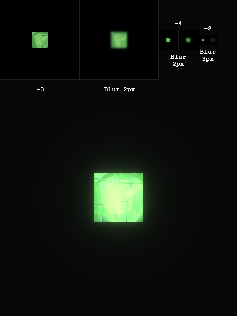
These are the logical steps for compositing the above image:
- Start with image called “render” (480x480)
- Divide render dimensions by 3 (160x160) → Save as image1
- Gaussian blur image1 with radius 2 (effective radius 6) → Save as image1-blur
- Divide image1 dimensions by 4 (40x40) → Save as image2
- Gaussian blur image2 with radius 2 (effective radius 24) → Save as image2-blur
- Divide image2 dimensions by 2 (20x20) → Save as image3
- Gaussian blur image3 with radius 3 (effective radius 72) → Save as image3-blur
- Combine colours from image1-blur, image2-blur, image3-blur giving each a one-third contribution → Save as image-combined
- Add image-combined to render with whatever opacity you think is tasteful. (The example is 100%.)
I’m sure all of this would require some significant ‘adapting’ before it could conceivably be used. Hopefully, it can at least serve as inspiration. I’d be interested to know your thoughts on these ideas.
Bloom (cont.)
I’m not done with bloom yet. ![]() I think I actually preferred the bloom in the initial release of the lighting changes. In release 225.2, you implemented a change to the bloom:
I think I actually preferred the bloom in the initial release of the lighting changes. In release 225.2, you implemented a change to the bloom:
I’ve noticed something that might be a side-effect of this change. There appears to be a subtle discolouration on the fringes of the bloom effect in certain cases. I’m wondering if the threshold may have been introduced at the wrong place within the chain of operations that produces the bloom effect. It looks to me as if the threshold might be applied onto the bloom after it’s been blurred when it really should be applied to the image before it gets blurred.
I’ve made an example image in Photoshop to try and illustrate this “discolouration” that I’m talking about. I’ve done this by applying a Levels filter onto a blurry glow. The shadow input level has been raised to 31 on the blurry glow on the right:
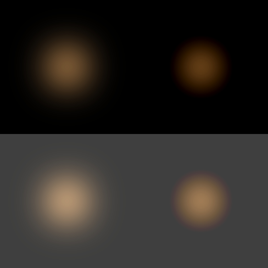
Notice how the hue of the glow is not uniform on the right. It fades towards red on the edges. I have seen something similar to this in the latest version of Boundless in certain places.
I’ve also occasionally noticed a very subtle distortion within the bloom that is similar to a ‘shadow blistering effect’, which is another reason why I suspect the threshold was applied after the blur operation.
I would be interested to see Boundless again without the threshold for comparison purposes.
Unfortunately, I have run out of time today. My comments on the other items will have to wait for another day (tomorrow probably).