Contents
- Introduction
- About my Boundless experience
- Bloom
- Night-time lighting
- Water reflection compositing
Introduction
Hello Boundless developers,
I’d like to offer some suggestions for how I think the graphics in Boundless could be significantly improved. Boundless has been billed as a beautiful voxel game and I think it is indeed beautiful a lot of the time. However, there are quite a few scenarios where I actually think the graphics in Boundless can get quite ugly. I think there are a couple of specific interventions that could potentially solve these cases.
About my Boundless experience
I started playing Boundless around Christmas of 2017 and I played a fair amount in early 2018 (about 250 hours). I stopped playing around the time that all the new brews and foods were added. It was around that time that the lighting system was also changed. I can’t remember how this change was described but I think it altered the way that lighting colour and intensity was calculated. My first impression of this change was that it detracted from Boundless’s aesthetic.
I would describe the old lighting appearance as:
- Warm
- Vibrant
- Enchanting
Words that come to mind to describe the newer lighting appearance are:
- Dull
- Bland
- Mundane
Now, I don’t want to give the impression that the old lighting appearance was totally flawless. On the contrary, there were many cases where I remember colours becoming overbearingly bright with clipping in certain colour channels resulting in large burnt out areas of the image.
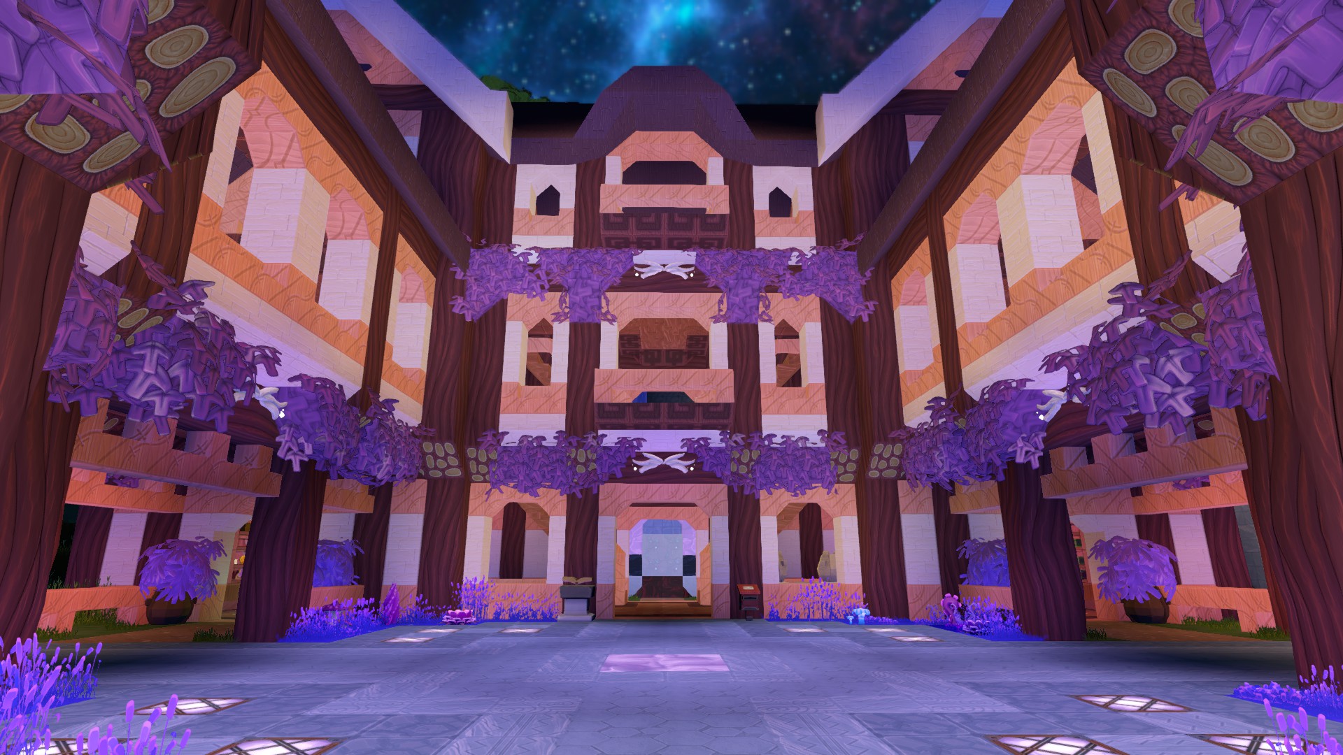
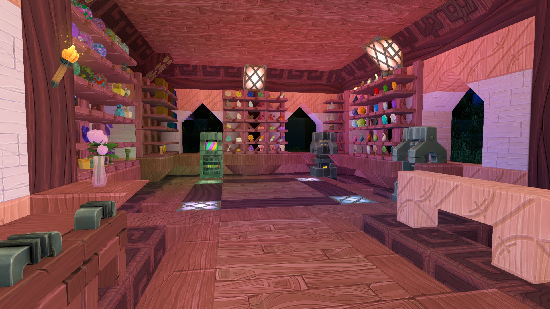
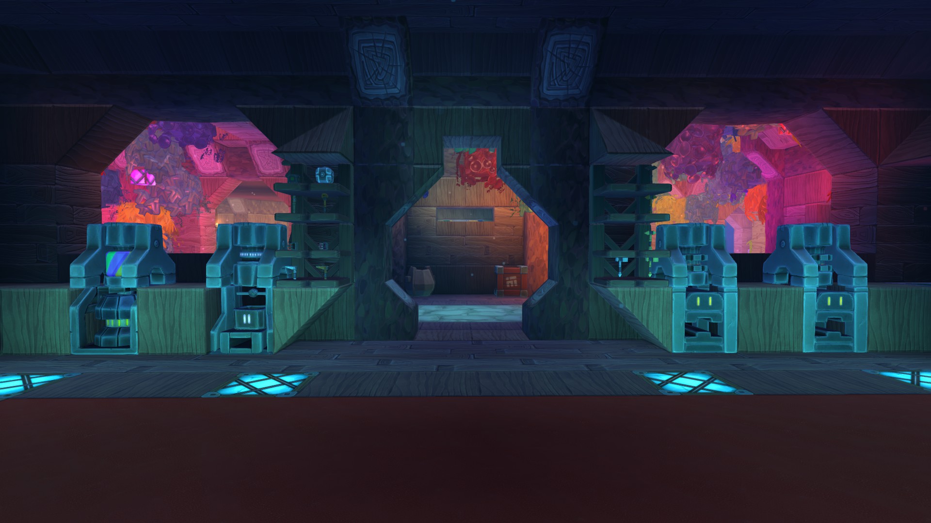
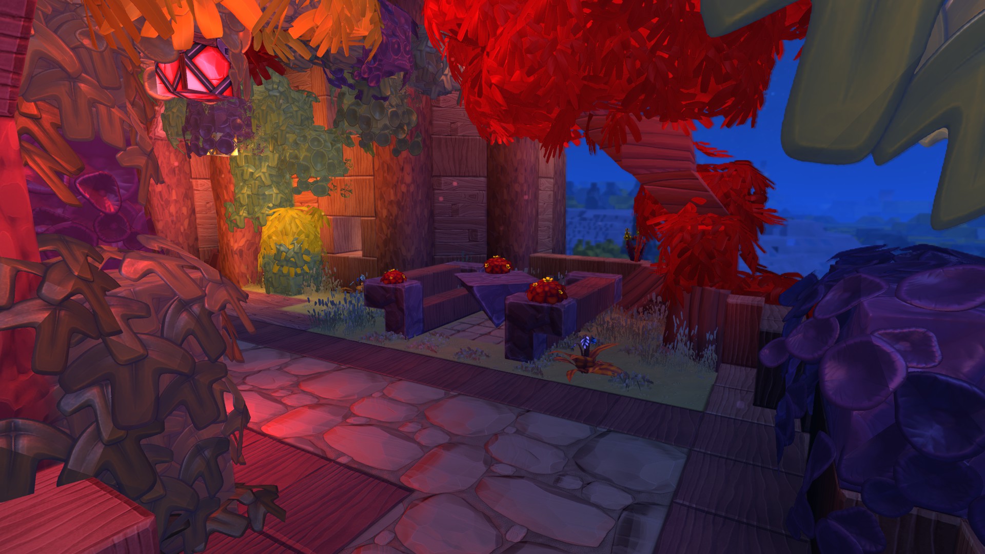
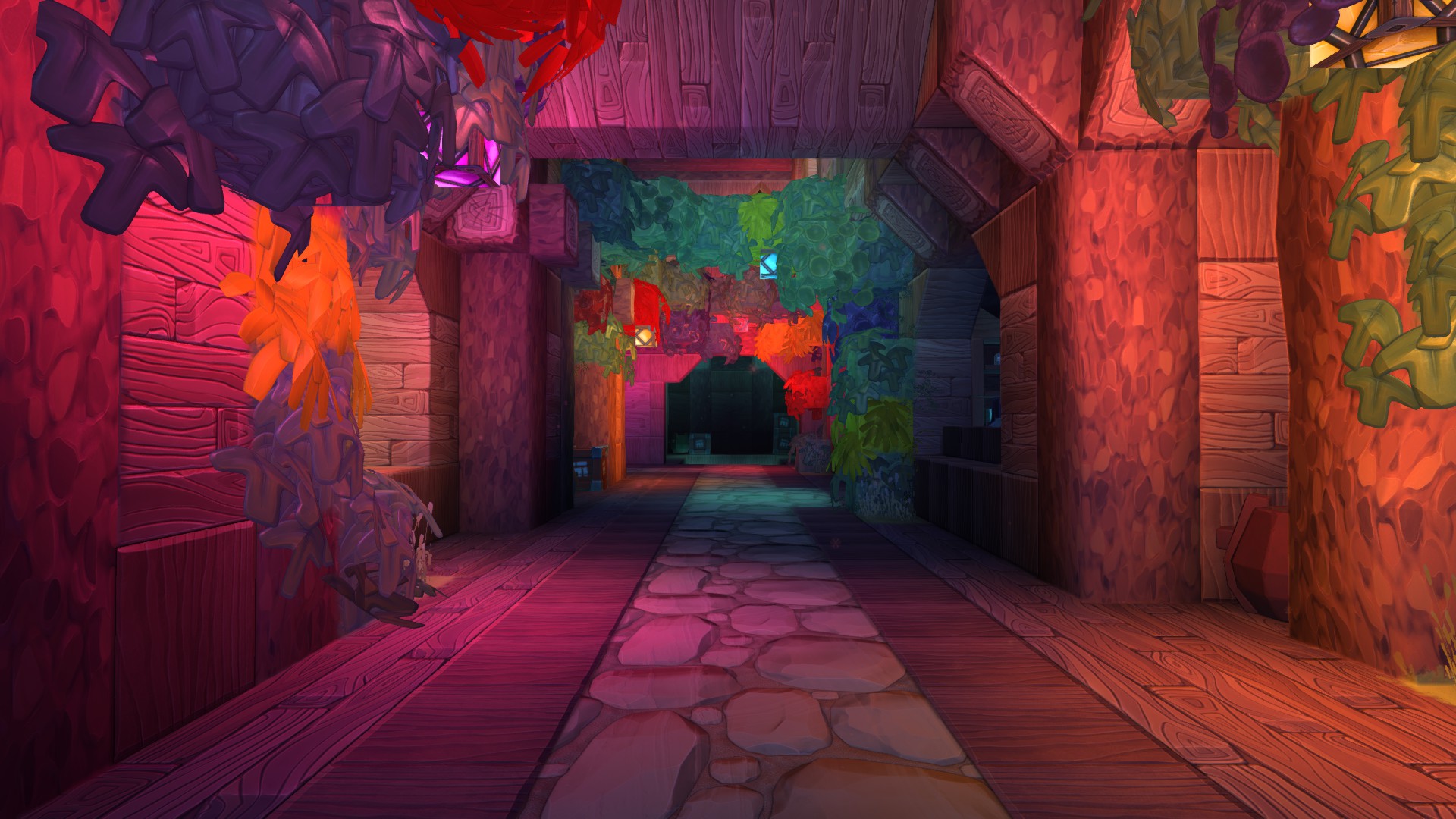
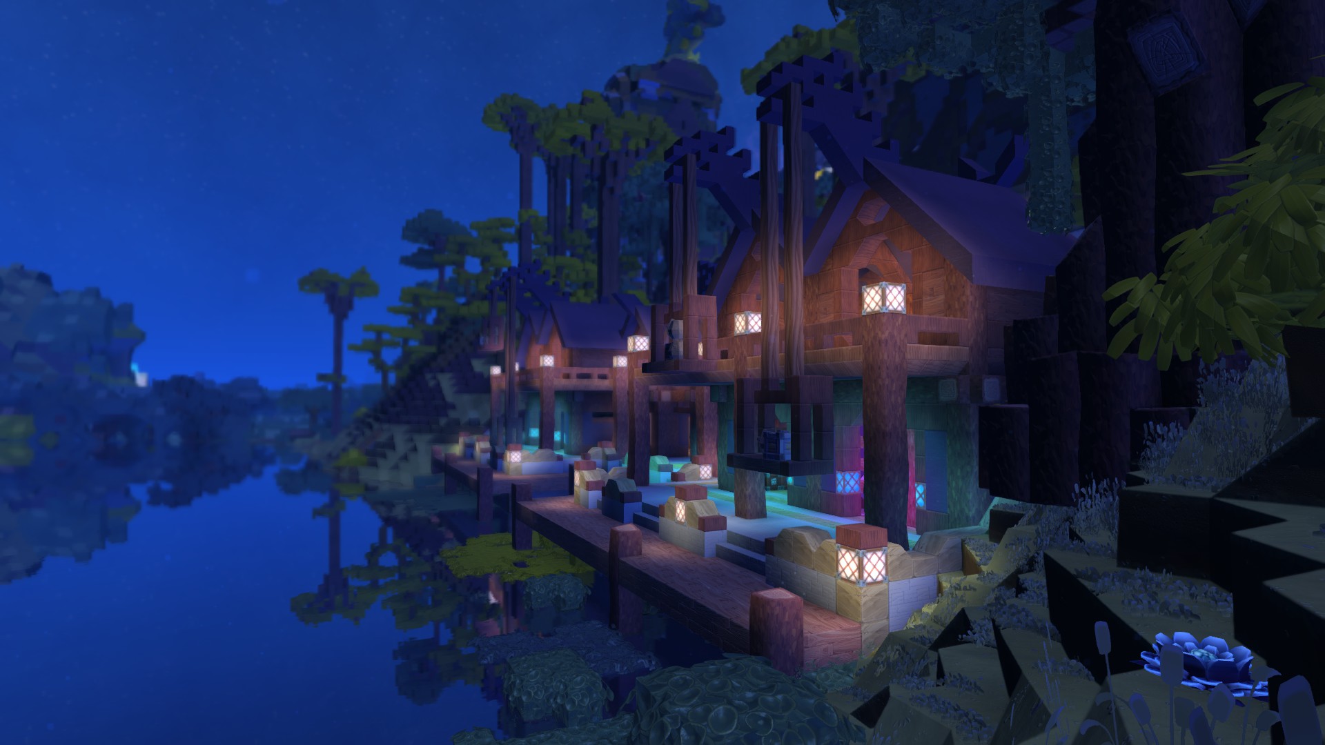
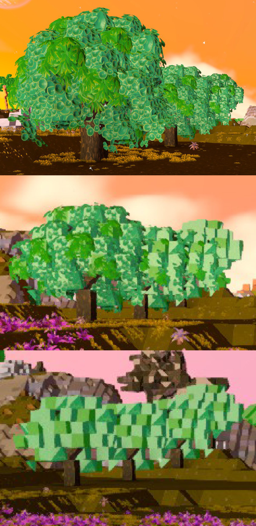
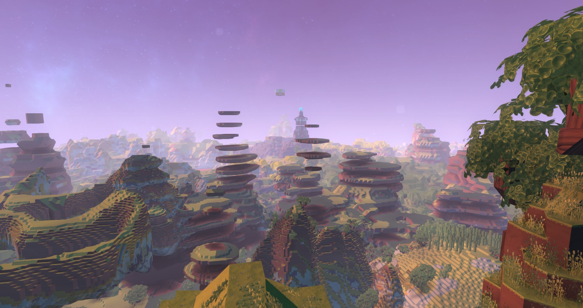
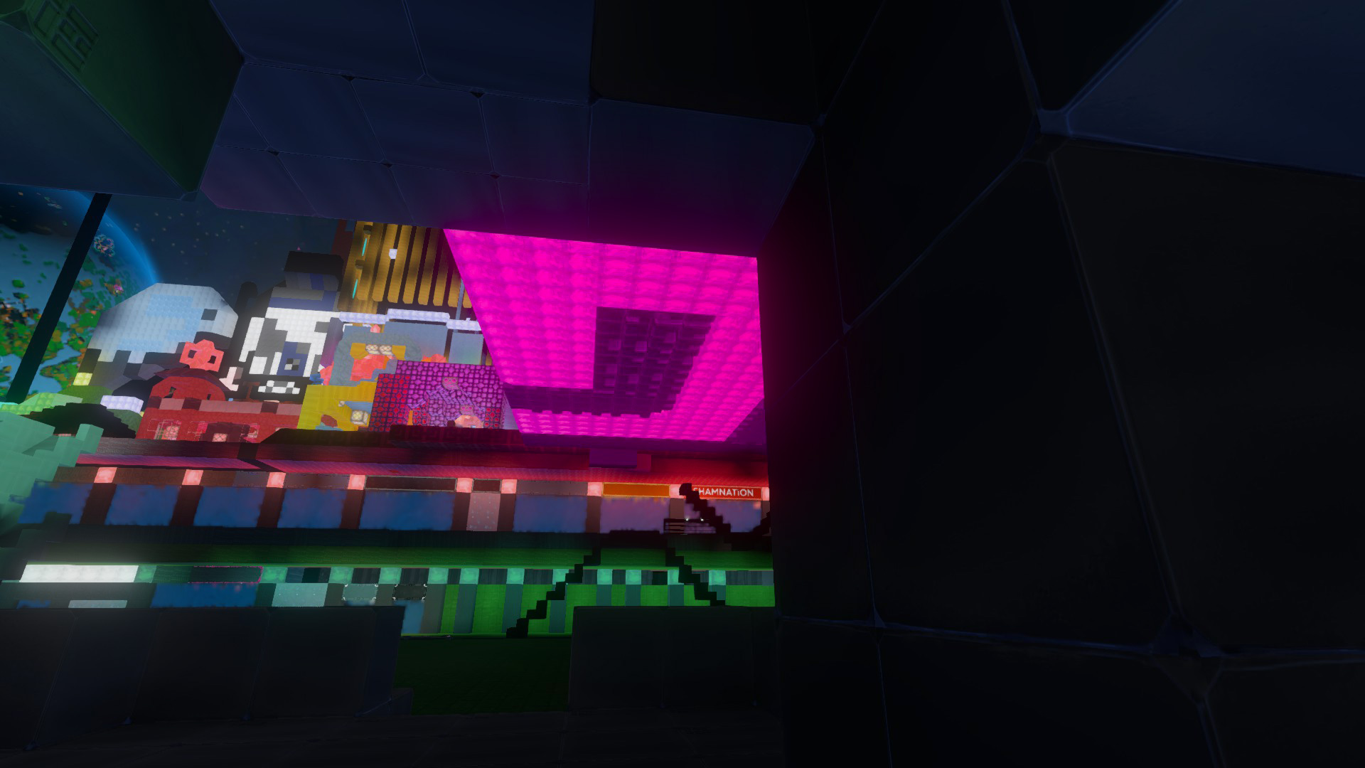
However, now that I’ve returned to Boundless again, I wish that some of that old vibrancy could be reintroduced somehow. Browsing through the ‘Post Your Screenshots’ thread, I found some examples of lighting that I think is very rare (if not impossible) to find nowadays.
So colourful:
So warm:
Such a tasteful, coherent colour palette:
With all that said, let’s move on to the details of my suggestions. I’m going to be trying to provide somewhat technical diagnoses of the problems that I’ve identified and, if any of my diagnoses are wrong, please feel free to correct me. I’d love to learn more from the developers about what goes on under the hood of Boundless’s game engine. Please forgive me if I misuse certain technical terms or reveal that I don’t fully understand the concepts I’m talking about. ![]()
Bloom
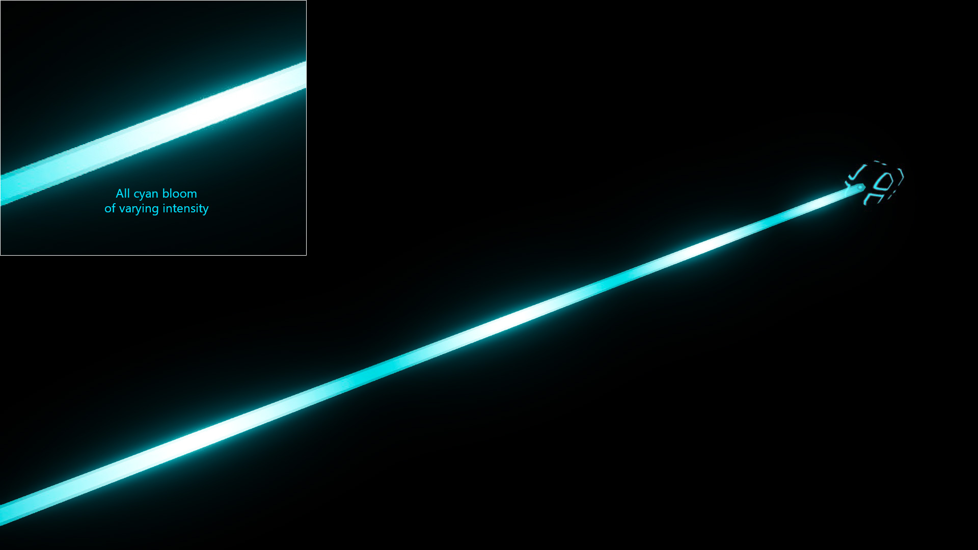
Back when I first played Boundless in early 2018, I actually disabled the bloom effect because I felt that it was often way too bright and overbearing. However, nowadays, I think it’s gone too far in the other direction. Now there’s not enough bloom. The only areas of the image that give off a bit of bloom are areas that are almost totally white. The colour of the bloom is almost always only white.
I think that the problem is one (or perhaps both) of the following:
- The bloom effect uses an LDR source image instead of an HDR source image.
- The bloom effect has an extremely high threshold.
I think that the bloom effect should be processed before the image is tone mapped into LDR colours. The only way to get a good-looking, authentic bloom effect is to do the blurring operations on a copy of the image that is still in the HDR colour mode.
Sometimes, hot spots in the image may appear white but that doesn’t mean that the colour of that area is really white. An extremely bright red light may oversaturate the virtual camera and be rendered as white. However, the bloom from that area should still be red. This can only be achieved by blurring the image in HDR colour mode.
Another issue with the bloom in Boundless is that it looks like it only uses one blur operation. A good-looking bloom effect will need 3 - 5 blurs with different radii. To improve performance, the very wide blurs can be done at a much lower resolution.
To illustrate the type of bloom effect that I’d like to see in Boundless, I’ve Photoshopped some screenshots. If you click on the screenshots, they should display larger and allow you to flip between them to see the differences more clearly.
Example 1: Original unaltered screenshot (apart from adding the inset bit):
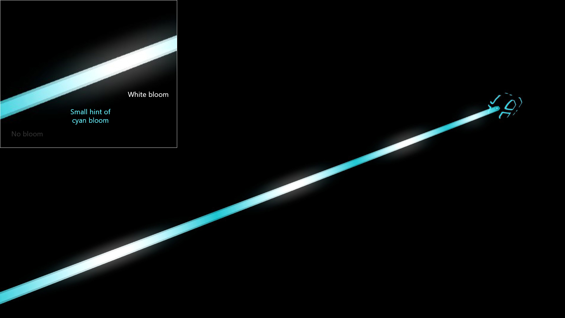
Example 1: My Photoshopped version:
Example 2: Original unaltered screenshot:
Example 2: My Photoshopped version:
In combination with improving the bloom effect, it might also be worth adding stronger emissive components to certain materials, such as gleam so that they can really shine properly.
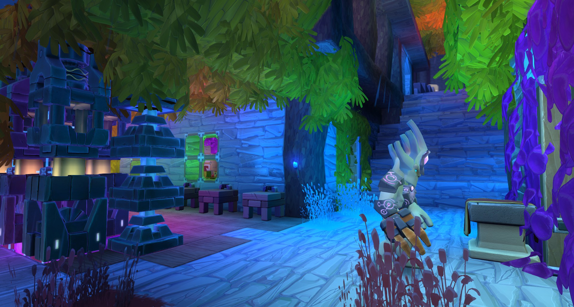
Night-time lighting
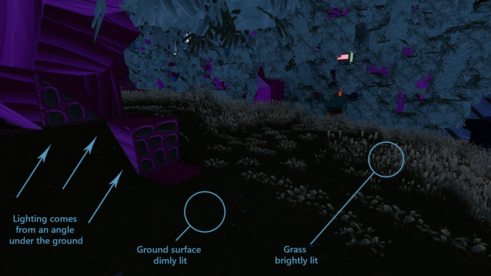
I think that the natural lighting at night is probably the biggest problem with the graphics in Boundless right now. At night, the terrain almost always looks terrible.
The problem is that the brightest environmental light source comes from under the ground. This results in the surface of the terrain being poorly lit. However, the blades of grass that grow out of the terrain catch the light and feel disconnected from the surface they’re growing from. The undersides of trees also become very strangely lit up.
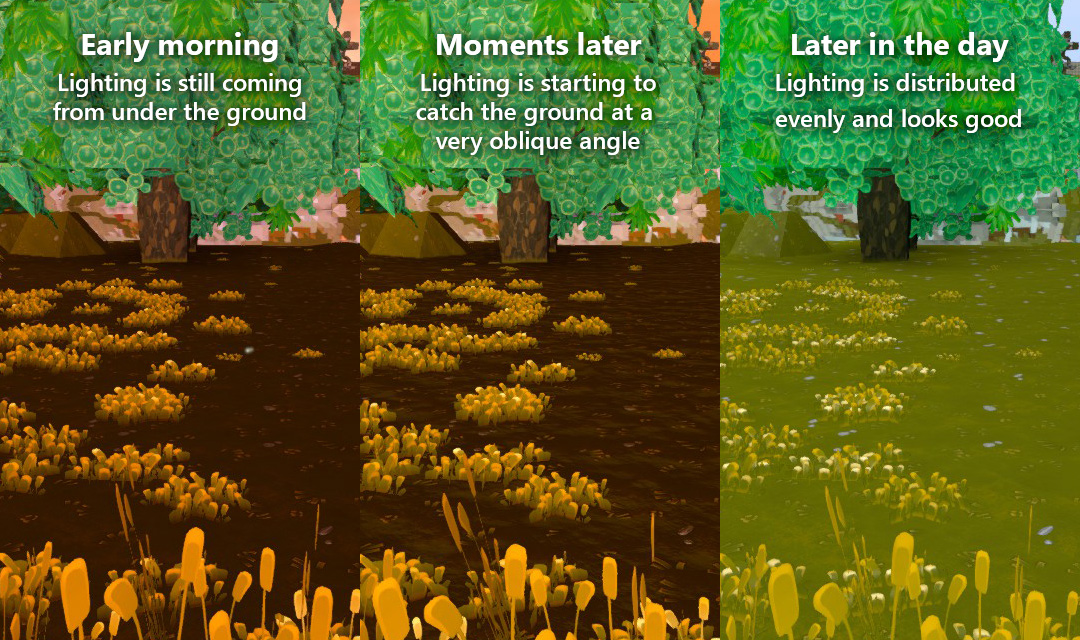
I stood in one spot and took some screenshots to show how the blades of grass look nicely connected to the ground during the middle of the day but often look ugly during the evening, night, and morning:
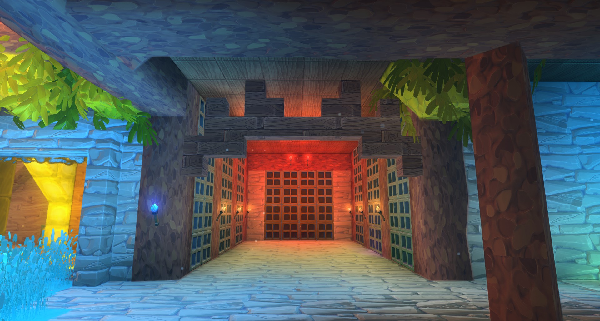
Here are a couple more examples to show how bad things can look at night.
Hideous:
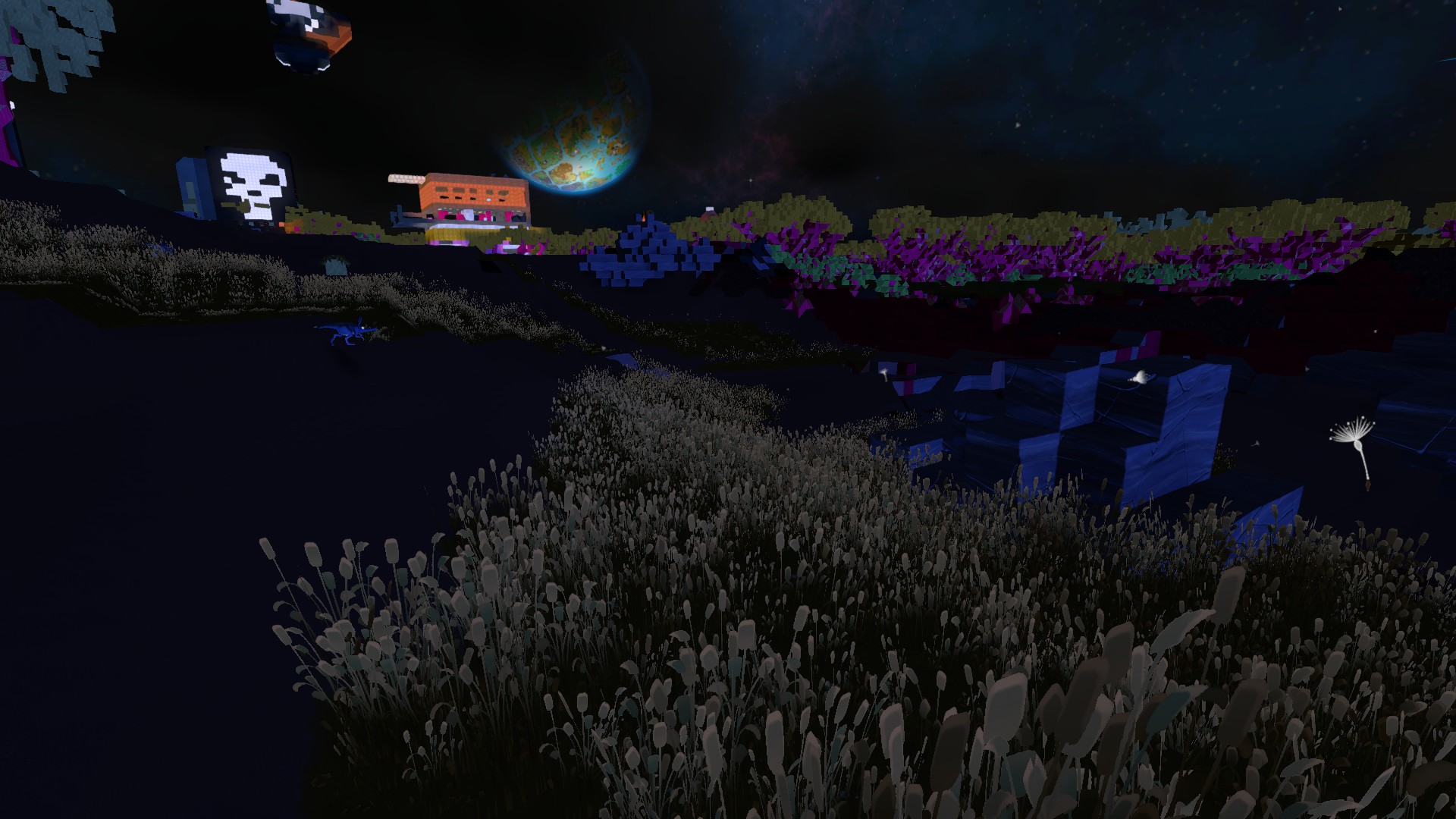
Dreadful:
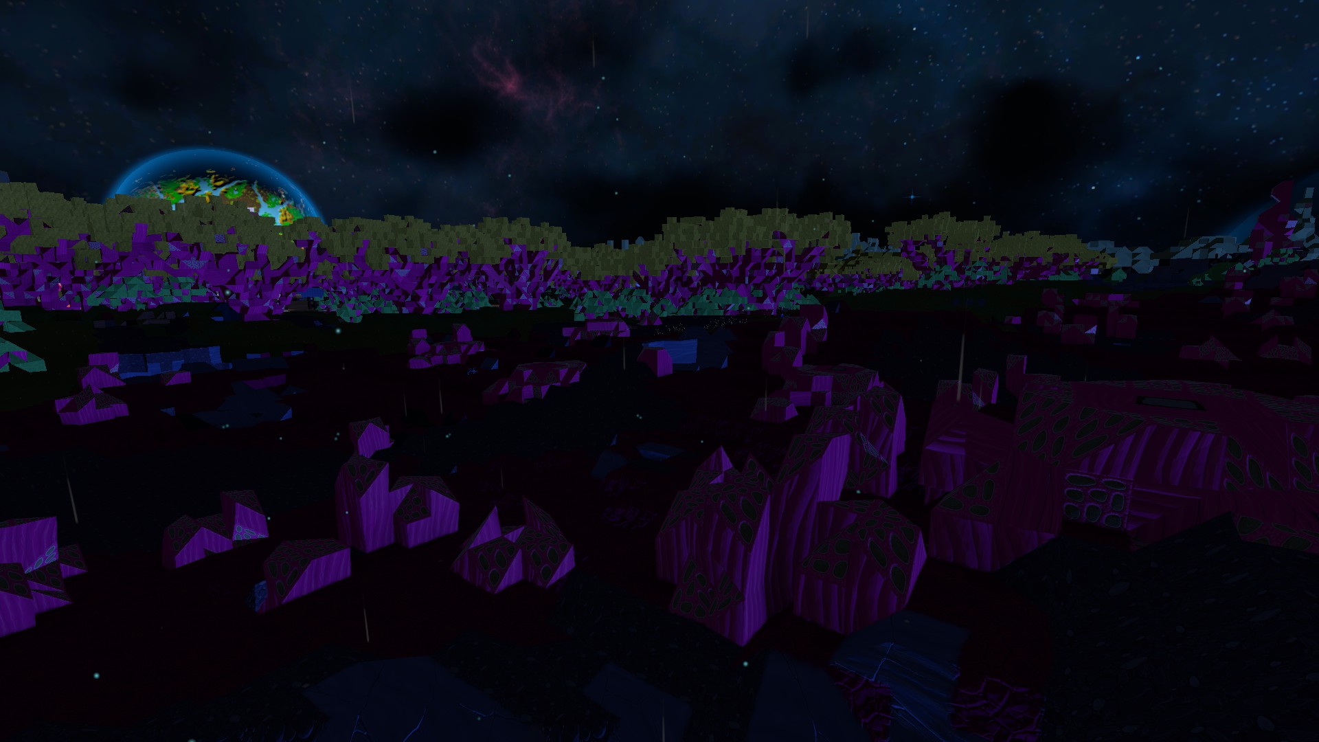
The light direction should never come from underneath the terrain. The environmental light source during the night should come from the sky.
Also, given that the terrain doesn’t cast shadows, I think that the lighting from the sun and moon need to be finessed a bit so that the terrain is never lit from very oblique angles. I think that the lowest angle that the primary light source should go is perhaps 30 degrees above the horizon. It doesn’t matter if the light direction doesn’t exactly match the direction of the actual sun or moon object during sunrise and sunset. There are no shadows to give away any directional disconnect so the priority should be to improve the overall aesthetic of the image by avoiding situations where the terrain receives a very different amount of light compared to the blades of grass.
Water reflection compositing
I think that the various water effects (the reflections, the Fresnel effect, the ripple shading) are being composited in LDR colour mode. This is best explained by looking at a screenshot first:
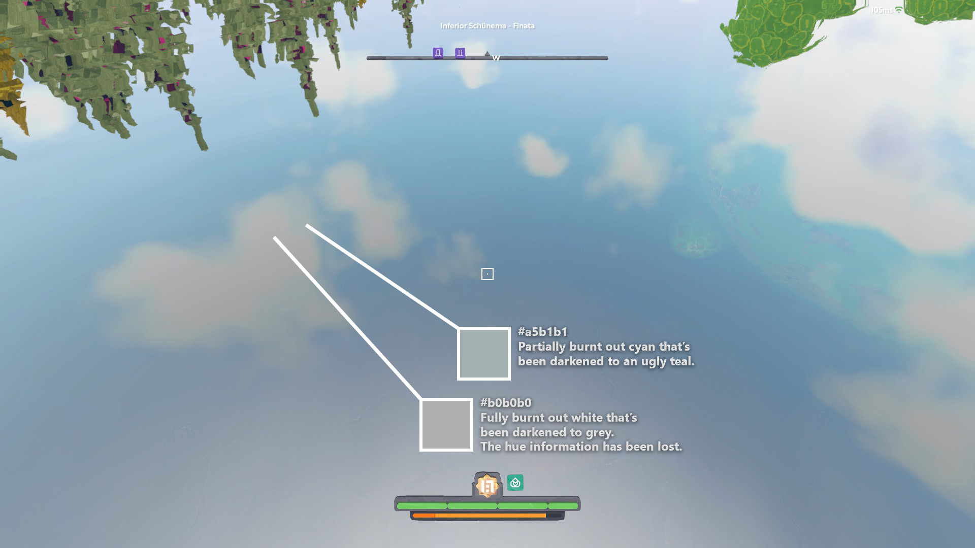
Notice how the clouds in the reflection have been overexposed, resulting in clipping. Then, notice how the Fresnel effect appears to darken the reflection as the angle of incidence becomes more acute. This darkening should bring the colour values of the cloud reflection back inside the colour gamut but, instead, they remain burnt out.
I admit that this is a much smaller nitpick than the previous issues that I’ve raised but I think that it speaks to a larger issue - the use of HDR.
While browsing through some of the old patch notes, I saw HDR mentioned on several occasions. So, it seems to me that Boundless certainly uses HDR within its rendering pipeline. However, I suspect it’s not being fully utilised. There are several post-processing effects that look like they’re calculated after the image has been tone-mapped into an LDR colour mode. I think that great improvements in quality could be achieved by adjusting the rendering system so that all processing occurs in the HDR colour mode and the image is only tone-mapped right at the end.
Thanks for reading and I hope to see some even more beautiful voxels coming soon! ![]()