I’m like 1.5 points off of being legally blind, so… self-burn? 
My glasses correct 90% of my sight though. I don’t see anything without them.
Can you explain meaning of all icons ? They are confusing me …
I actually like the look it has now , no need for the color block an really like the little explosion for exo exclusive colors 
Just add a line last seen + # of days imo
4 Likes
There is so much data on new format that it could be better start using table to keep icons and colors on own fields.
Could there be possible to move sand and gravel own category? Now that we have options to build from these blocks I have found that it takes while to locate these colors from exo lists 
1 Like
I won’t lie, I preferred the explosions… but I don’t like change hahah
I’m sure i would get used to it, but this looks more complex and my phone doesn’t like it much
The additional time info is excellent though i must say
2 Likes
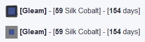
![]() [Gleam] - [59 Silk Cobalt] - [154 days]
[Gleam] - [59 Silk Cobalt] - [154 days]
![]() Gleam - [59 Silk Cobalt] - [154 days]
Gleam - [59 Silk Cobalt] - [154 days]
just having a bit of fun trying things out…like everyone else, happy to have this resource at all!
Exo icon is here to tell if it’s not from an homeworld.
New icon is here to tell if the color have ever been seen since the beginning of the live universe on a planet.
At some point the New Exo Color icon won’t exist anymore once all color will pass (may take a bit)
So for new player there is no way to know if that color is new for them, so imo EXo icon is a must.
I could remove the new icon thought and only using the seen x days statement and make it say “new”
1 Like
I’m with @WendyVandecatsye. I prefer the look it has now. Simple and straight to the point. The x amount of days since seen is okay. But not necessarily needed. We know a lot of them are repeats already 
2 Likes
Do you mean the ‘new’ icon, rather than ‘exo’ icon here?
Cos at some point all the colours will (hopefully) have appeared and none will be new!
Its up to you of course, and just cos I can see that new + exo gives the same info as new on its own, doesn’t mean everyone will see that.
(Colours that are exo but not new would still use the exo symbol, just don’t need both on a colour that is completely new!)
Any assistance from any outside source (ie you, and the time you take to post the exo info) is greatly appreciated regardless of the format it appears in!
1 Like
Yea sorry it was about the new exo color icon
How about removing the ‘new’ and ‘exo’ icons? If it is new just say new color in the area it would say last seen. And if the color was last seen X days ago it is logically an exo only color. This should help streamline it a bit.
1 Like
only thing I would adjust is the color icons. they look quite dark on the white background. maybe a wider 50% grey border could help with that
I think wider border will make dark color hard to see when the icon is cropped but i will test it out.
I’d prefer the current layout with the color block in the front. It’s simple, quick and tells me everything I need to know. I don’t need the rest of it, myself.
Thanks again for what you do with this information.
3 Likes
Really like the new layout or does however it does look a little weird on phones
1 Like
Heck yeah!
The forum is made in a light style. Icons are displayed in dark frames. It is difficult to understand the shade of color in this version. You need to consider that colors can display a different hue due to the proximity to a different color. @majorvex design option looks better for a color icon.
I think it’s better to refuse the dark filling of the icons, remove the frames for colors. The uniqueness of the colors on the planet can be displayed as a separate frame on the icon. For example, in a gold frame or painting a corner.
You used a lot of square brackets, you can get confused in them. “Seen 154 days ago” is best reduced to an icon and numbers. For example, an hourglass.
1 Like
@Gorillastomp I like the gold star for easily knowing if it is an exo color only
1 Like
smaller border is the same like i think and maybe better in black
smaller black border or remove complete
either fewer symbols for a better overview or simply not making all symbols with the frame like this old ![]()
the whole frame made it look a bit too crowded and darker than it is, and the colour maybe instead the cube make a circle
yes this sound good a hour glas symbole with just as example “150 days” behind it
1 Like
Thin pure black border or no border is best. Gray will look awful with certain colors, especially with reds.
1 Like
Honestly the whole “color icon” at the start of each line is just not necessary. You specify what color it is in text anyways. The icons also are confusing as well, having to include a separately collapsed legend made it confusing for me to begin with… If we’re going to have a legend for icons, don’t collapse it by default. I was scratching my head trying to figure out what icon meant what, then I found the legend and it still doesn’t make sense. The icon specifying new is far too small to even read. Entity Found doesn’t make any sense to me either, what is that supposed to mean? The old icon is what I’ve gotten used to since it’s been used for a while, so there’s the whole “I don’t like change” kind of stuff going on here with it. Honestly I don’t see why people gotta change/fix what isn’t broken to begin with. But that’s just me  … Nonetheless, the information you post whenever a new exo shows up has been absolutely invaluable to me, and I really, really appreciate the effort you go into to provide this information for the community. Thank you.
5 Likes