love those sights now ![]()
4 Likes
Yes this is what i mean.
1 Like
I would vote for an option. There are such a variety of monitors, video cards, and other devices out there that I am not sure you will every find one setting that would make every one happy.
6 Likes
Default probably quite a bit lighter AND an option change it ourselves seems like a good idea to me…
1 Like
in configuration, remove the option of brightness and it looks great all
vote in the poll what u prefer  Lightning Poll
I have mixed feelings about the lighting, but generally think it’s pretty nice. The lighting is really what matters to me from this update, don’t really care for farming other than the decorative options it gives.

Forest looks amazing.

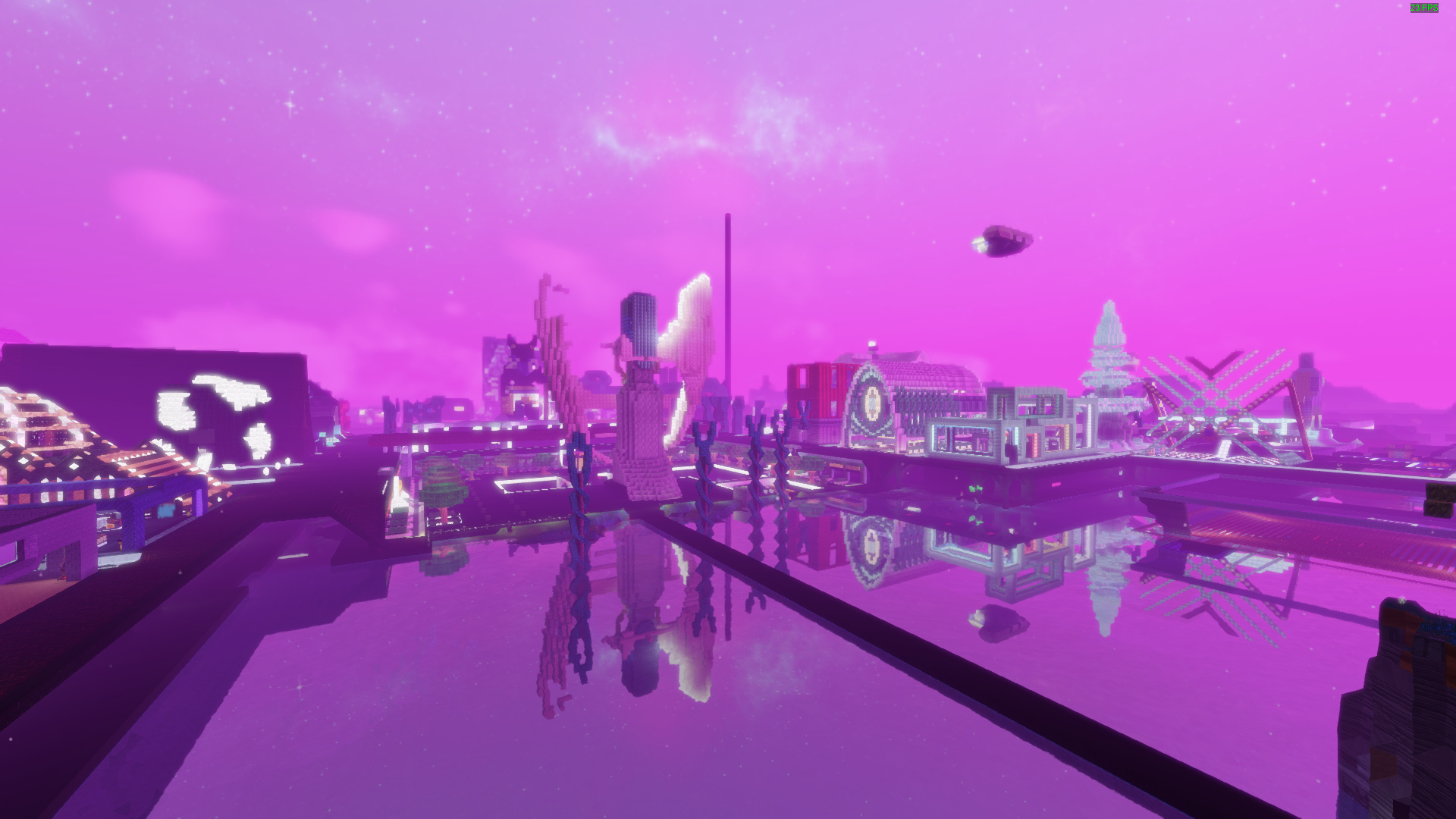
Flowing water imo is way too blue, almost looks like lazor.

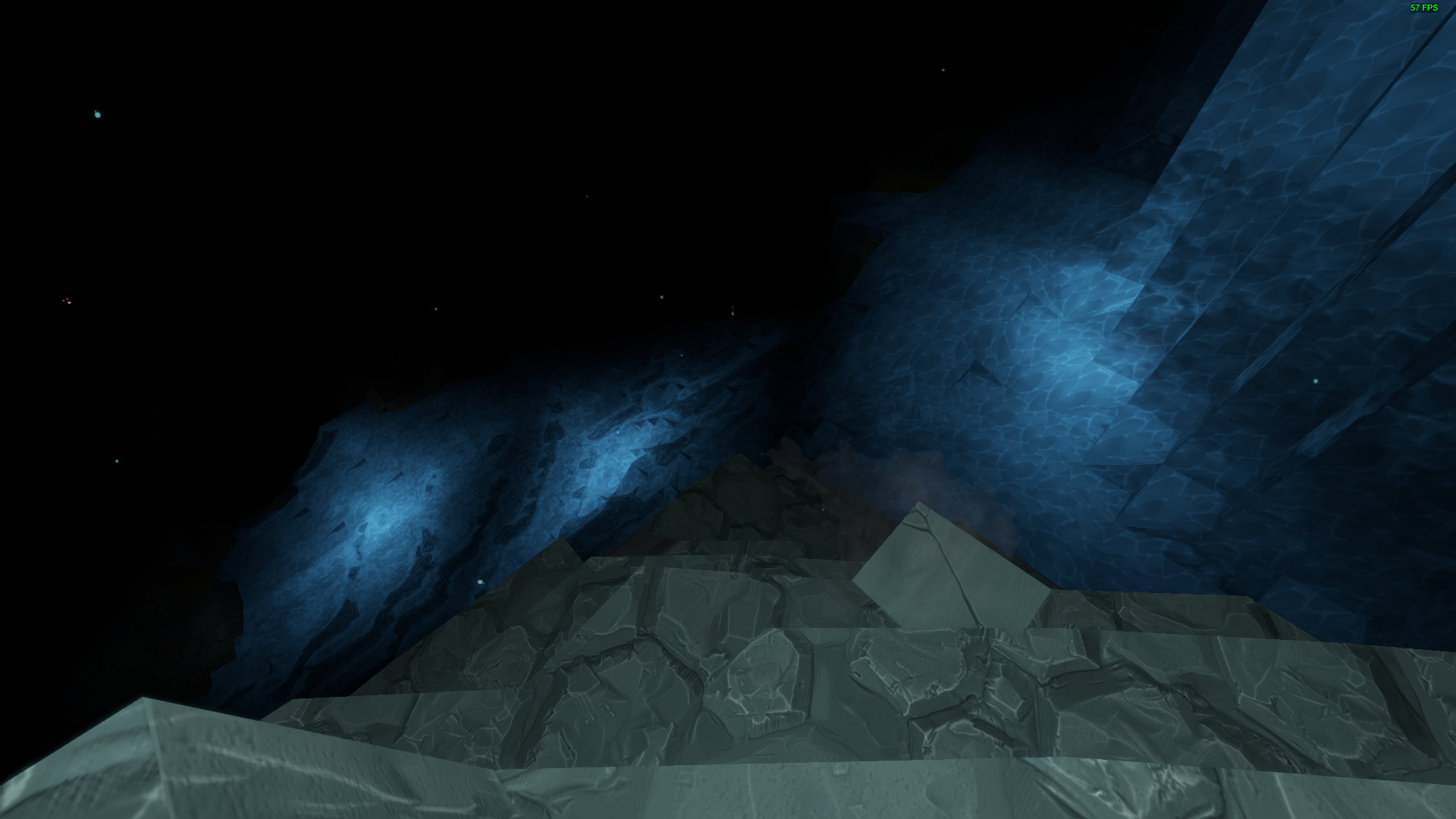
Ice is sadly reflecting a bit too much, will definitely not build with ice in future. Kinda sad, cause the pattern on ice is pretty nice. Other than that, Trunks and Timber looks great!

Clear blue water, which is kinda nice!

I definitely love how far you can see details! That is great and something I wanted for a long time!

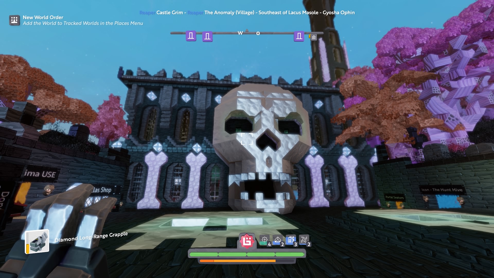
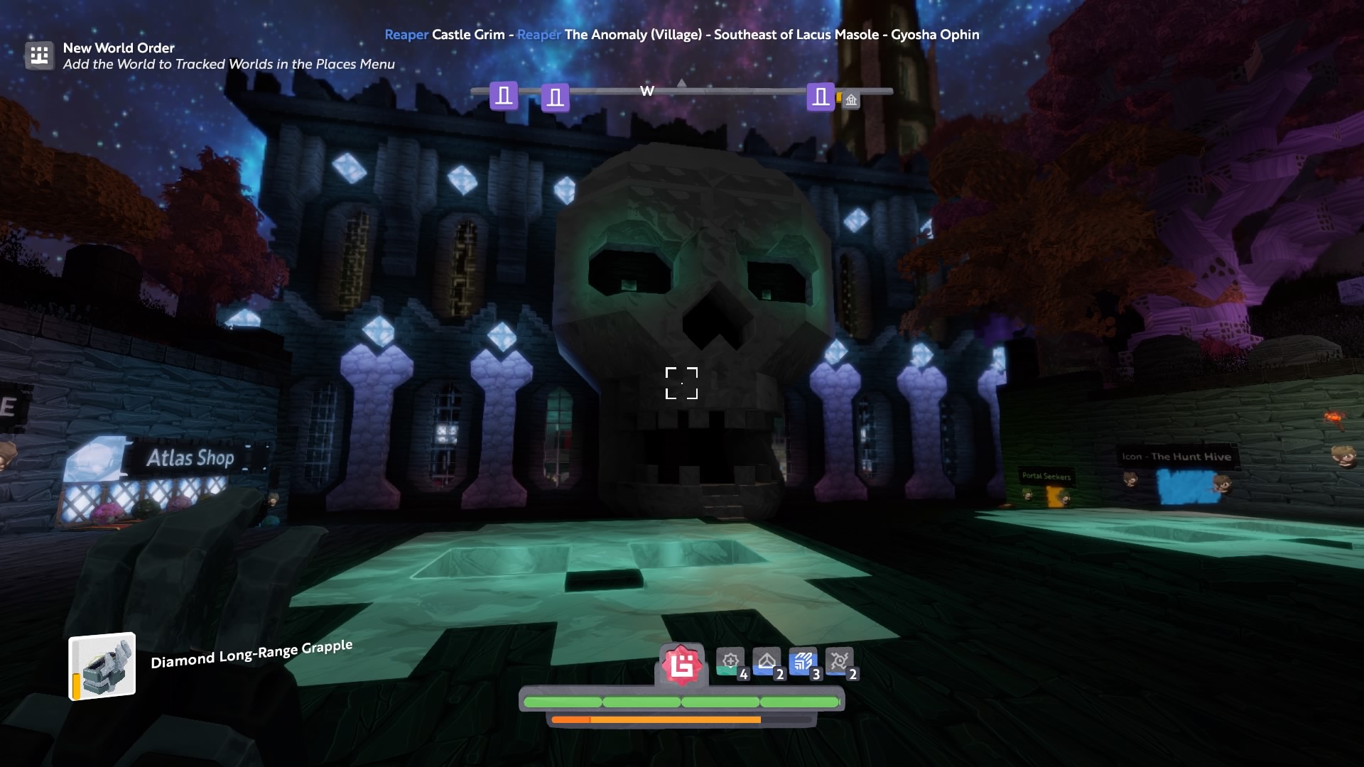
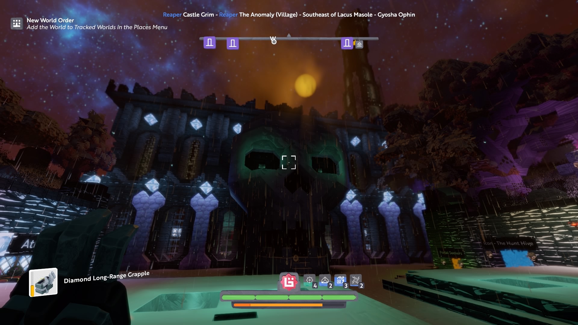
Kinda nervous about the darkness and dark texture of certain blocks. Castle looks kinda weird atm, at least to me.

My wall definitely is a lot darker, not sure what to think yet. Looks alright I guess.

More wall, just look very dark.

Castle again, the oxide gray stone sticks out so much more than before. Kinda like it, kinda not sure yet 
But I always say, nothing is ever final so we may see some tweeks still.
5 Likes
I always appreciate having a gamma adjustment for graphical games. I have many monitors on many video cards in my home, and each seems to render differently. A gamut adjustment would be even better, but a single slider is a better UX so I’d side with that.
1 Like
Where is configuration? Is that on Pc?
Do you have bloom on by chance?
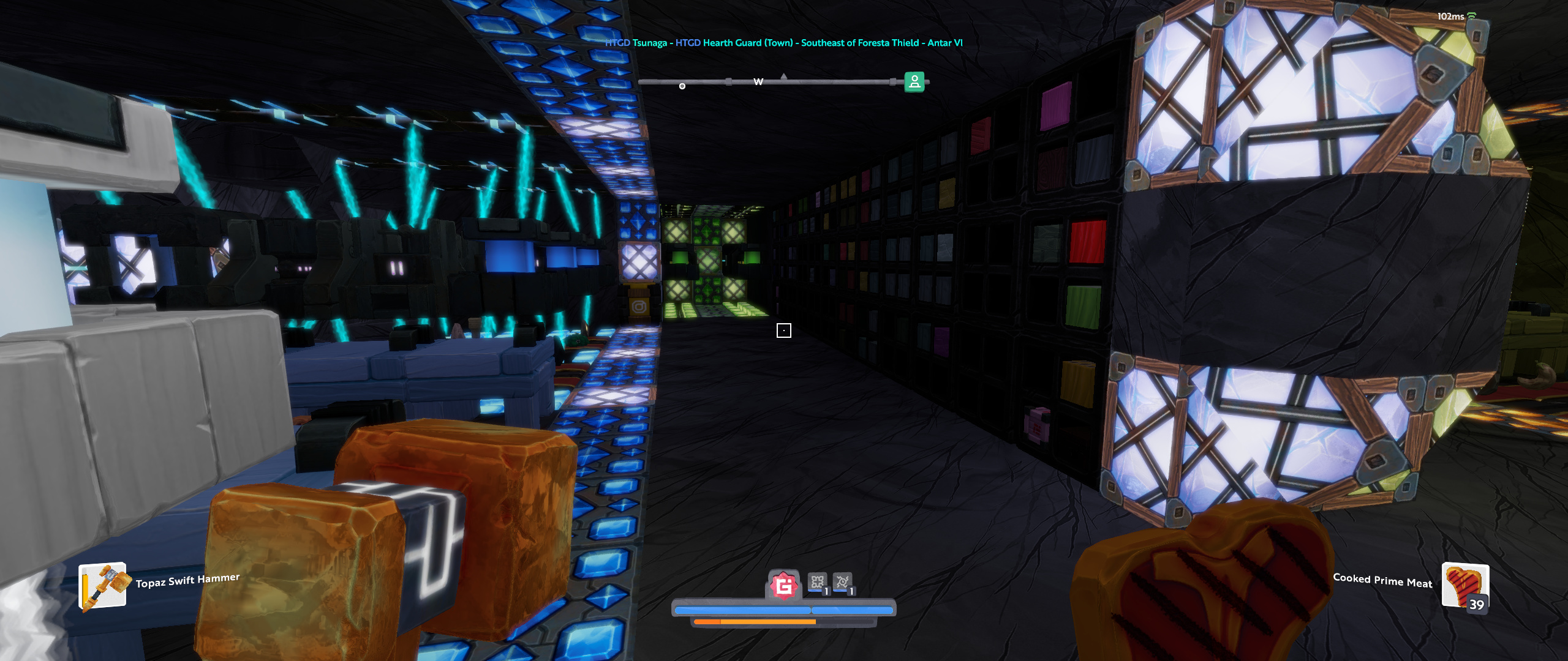
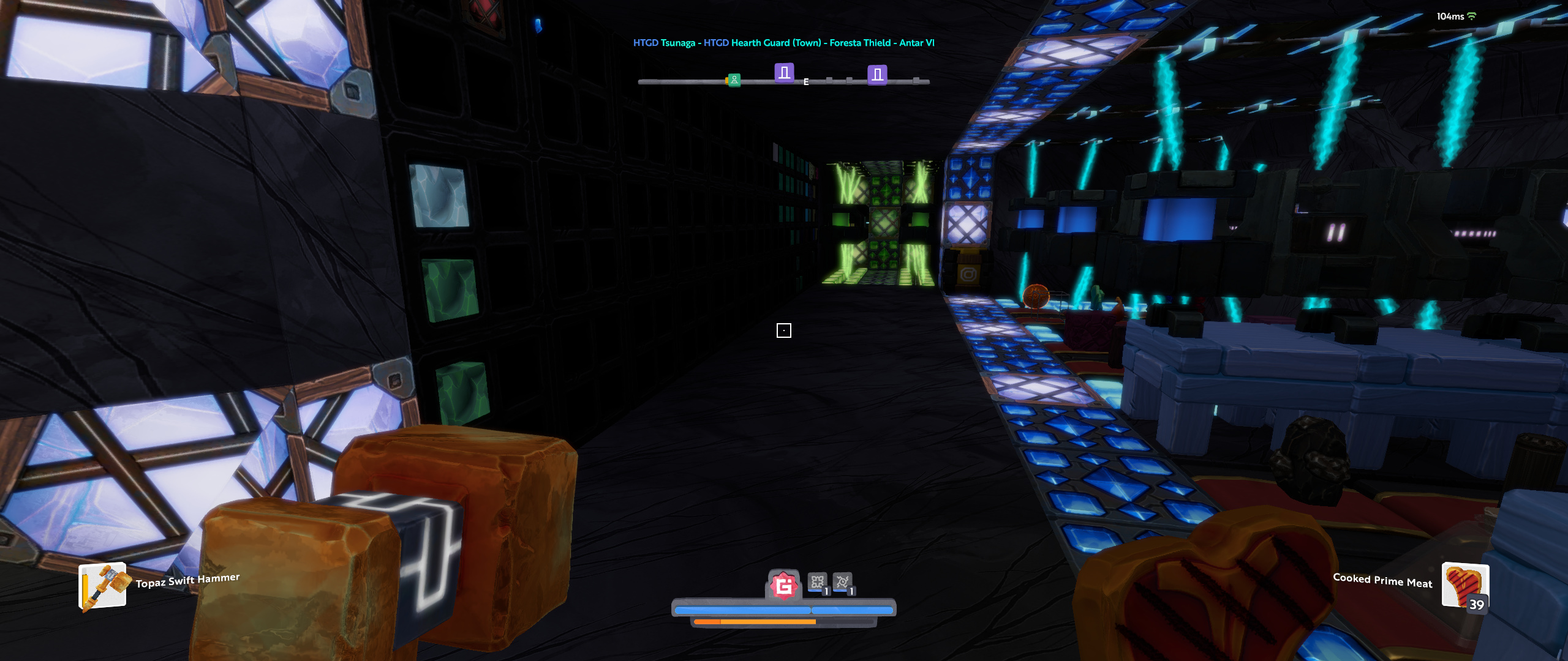
I cant see much of my base hearth guard has gone dark ![]()
storage blocks are black literally some things are just not even visible.
Ps4 press start
Is the Storage made from Black rock?
yes with black marble around @james
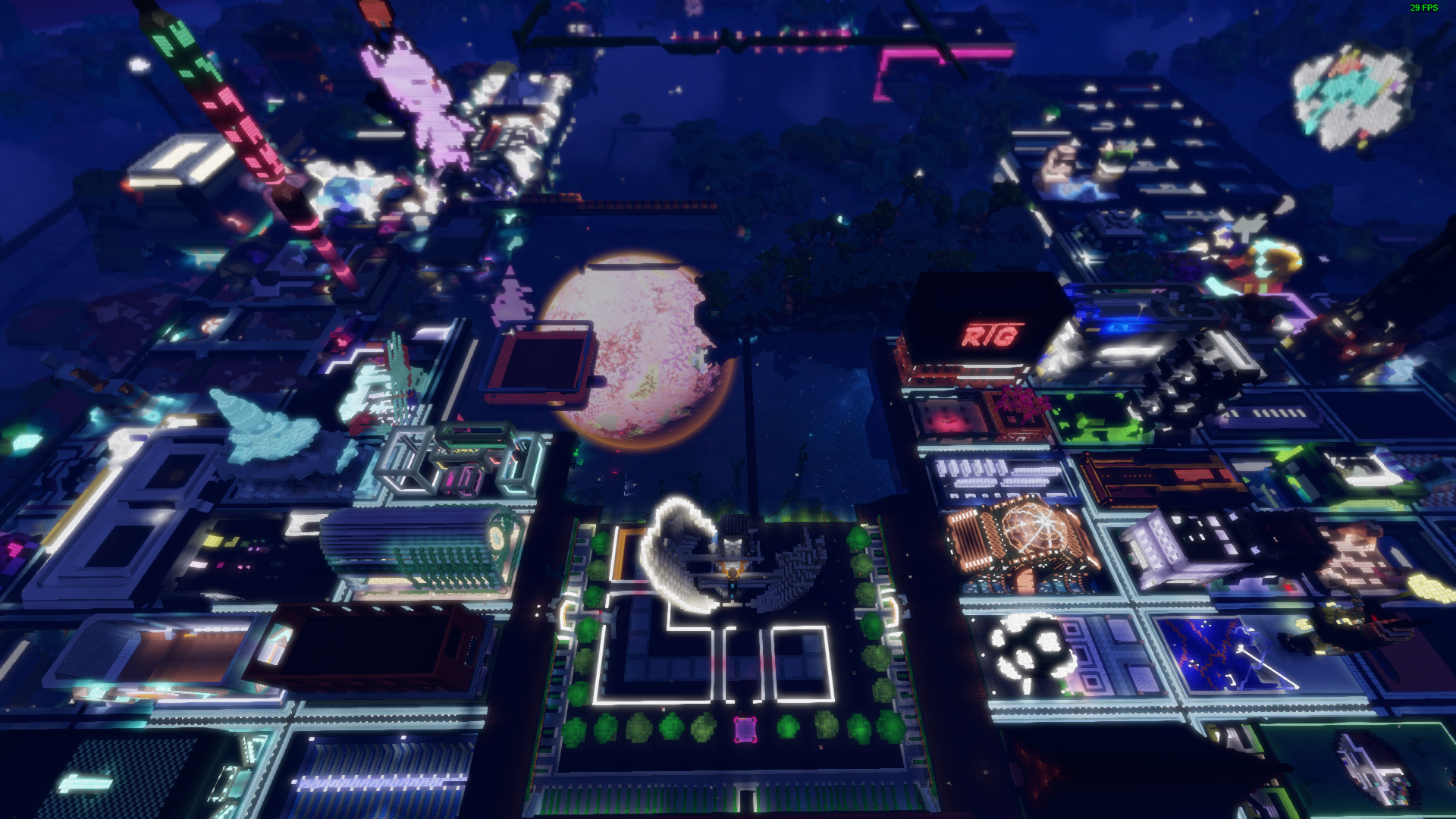
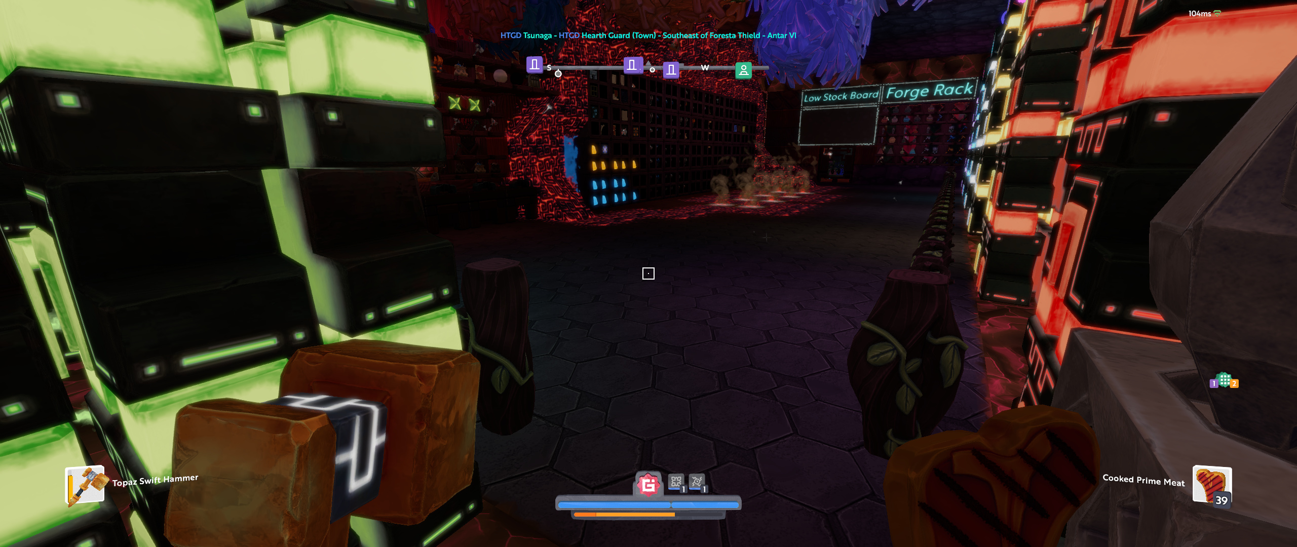
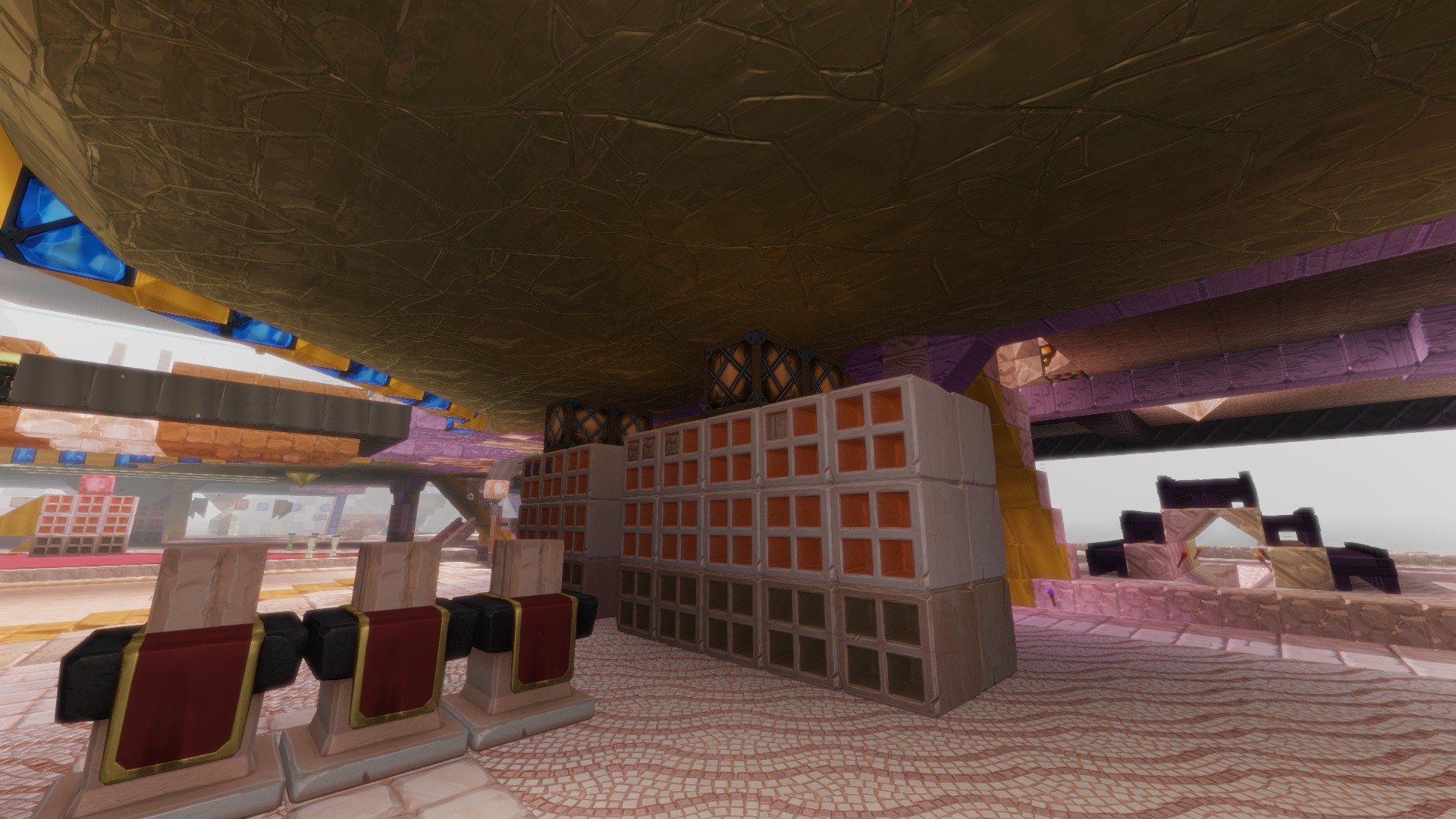
My place certainly looks very different now:
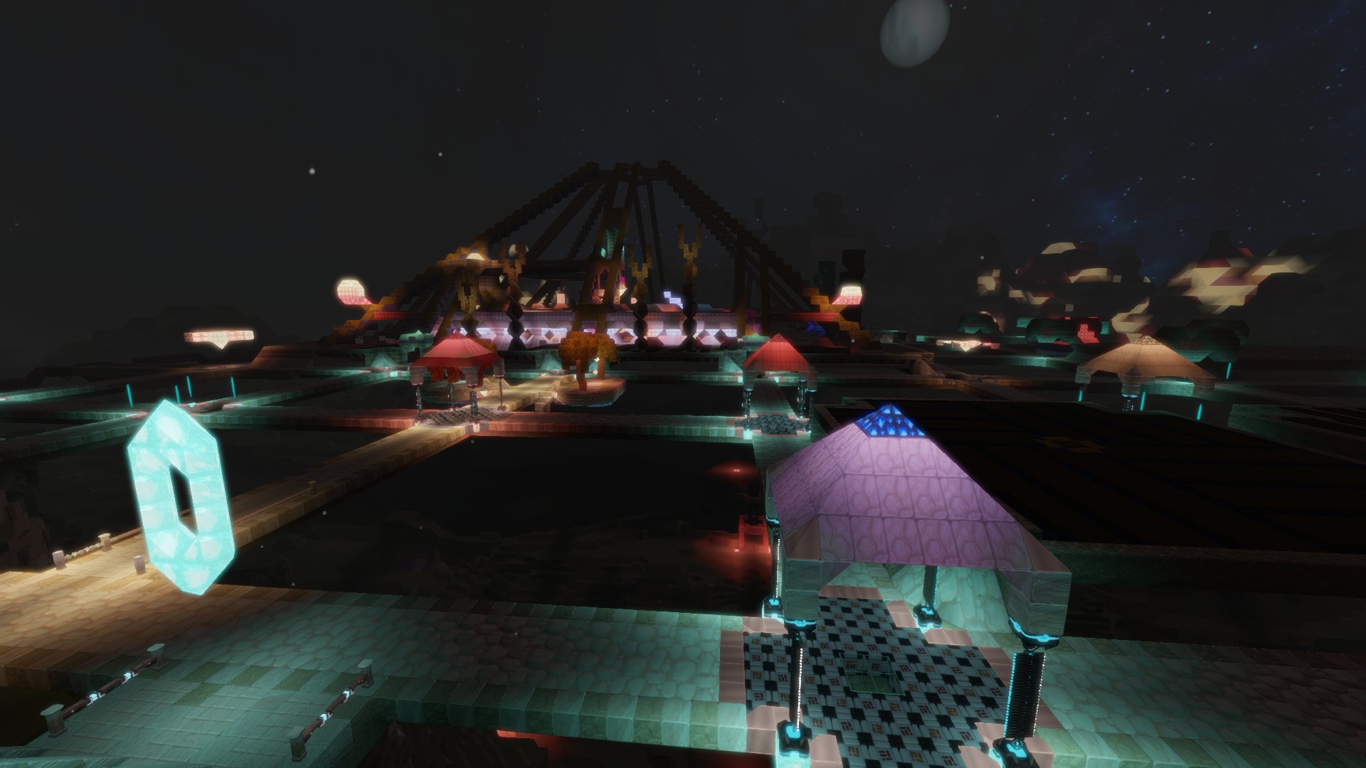
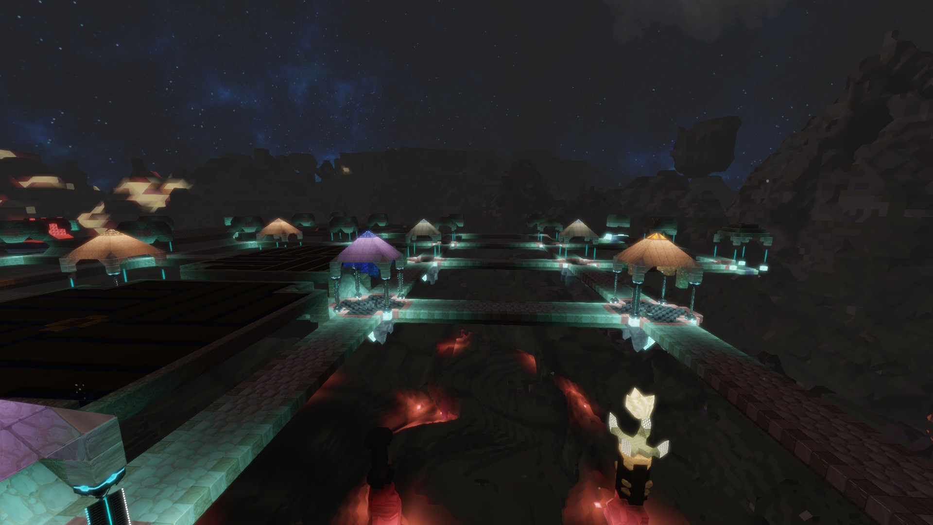
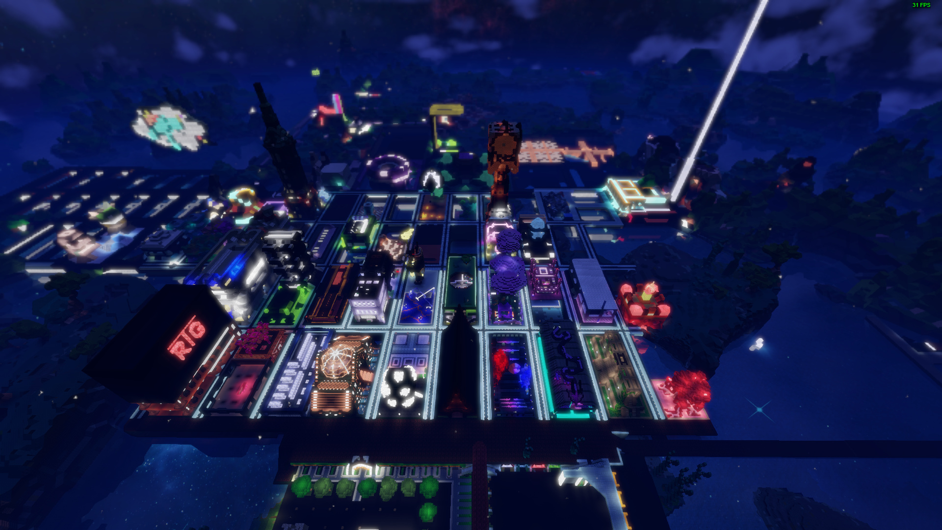
Looked like this before, for reference (proper night time in second screenshot): ![]()
3 Likes
Too bad these exo gleam lanterns are so dark now… Kind of expected this unfortunately, but going to have to replace them completely. ![]()
Before (in the background on the left):
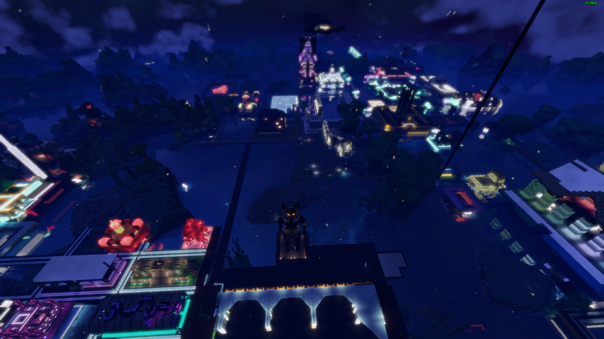
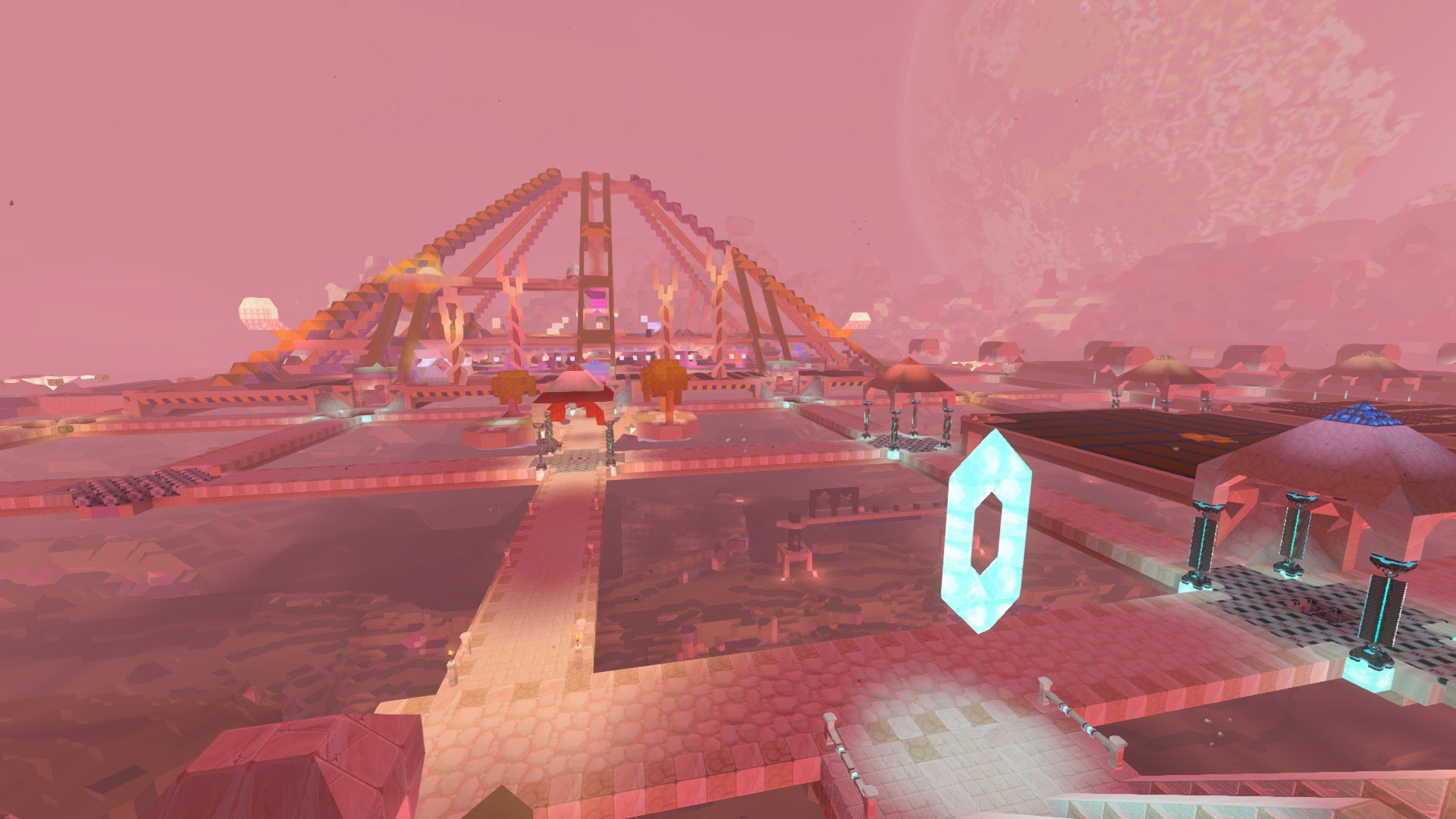
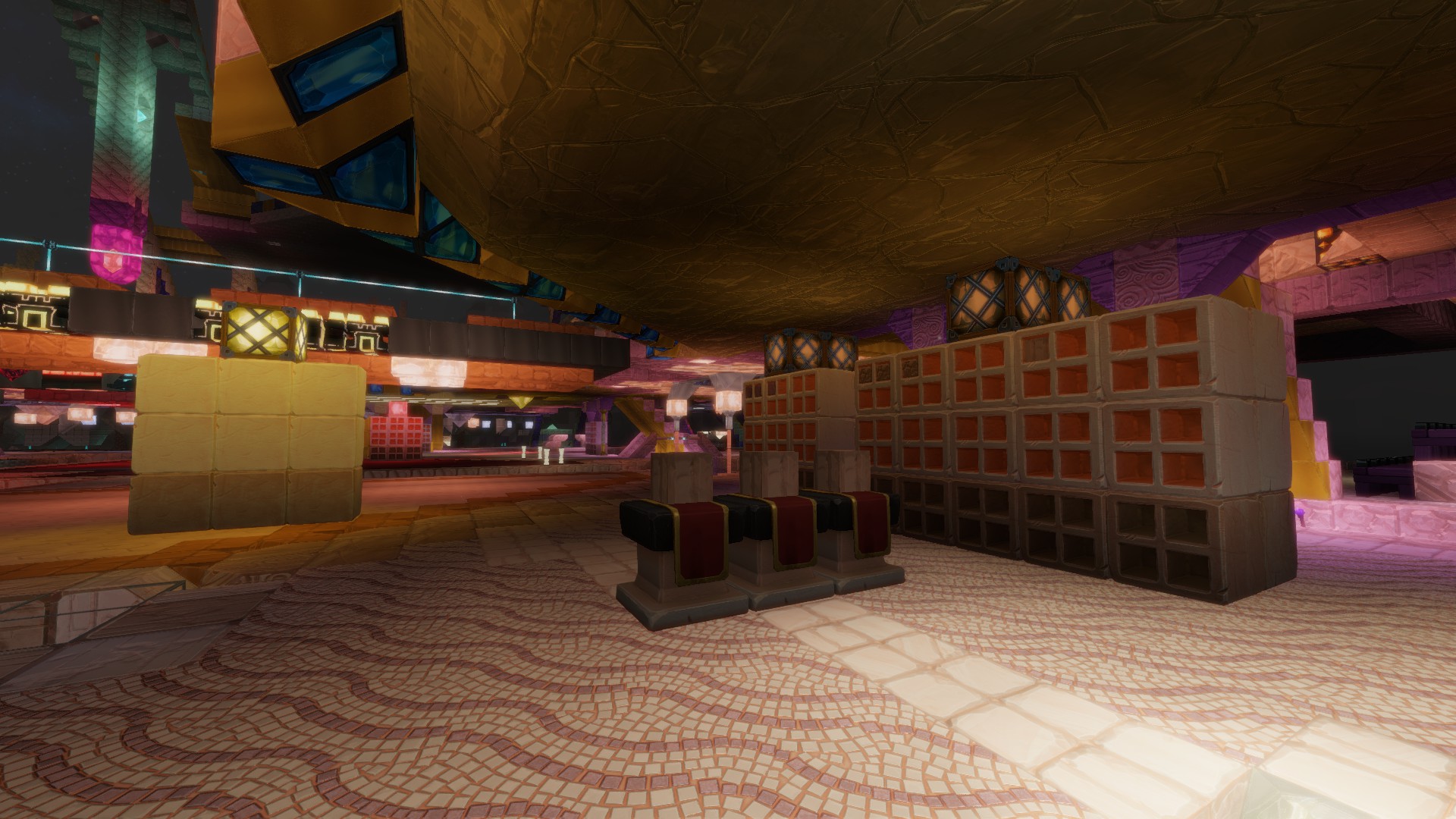
Edit: A bit different at night though: ![]()
Don’t Touch Houches 1 I play on ps4 pro on a 4k tv and its beautiful here now I’m in Love with the planet lol
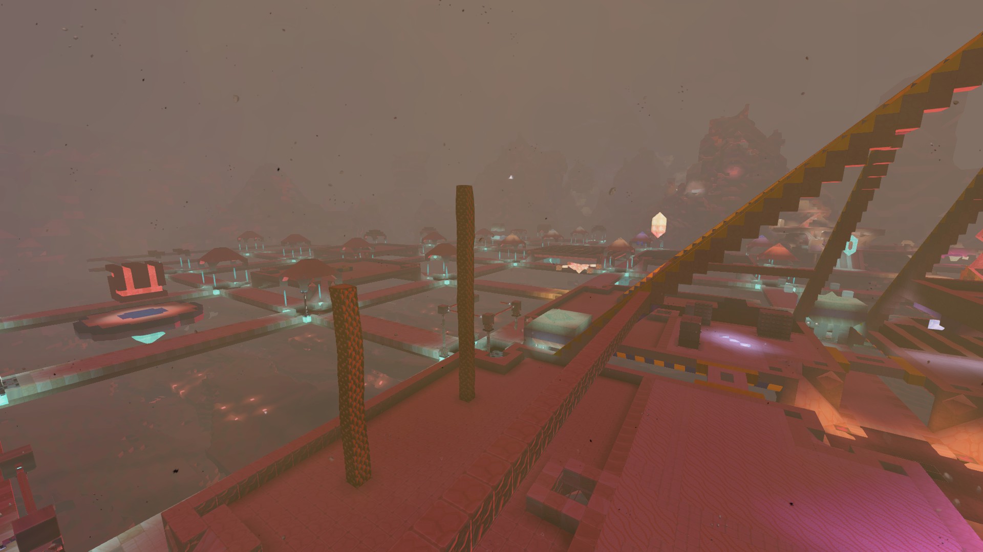
Not sure how I like it. Might take some getting use too. Everything is so much darker. Gleam really isn’t putting off as much light. My workshop feels like a dungeon now. Gyosha has night now which is cool. The lighting on my white marble make it look like metal at times.
2 Likes
Ummmm I thought it was a dungeon? 
4 Likes
It feels like every light source is very reduced in effectiveness, mostly for mesh blocks, maybe that needs to be tweaked? Seems like it might be due to the different lighting resolution for mesh blocks if that’s still the case?

How is everything so dark with white gleam lantern light sources right there, those are supposed to be white crafting tables!
In the screenshot above, the empty storage above the machines is basically a ninja now, I guess black just got a whole lot more black!

This screenshot highlights the issue I think, mesh blocks now sometimes stick out like sore, dark thumbs.

Everything in the inventory seems overly saturated, I can barely tell apart the various different types of black blocks, the white gleam and gem tools seem oddly grainy?
That said, aside from those issues I’m starting to like the changes.
3 Likes