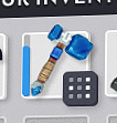
Instead of showing the 9 white squares on the inventory icon of a smart stack, it would be nice if red == full, yellow == partially full, and green == empty.
This would keep me from trying to constantly add rock to a stack of 891.
Instead of showing the 9 white squares on the inventory icon of a smart stack, it would be nice if red == full, yellow == partially full, and green == empty.
This would keep me from trying to constantly add rock to a stack of 891.
Just a little tip:
(And i didnt notice this until last week and over 900 hours into the game lol)
When you grab an item or partial stack of items and hover it over any smart stack, the little tooltip that pops up basically tells you what’s going to happen.
If theres enough room in the smart stack for all the items it will say “add as many items as possible”
If the smart stack is full or if there isn’t enough room for everything, it will say “swap items over”
If you are grabbing partial items from a smart stack and the other is too full, it will say nothing and when you click nothing will happen and the items you grabbed from the first stack will go back there.
Hopefully that explained the scenario you were asking about.
It does. But my suggestion means you never even try to hover over it – you can immediately view in inventory what’s going on.
that’s true it would save a lot of time. I’m not against it, I like the idea! just wasn’t sure if you knew about the hover thingy 
@james @luke-turbulenz I just wanted to drop in regarding QoL improvements such as this. Little QoL adjustments such as this pay HUGE dividends in the long term for any game and their value simply cannot be overstated. It would be amazing if we could formalize requests such as this slightly such as, for example:
I understand a lack of desire to bluntly state “we’re not going to do that” but that’s simply reality and the community should be mature enough to realize that there are endless features that could be introduced to any game but there’s only so much bandwidth. At least providing a “Will not do” would provide closure on the issue.
We want and welcome suggestions but we don’t discuss them as soon as they appear because it will just mean we have less time to develop the game. We do log them in a database and review, either in our spare time or a set time in the month and decide if and how the suggestion can be implemented.
Actually, Rob our UI guy, has already got this in his mock ups.


So we’re are doing it but it just hasn’t been implemented yet.
That kind of response is amazing, Luke. Thanks! Great to see that this particular request is actually slotted for a future time.
Oh that is amazing!!
Way better and more intuitive than I would have expected.
I should never doubt you guys (not that i ever did :P)
My next question would be:
When the dev is done tinkering with that smart stack of Sapphire Hammers, care to send them all my way??? 
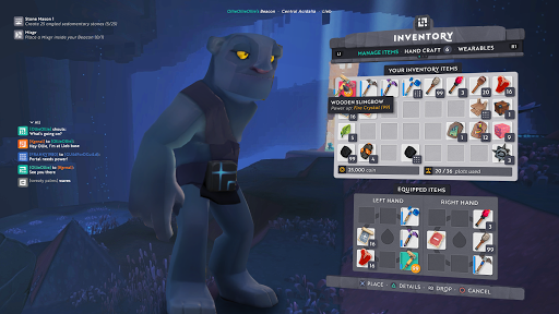
has any one noticed in the picture showing the full inventory, that there is a menu that says wearable’s.
Looks awesome, already looking forward to it! 
And he’s playing on a playstation
did not notice that lol, but that is very cool
Oopsies better take the pic down before everyone goes crazy :P!
He’s also in the cave from the trailer!!!
Dualshock 4 is natively supported on steam.
Not to mention…
Just FYI the screen is from a year ago. I found a post with target UI and it matched this picture. Wearables were also mentioned previously, with some form of lootbox being the way to obtain them although we do not know if this was changed in the last year or not. Best to just wait and see what the devs have in mind.
ahhhhhh that makes a lot of sense.