This week we’ve been reviewing all the feedback and ideas from the recent Testing releases. This has mainly focused around the Objective system and exploring alterations that gives players freedom to explore their own path - which has always been the ambition.
The high level aim of the Objectives are to:
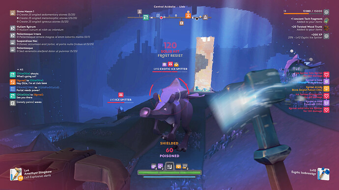
- Tutorial Objectives: Gradually introduce players to all the features of the game. This will start as some basic Tutorial style objectives at the beginning, but continue up to more complex introductions such as building a Portal. To experienced players this may seem like a bore, but we get lots of comments from players not knowing how to proceed in the game. And not everyone is keen to ask for help on the forums or Discord. The aim is to allow players to play Boundless without resorting to a Wiki.
So now you know how to play the game, what should you do next?
-
Rewards for your own direction: If you want to go off explore, mine, gather, fight, build, craft, build a city, develop your character, then there needs to be a reward mechanism.
-
Rewards for given direction: If you want a mission or an objective beyond #1 then there should also be a reward mechanism. The aim is to make these longer form much more like quests.
I think we have a some solid ideas and will make sure they’re shared for community feedback.
From a release perspective we’re working to migrate the Testing version across to Live, but this will not happen until we’re happy that the Objectives are exactly how we want them. So it’s likely to be a few more weeks.
Code
We started the first pass implementing the throwable Bombs. These are thrown grenade like objects that bounce around and have a timed fuze. When crafted they will support a wide range of effects beside explosions, including buffs like healing and penalties like slowing targets.
Further work continues on the Tutorial and Objectives. The GUI skinning continues with the character screens, beacon and settlement screens getting a visual update.
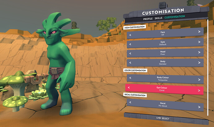
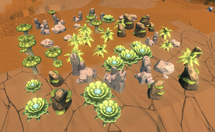
A first pass of the Character Customisation is now complete and is sufficient for us to test the character assets in the game engine. We have some more iteration planned before this feature is merged into the Testing or Live releases. We added some new prop blocks with six variants of plants, rocks and fungus.
We have started work to allow more threads to be used when meshing the world. This should mean that loading (assume you’re not bound by networking) and world alterations should appear much quicker. Ultimately this will make the game feel more responsive and make better use of the available hardware. We worked on further optimisation of loading and memory for PlayStation 4.
Design
This week Luke was poring over the feedback on the objectives system and tutorial from the community, and together with feedback from our own internal play sessions he’s come up with a plan for the next iteration. He’s also been preparing some posts for social media, so watch out for those.
Ollie has spent much of the time setting up a new project management system (exciting!). He’s also been prioritising the tasks in our backlog to work out what we should do next.
Rob has been exploring how best to communicate player status in the HUD.
The design captures:
- The most basic reticle.
- Reticle holding equipment in both your right and left hands.
- Equipment cool down in the right hand.
- Powering up or charging in the left hand.
- Exposure to a toxic atmosphere.
- Oxygen depletion whilst underwater.
- Direction of damage indicator.
- All items together. (If your reticle ever looks like this - RUN!!)

Below is the current visual target for the complete HUD with all elements activated. (Before anyone complains that it looks too busy - this is with all the elements activated, it will not normally look like this!) Let us know what you think, because now is the time to get feedback and make some changes.
Art
The art team has been busy working across a wide range of areas.
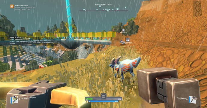
- 1st person tools/weapons: Gerry has nearly completed the final pass on the 1st person tools and weapons animations. As mentioned previously these animation positions are designed to work with a less distorted FOV in 1st person. See Gerry’s WIP. Notice how accurate the model proportions are compared to what we’re used to in Live.
- Kit of Poles - Amanda is having fun concepting the poles feature. She’s close to concluding our planned design on these. See her second WIP post here. The poles will be a framework for building lots of different structures: street lights, flag poles, wells, cooking spits, building supports, and poles.
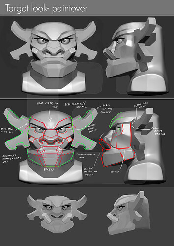
- We’re in production on the character heads. He’s a sneak peek of the ZBrush Orc inspired head with annotated feedback from Amanda. It takes a lot of work to get the models to match the original concepts.
- Character Customisation - Jess has been supporting Luca who’s created a placeholder character customisation screen, featuring selectable faces, heads, bodies, colours.
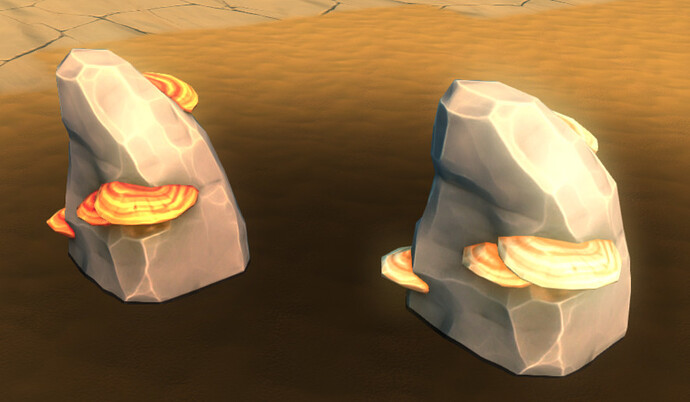
- Natural props - Production on natural prop meshes continues apace. Blocktypes have now been added for the full planned set of natural props. In rocky areas if you want to find mushroom-type resources, you’ll find it growing on these rocks.
Here’s our progress of the set all here using the same tint as a plant model.
-
Sanctum - We’ve started pre-production on the new Sanctum. It’s too early to share any details but we’re very excited creating the first environment the player sees when entering the Boundless universe. More of this to come.
-
World Builder Prefabs - We’re augmenting our set of natural prefabs with some interesting little shrines. Some of these have been updated since last week.
World Builder prefabs are always welcomed especially if you have a crazy or fun idea of something we can hide in the worlds for players to discover!



 (and that’s even without decals and wearables!)

