After much toil with the system of the infamous poles, we have started to narrow down the direction in which we would like to take them.
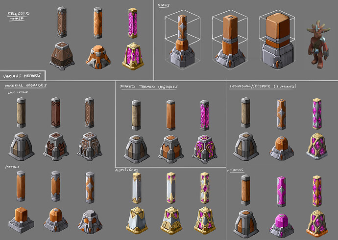
Initial exploration as seen below was looking at the visual progression of three material sets: wood, metal and gem/alloy.
We wanted to create a selection of visually appealing assets that do not restrict players to choosing the highest value material (in this case, gem/alloy) to add to prestige points. The idea is that we could have a high end decorative wood piece that would match the same value points as a decorative gem piece.
Another concern we wanted to visualise was which stylisation approach we wanted to take for best results that benefits well for variation, cost, customisation and consistency between different material designs.
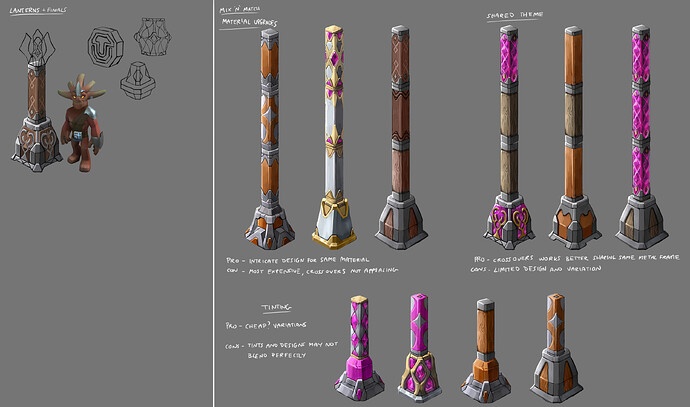
Material Upgrades
Each material set has three upgrade stages, from raw->refined->decorative. They follow a distinct stylistic progression. Frames at the end parts of poles for better consistency.
Pros: Individual material sets work well together, consistent design for contained set
Cons: Most number of different assets hence expensive, crossovers doesn’t join well, no consistency across the board
Shared Theme
Each material set has a linking, generic metal/stone frame. Material progression doesn’t exist and design across them fits in same style for better consistency.
Pros: Crossovers works better and looks less jarring.
Cons: Limited design and variations. Visually implies gem/alloy is much more prestigious.
Individual/Separate + Tinting
Each material design are differently styled. No efforts made for shared consistency. Use of tinting system in attempt to blend different sets together.
Pros: Most possible design variations, cheaper
Cons: Tints may not blend perfectly due to different materials.
Eventually we’ve started to narrow down to something completely different, and much more exciting!
Behold (still in WIP):
What we’ve settled with completely branches off from the first exploration, but taking some distinct pointers. We’ve decided that it would be better bang for buck to have vastly different designs for each progression. Rather than restricting ourselves to thinking of consistent designs, it is actually better to have clashes of bold contrasts.
We didn’t want to stray too far from the material’s personalities, so we’ve implemented a more themed approach: elven (wood), dwarven (stone), oortian/machine (metal), and mage (gem - this is actually going to be gleam and not gem).
The way progression will hopefully work with this approach is a design following a general motif of the theme, but distinctly showing a state in how much it is refined. For example, a ‘raw wood’ pole would be more of a twisty painted tree branch, as opposed to a ‘decorative wood’ pole, which takes the form of more structured and carved designs.
Hopefully this would be able to add variations and that all stages of progression and themes would be used to the best of their design and value. This point being that prestige may be more calculated for the variations of assets you have, rather than quantity of just high-end props and blocks.
Many thanks!


