Crafting UI rework

No doubt, people have been asking for this.

The crafting UI is terrible and since with each new thing added, those lists are getting longer and longer, we need a better way to navigate through them.

I put together this mock-up very quickly to show how I’d like to see the crafting UI.
It’s faaaar from perfect, I wasn’t feeling like spending hours on a photoshoped UI picture since I’m just on lunch break.

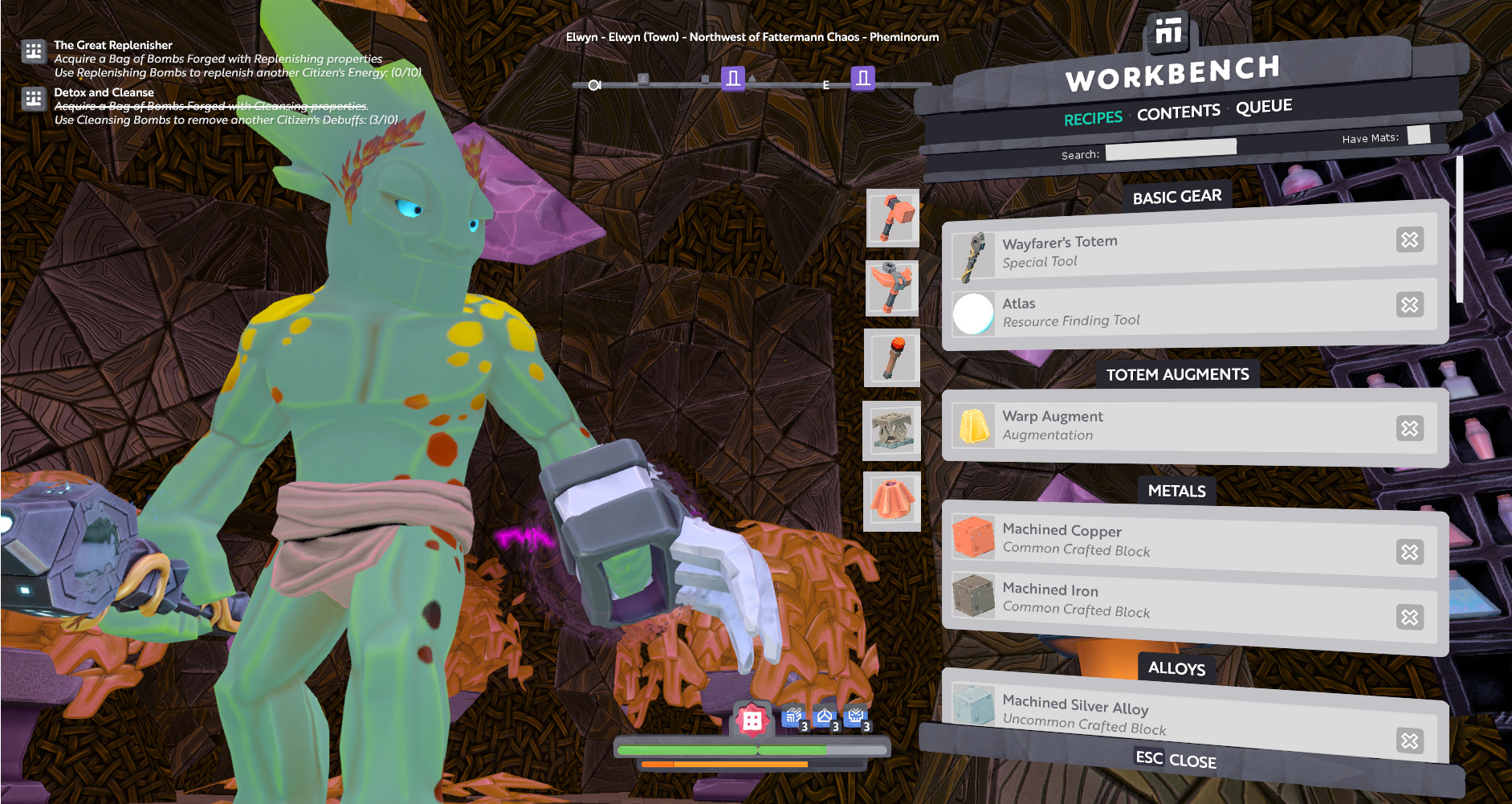
• First, here’s a question. Why does the UI only takes 1/3rd of the screen? Why is it important to see our character when crafting? Unless I’m missing an important situation, I think there’s no point in seeing our character while in the crafting UI of a machine.
Imagine a crafting UI that could use ALL THAT SPACE!
Basically, with that design of having to use a window on the side of the screen, the design is greatly limited in space. But even then, I see things that make no sense…

Suggestion_Crafting-UI_SpaceOptimization1
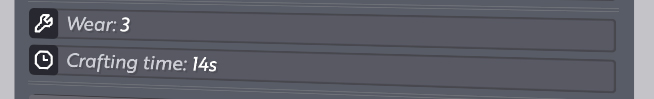
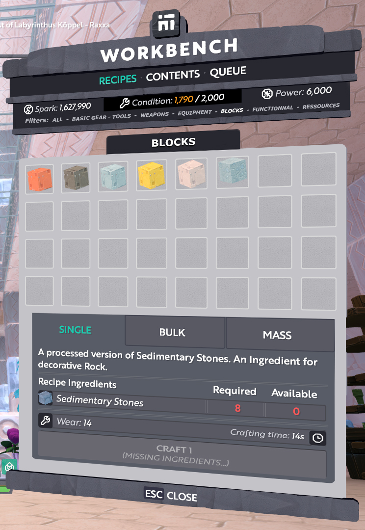
• I noticed that there could be A LOT of optimization of space, some lines have almost no purpose. Like, the “Wear” and “Crafting time” are currently displayed on two lines in the current UI. Why? Why not put them in the same line?


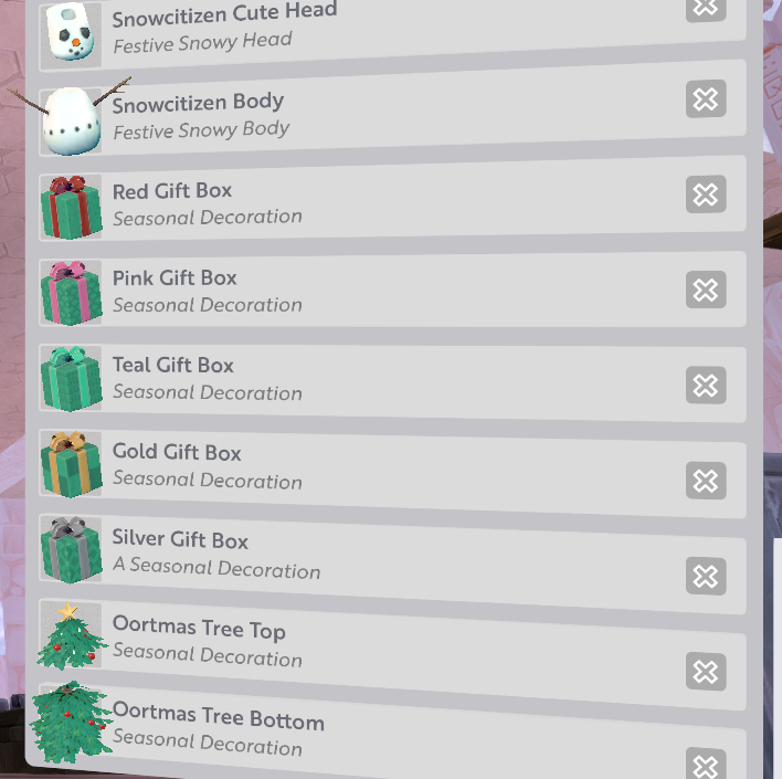
• Unless we get a block with a name like “Stick of the singing unijambist bear wearing a ham jacket under the moonlight”, I don’t see the point of having such long title cards for all blocks in a list. Look at these crafting list we have. All that empty space!

• I don’t see why we have to go to the Contents tab to see the sparks, power and condition of a machine. That should always be an information available to the player through the machine’s UI.

• When I bulk/mass craft a block and then go to the Queue tab, I should have the indication of how many blocks are being crafted at once. Not that I’d forget, mind you, but it’s odd to not show it.
On a related note, when applicable, we should have the indication of the tint of the block that is in the queue.

• Another idea would be to make the filter system easier to use. For instance, it could be re-worked as to not have the player cycle through all filter options, and just select what he wants through clicking on little icons representing categories like “tools” or “weapons” or “blocks”. Maybe it could be a drop-down menu. Something that requires as little clicks as possible to go to the desired category, basically.

• What if instead of having to cycle through a vertical list, we had a catalogue of blocks, somewhat like the inventory?
You can recognize blocks by their little model in the inventory, so you should be able to do the same in the crafting UI.
My mock-up doesn’t show it, but I think such design should be compact, and yet still allow the devs to make sub-categories.
My personal thought on UI design is that scrolling down should never been needed to navigate. Not to say that there shouldn’t be a scroll-bar, just in case, though.

Here’s how Creativerse does the crafting UI :
CreativerseCrafting
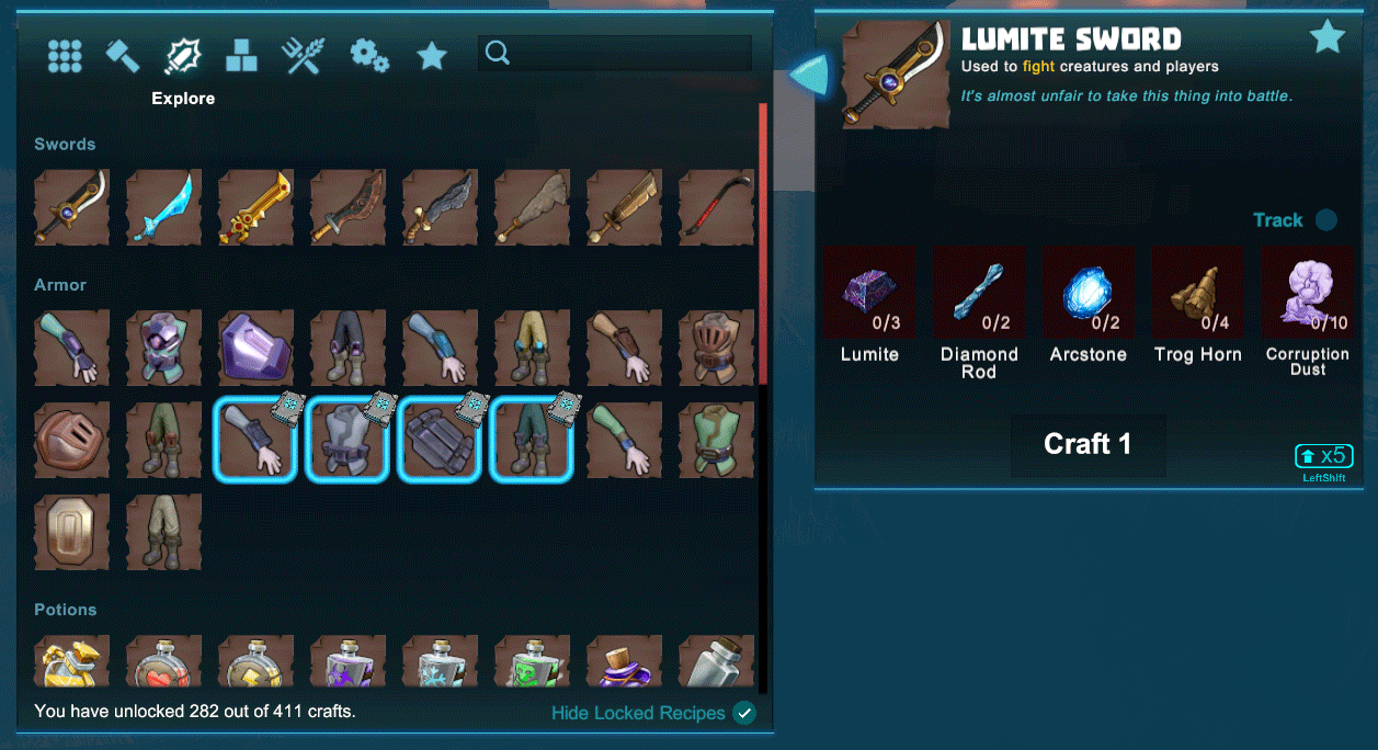
THAT’S how you do a crafting UI in a construction game. And that’s only what you can build on the fly, with no crafting time, tools or machines required.
You still have to scroll because of the crazy number of items and blocks they have, but it’s still very compact and easy to use.

Do you imagine the SIZE of the list we’d have to scroll through on Boundless if we had even half of what CV has? It would be madness.
When you unlock all the gem-tools and weapons, the list already becomes hellish. I don’t want to imagine what would happen if we get an update which adds armors.

So please, Wonderstruck, PLEASE, do something about the crafting UI.

9 Likes

I always figured the reason you see your character while in the menus was in case you were somewhere hostile you might have a chance to react.

I guess that can make sense when you’re hand-crafting. I personally wouldn’t be caught crafting at a table/machine with hostile creatures around me. ^^
Plus, the camera only shows what’s behind you.

But I think the reason you see your character is because you can preview appearance items in the exchange and outfits/colors in your inventory.
There, I think it makes sense. But it’s not crafting.
It’s just that the base UI is the same for all of those.

I would gladly give-up the ability to see my character and potential enemies coming from behind if I could get a bigger UI when I’m crafting, with more space to display all the things I can craft without having the scroll down all the time.
I’m more likely to craft in a secured space where creatures don’t enter than in a dangerous space anyway.

1 Like

I am no graphic artist…but here is what I would like:

Search bar at the top

A check box for ‘has mats’ or ‘able to craft’

Down the left side of the crafting, icons to select that represent the different groups (Tools, Equipment, Resources…ect which are the titles of the sections you flip through at the top currently with the little arrows in the current setup)

I think this would make things so much faster and easier…without changing things dramatically.

Again, not a graphic artist…but I would look like this :

4 Likes

I brought this up a long while ago and here are the responses… things might have changed some since then…

They posted a sneak peak of a way better recipe search and filter system a while ago that addresses a lot of these concerns. I hope we see it soon in a QoL update. Ever since the signs, beams, and poles were added the refinery especially is a real chore to use.

Whitespace is hard to evaluate because this game is in a lot of languages, some less expressive per character than English.

Still, I hope to one day see sticks of the singing unijambist bear wearing a ham jacket under the moonlight in-game.

Yeah, that would be a good start, but still, look at how many tools you can craft once you have the skill points for gem gear. You get a list of almost 70 tools and weapons, 70+ blocks, Almost 30 functional items…
That could be simplified.

Ah well, I wouldn’t have thought this was an official reason. Uh. :expressionless:

Oh, out of curiosity, I’m gonna look for that thread.
And yeah, as I was writing the dumb stick name, I kinda was thinking “eh, they actually would totally be capable of adding this as an easter-egg”.

Agreed on all points with OP

1 Like

It was shared here:

Its basically an icon view + filters.

5 Likes

The GUI is single panel because:

  1. Designed to allow for vertical split screen.
  2. Designed to allow you to see the environment + character when in the GUI. (Although the camera doesn’t do anything smart at the moment.)
  3. Designed to work on a portrait touch device.

Some games will build different GUIs for Mouse+Keyboard vs Controller vs Touch. We tried to build a single GUI that worked with all the different inputs.

But I agree that there is too much wasted space in the presentation. The space-to-info ratio isn’t great.

5 Likes

Awh yeah, that looks awesome, James! The grid view will be waaaay better than the list.
If you had to make a guess, do you think it’s likely to come out before or after the Farming update?


I’ll admit that I keep forgetting Boundless is also playable on consoles. I guess the circle-selection for what tools we have in our hands works better on consoles, since there, you have two thumb-sticks to select things quickly.
Took me a while to understand that there was CTRL and ALT to modify the way you select tools between both hands, left hand only and right hand only. Still forget it often, though.

2 Likes

Not just the crafting UI, but any menu that haves a modestly long list of items needs some work to make it easier to find stuff.

1 Like

:scream:

Brilliant OP!!

I can’t wait to see this on the roadmap! Thank you for sharing :smiley:

1 Like

Really hoping it comes out as a surprise minor update before Exo-worlds or Farming.

1 Like