Hi guys,
as anticipated in the previous Weekly Dev Update i’m working on some concept for creature progression and variations according to biomes and difficulties level.
The main idea is to identify a common language to apply to our creatures for indicate certain attributes as elemental effects, toughness, ability… etch… etch…
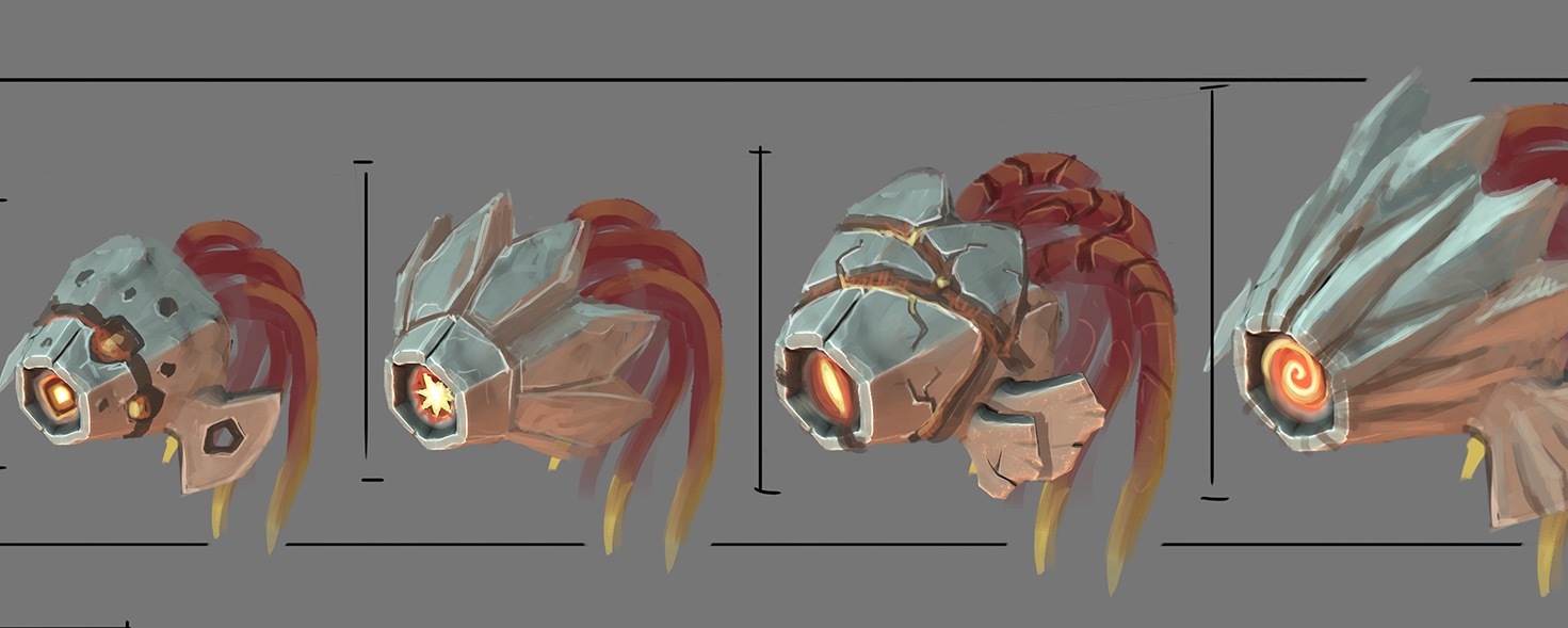
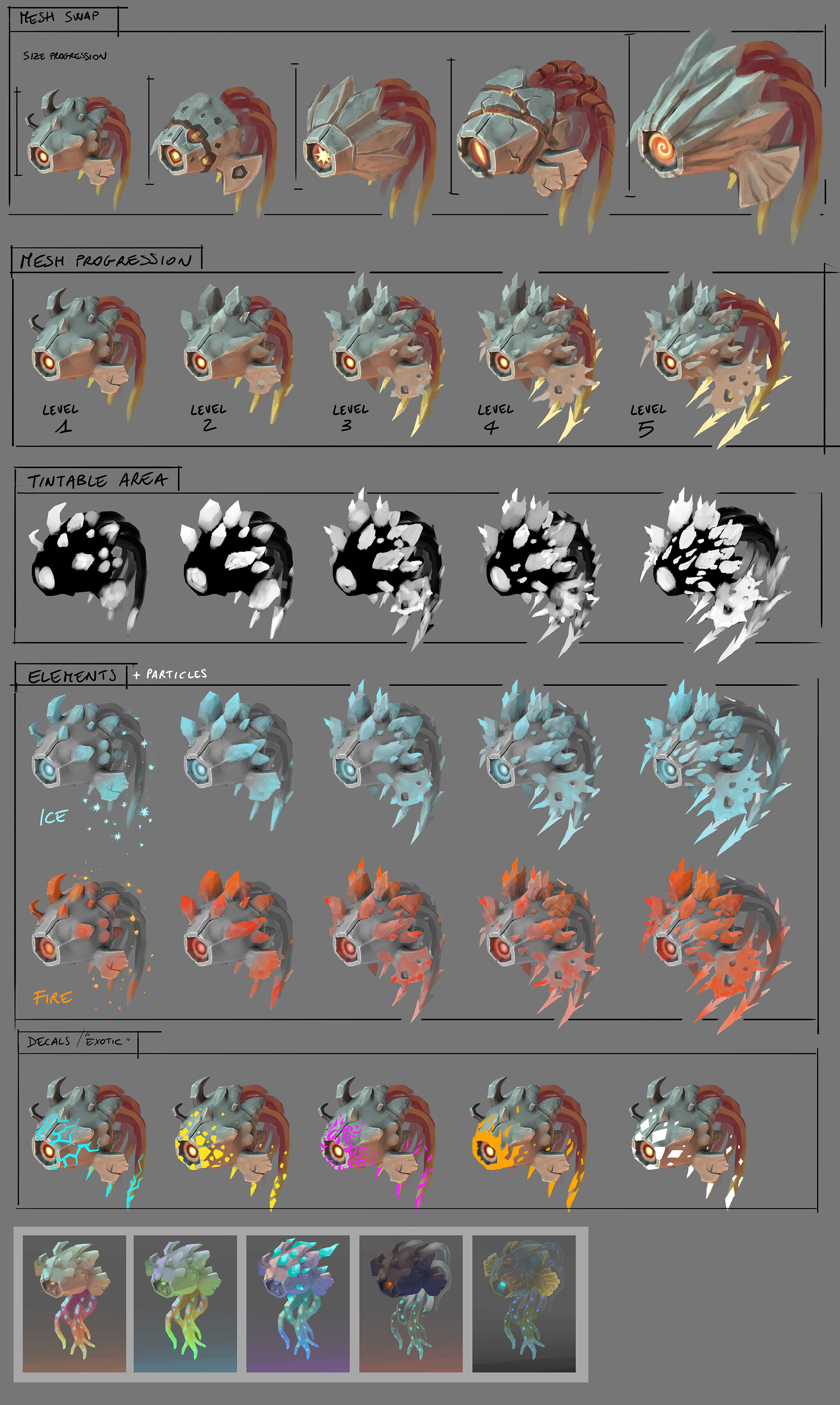
I pick the Cuttletrunk as benchmark. You can see Mesh Swap for shape variations, Mesh Progression for thoughness, Tintable Areas for elemental attributes, Decal/“exotic” for special ability like blink, freeze, poisoning, disintegration, petrification … (i’m carried away too much. I leave disintegration and petrification out for now )
And last you can see some material exploration that are going to be achieved with in game shaders swap. That is going to be a visual representation for extra details and colours.
The creature team is working on them right now and i hope we are going to please you with some cool gameplay and fun.
Hmm, then yes, it sounds like you’re taking the wrong aproach here. We are indeed looking at what it could be in the future. That’s the entire point of concept art- to explore a concept.
It basically just shows the areas that are able to change colour. Whiter areas will show the colour change more prominently, whereas grey areas will only show a little of the applied colour, and black areas will not show the colour at all.
If you reference the “Tintable Area” section with the “Elements” section, you can see that the main trunk remains the same in both the Ice and Fire variations - the blues and reds that are shown are the tintable areas.
I can explain this one! Creatures, much like items and blocks and props, can be tinted in code to create differently-coloured versions. The ‘ice’ and ‘fire’ variations of the Cuttletrunk that you can see below the Tintable Area mockup are the same models with the same textures, but different tints. This gives us the ability to create a lot of visual variation without too much work for the art team.
I don’t think so. I think it’s the wrong approach to judge something only you have in your head and then apply that judgement to what you have in front of you.
That doesn’t help anyone.
The point of concept art is to show concepts which can then be judged and altered, exactly because they are just concepts.
Spent 20 minutes coming up with a lengthy post. But I don’t want to turn this into another beacon persistence thread so I ctrl-a deleted it . So I’ll just spam some emoticons and will encourage you to also not start a big argument.
I just want to add that this is what I think @Havok40k and I disagree with:
We’re not here to judge the mock-up or it’s art-style. We’re here to judge the creature depicted in the mock-up. It’s a subtle difference, but I think doing so leads to more useful information for the devs. However, they’ve said time and again that they welcome all feedback, which you’ve given. So yay everyone, happy happy joy.
The part you cropped out says those are mesh swaps and size progressions. So that suggests that as they get larger, the model (mesh) varies slightly. This could indicate tougher versions or higher levels. Even just different species varients.


 Puns aside, I’ll agree to disagree and move on.