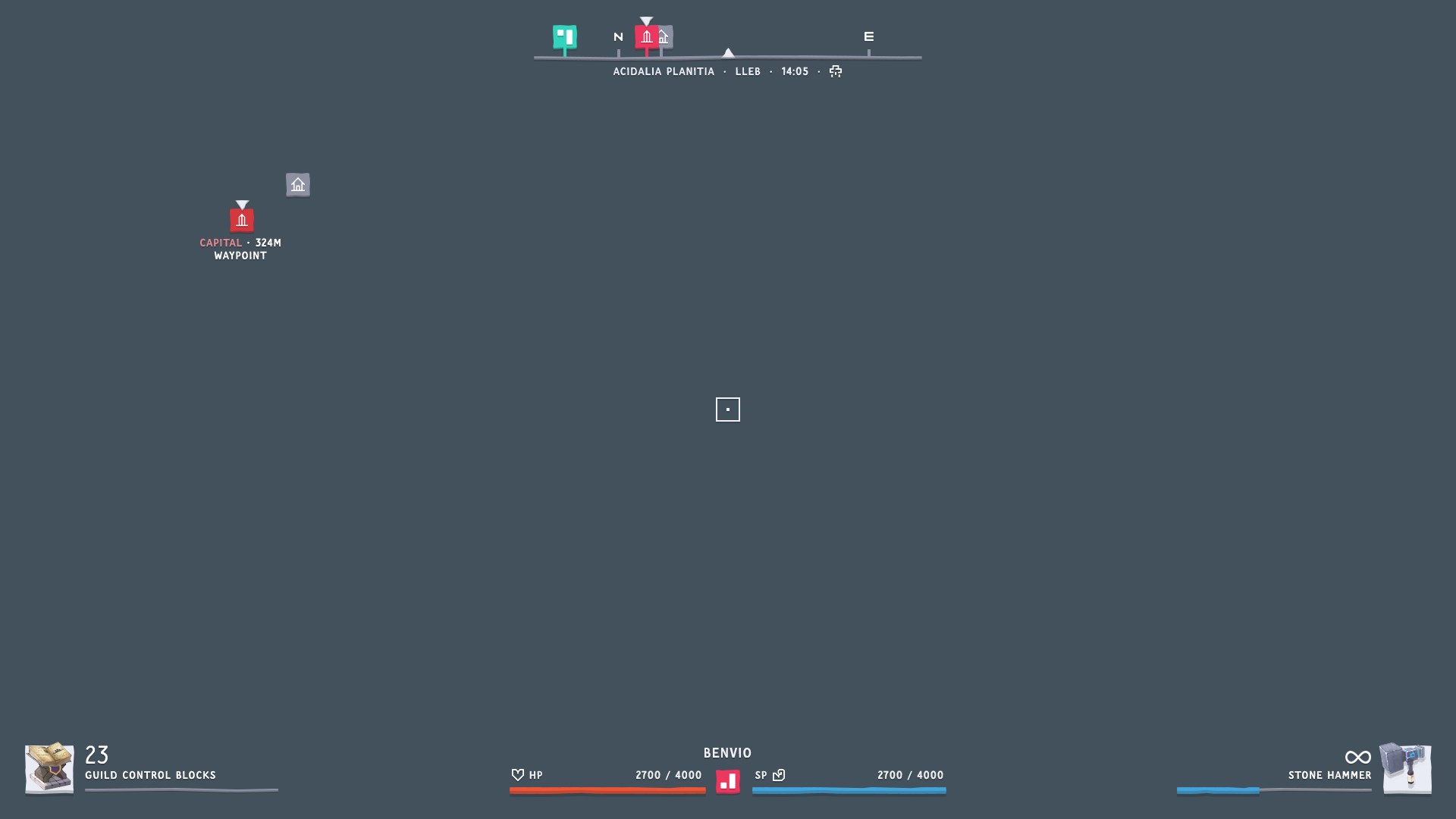
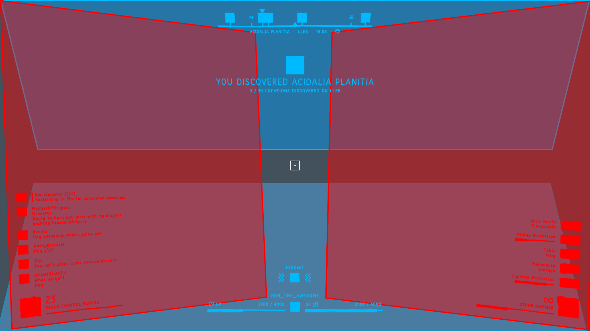
Here’s some of the HUD GUI I’ve been working on. This mockup is missing the 3D angled + depth effect used in the rest of the GUI, but it will be included eventually.
I’ve also made sure to include an appropriate amount of leaks as is expect from my posts.
Additionally, the intention is to tint the GUI using the player’s chosen ‘hero colour’ during character creation. In the above example I used B< pink, here I’m using cyan:
Not all GUI colours will change, I’ve tried that and it becomes quite hard to read, so there’s a universal colour for health and general blue focus colour (which could vary based off the chosen hero colour).
Opinions, thoughts, feelings welcome as always
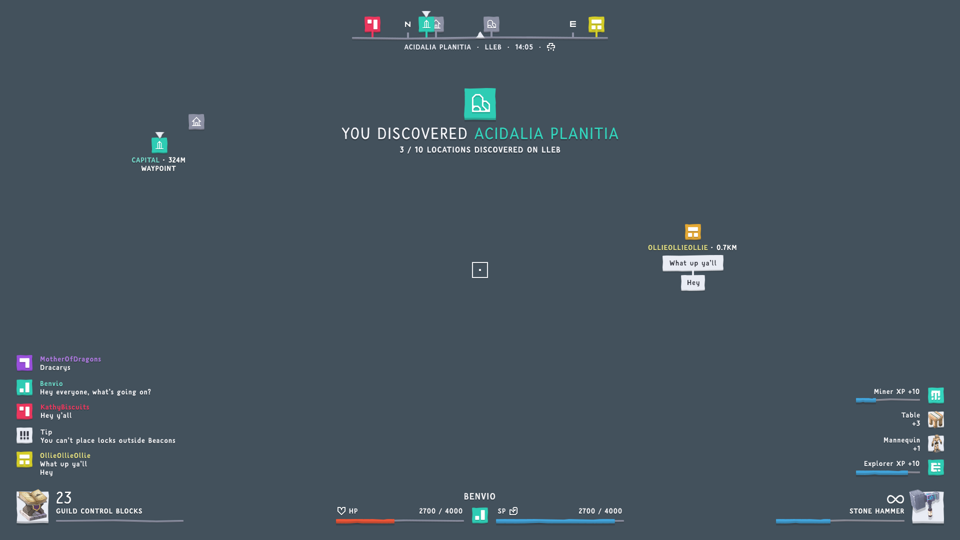
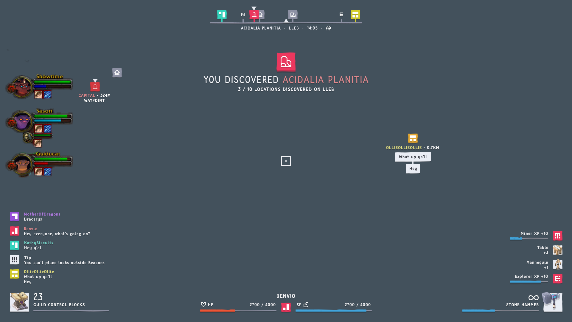
[UPDATE] Here’s an in-game example, and how the perspective planes work:
Generally it looks really good.
But I’m not sure about the hero color thing. Not sure means here I’m neither for nor against it^^
A nice idea but I’d have to see how it behaves ingame to say more about it.
Will we be able to change the hero color afterwards or is it fixed forever?
Really? the “pencil” symbol should stay for capital? xD
damn i failed hard in interpreting it. Always thought the “pencil” is for kind of formulas.
Maybe my intuition is not working right…
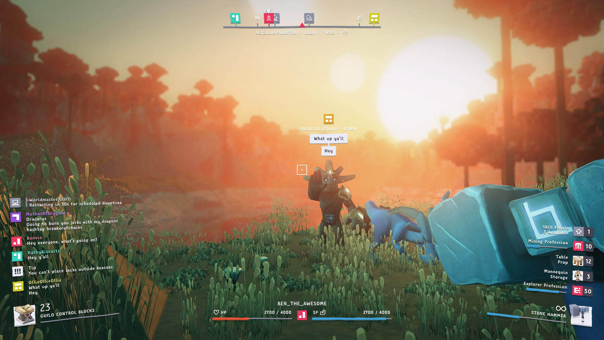
So you gonna have kind of stamina?
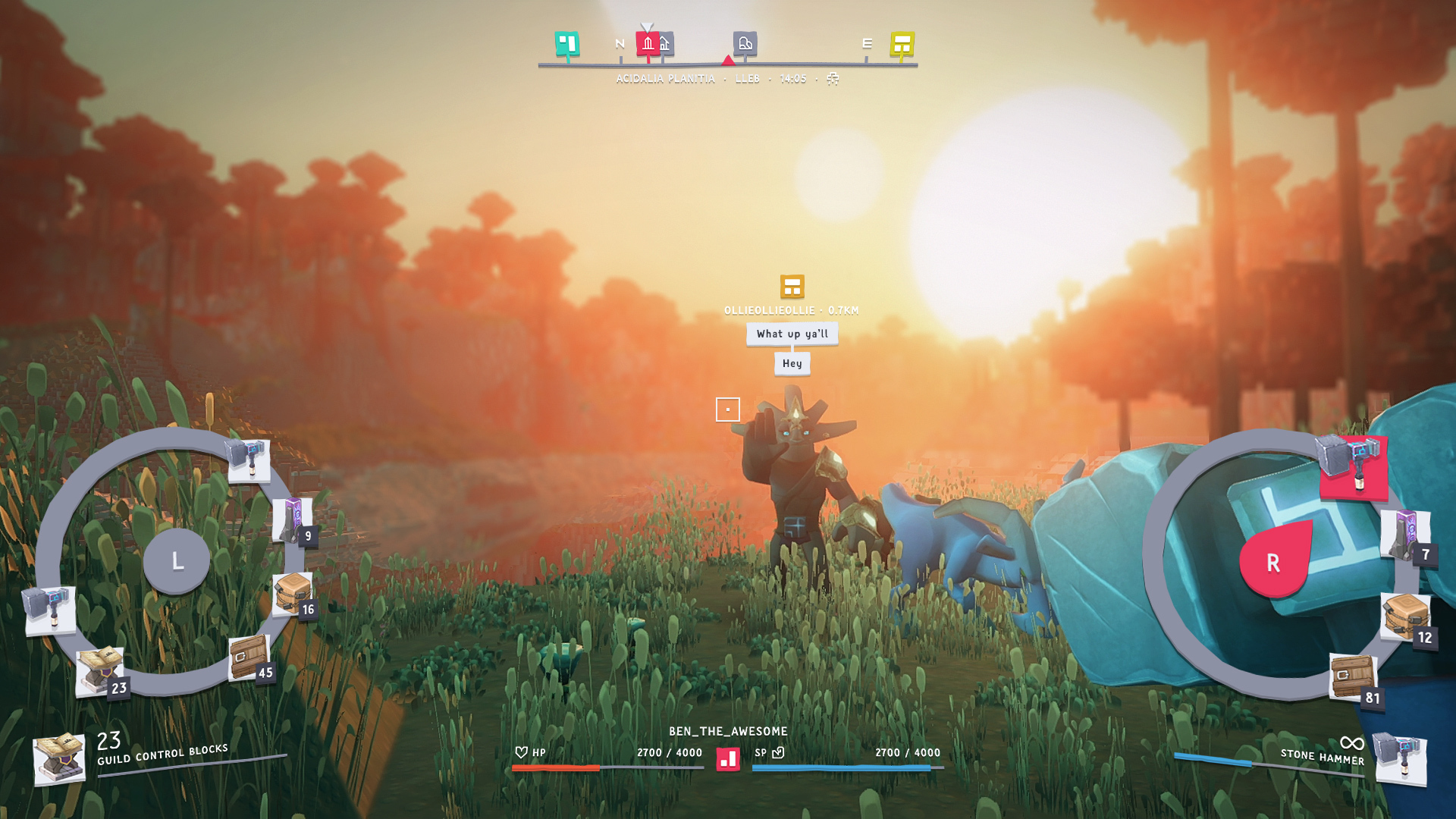
But I really don’t understand are all these “bonusses” on the right? displaying it there like this, looks strange if those are bonus on your hammer or skills or whatever it stands for o.o even if you can hide / display it, it seems not right in this order. Can you maybe make it circular around the hammer (if it belongs to the hammer) and i would maybe just display the symbols with a number next to it. what those symbols mean would be maybe better displayed when you open your inventory or character equipment and point over with your mouse.
At least this is my subjective feeling, that it’s too much information on the right side + I kind of like non-symmetric things. so if the displaying of the bonusses would not be like the chat on the left side, I’d better like it.
Last thing to mention: I really wonder how it looks like when many people on a “crowded” place talk. will this kind of “speak bubbles (squares)” overlap?
I think the things on the right are pop-ups when certain things happen. For example you pick up an item then it’s displayed there for a short amount of time. Or as it seems when you get experience. Although I hope this stacks so you don’t get thousands of popups just because you mine a lot of blocks really fast^^ (assuming you get XP for every block mined for example)
The right-hand log is for ‘gains’, so pickups, items finished crafting, XP rewarded. It’ll popup there for a few seconds and then fade out. The left side will do the same.
Busy areas will be noisy, but there’s heuristics for whether you see speech bubbles or not (depends on distance, where you’re looking etc)
Ah yea^^ I mean if this were a real game state then I’d be worried too.
But I’d say it’s as always with james’/Bens mockups. He just throws things, which could occur, in there to see how it looks without worrying about if it makes sense.
Well, at least @Ben has an opinion that he’d like to have
One more thing: does +3 tables mean, that you will be able to create soon items not one by one but an certain amount at one time?
If not I’d expected 3x +1 table
As always, ignore the content of the data – I always just throw lots of stuff in there (sometimes it doesn’t make sense you’d be able to see all those things at once, I realise)
We’re not going to be supporting groups in the near-term, but you will see those health bars /status effects above friends when they’re taking damage so all the info will be present