The new lighting system: my dark view

DISCLAIMER: If you’re going to respond to this post, please respect that this is MY opinion and perception of the lighting update situation. The purpose of this post is to create discussion (for both sides, those who like and dislike the lighting update) and to see if anyone else feels the same way as I do about it who might not feel like writing a forum post of their own. This is my first forum post on the Boundless forums and I’ve heard some “things” from other community members about the atmosphere here, so I can only hope they exaggerated/were wrong. Please be civil and show restraint for differing opinions. It’s okay if you don’t agree.

So let’s dive right in here…

I’m extremely disappointed with the new lighting system.

I’ve seen the community split down the middle on it so far from various Boundless related Discords and from skimming the forum, and I don’t know which direction the opinions currently lean in terms of favor.

I can only imagine the people that are in favor of the new lighting system have only played during in-game daylight, have a build comprised solely of light colors (most likely), simply prefer an extremely dark build (for spooky effect?) or haven’t gone exploring in a cave yet.

Let’s not confuse the lighting changes with some of the color fixes, new water/lava textures, or the farming update itself. Those are fine. (Though I personally think the water and lava looked fine before.)

I’m talking exclusively about the lighting. Obviously it comes down to preference, but I’d like to ask the community and especially the devs how this new lighting system is better for us?

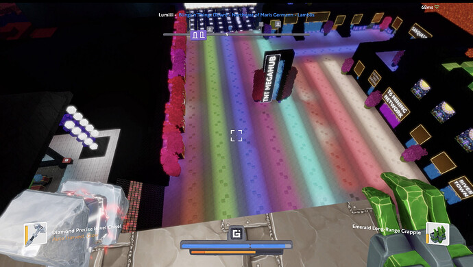
Before the update, the world of Boundless was colorful and vibrant. Right now, everything is dark, dull, and dim. Yeah things look acceptable if you take a screenshot during the daylight or an overhead shot of a city comprised entirely of gleam. It’s about being at camera level and walking around in this new lighting system.

Most importantly, torches, gleam, and light emitting tools/decorations, give off very little to no light as compared to before. Think of an irl LED light whose battery is almost completely dead and the light being emitted is extremely dim and soft. Maybe think of a room with mood lighting and the dimmer has been turned all the way down.

Dark colored blocks (especially black), act as dark light-eating voids. Light does not reflect off of these surfaces. Before the update, a torch or some gleam would create a radius of light that would shine off of nearby surfaces/walls like they would in real life to some extent, meaning you’d only need a few to light up an indoor area. Now it feels as though light emitting objects don’t glow and certainly don’t cause light to reflect off of surfaces.

I wish I had the foresight to take some before screenshots of my current build for instance which is a city comprised entirely of black blocks, wood, gleam, dark glass, of varying levels of refinement/rock type.

Before the update, even at night, you could still distinctly see all the surfaces/textures of the blocks, able to differentiate between metamorphic rock, igneous rock, bricks, etc., and the gleam/torches only needed to be placed in reasonable distance from one another to help you see properly.

As it stands now, my build is a void awash in complete darkness. You can’t see any definition or variance in the blocks. Just vague solid black objects that eat all surrounding light. Gleam has a faint glow, yes, but it doesn’t light up the surrounding area anymore. Torches and light emitting tools do very little to light up the area you’re in. I found this the most obvious in caves. Yes, you can see fine in a narrow tunnel, but once a cave starts opening up, it’s just blackness. (Yes, even with lighting tools.)

Somebody posted this image highlighting how they see things with their night blindness and I think it really captures what Boundless feels like now since the update. It’s not just an example of night blindness for someone who doesn’t experience it themselves, it’s Boundless before and after.

Boundless before and after the lighting update:

ALL in-game colors should be viable and function well near light. Gleam should be gleam. It should glow and give off light like it did before.

One shouldn’t have to rebuild/repaint an entire build just because they selected darker colors in a time where those colors worked fine.

Here’s another point to consider. I don’t recall people complaining about the lighting before the update. Was this something people wanted or was it a technical issue that needed sorting out? Just because something is new, doesn’t automatically make it good. (Or bad for that matter.)

As for solutions, the easy option would be to give people a slider to adjust things as they see fit, but if it’s just about making bright things brighter and dark things darker, it’s not addressing the problem with light not traveling/reflecting off of surfaces well enough like they used to.

Then you have the problem where if people don’t have the same setting as you, they might not see things the way you see them or the way they would’ve shown up before the update. Rolling back the lighting isn’t an option because I assume it would upset many people and isn’t really viable anymore anyway. (Unless there was an “advanced” lighting option that would keep things as they are now and disabled would return things to how they were before, but again I doubt that’s a viable option.)

Anyway, discuss!

EDIT:
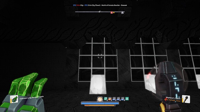
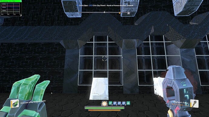
I was actually able to find a single before screenshot I had taken of an area, so I went ahead and took screenshot of the same area after the update. Compare.

BEFORE lighting update:

AFTER lighting update:

Notice how even the Wayfarer Totem is so much darker. From a distance further from this, it’s hard to tell I’ve used black mosaic tiles or marble. Also notice how “flat” the white gleam looks compared to before.

Notice how before you could make out the “mortar” on the black bricks. After the update they almost look like a flat/smooth wall. Also note the window, you could see it had depth before the update, but now it almost looks like there’s nothing behind the glass.

12 Likes

in my opinion, they have touched the lighting, to then be able to tint the blocks to our liking and that the shades of new colors be well with the new lighting, I think that’s why they have changed it, if not, I prefer the previous lighting, it was more real, now it seems like sketchy drawings, it’s my opinion

2 Likes

I think they simply need to adjust the drop off, of the gleam. I feel it has a sharp one block straight drop off rather than a gradual drop of like before.

This picture shows it perfectly.

1 Like

I can tell from this picture the darker blocks are almost solid black. I assume before the update you would’ve been able to see which type of block they were based on the amount of lighting in that area.

That’s the problem I’m having with my build. It’s just a void of solid black shapes instead of being able to see the block textures.

if I support you, now the range of luminosity is very poor, both with the gleam, as torches and tools with light, everything has lost luminosity and that affects everything that illuminated, nothing looks good, everything is very dark and grieve the truth

1 Like

one of the biggest lighting complaints was about how badly dark blocks looked, where they ended up looking waxy and reflecting loads of light instead of remaining black/dark-green etc, eg unrefined vs refined rock vs decorative rock of the same colour looking very different, whilst they now look the same (and this was to do with shininess of blocks being badly lit, which is what caused black blocks to end up being more “bright grey” instead before)

11 Likes

Ok, I agree that it was a bit odd how some of the blocks looked metallic before or even “waxy”, but I do feel like while they are more uniform now, it’s gone a bit overkill.

I see that the colors themselves have been corrected which is great, but I think if you’re putting any amount of gleam/torches/light emitting objects near any colors (black or otherwise) there should be a certain level of shimmer/glow that helps bring out the definition in texture/rock type instead of “eating” all light.

One very specific example I’d like to share is a dark room I have where there was a single block of green gleam in it that was meant to represent a computer monitor. Before the update, there was a green glow in a radius from the single gleam block that brought your attention to it. Now it’s just a textured green block in an extremely dark room.

1 Like

I think the luminosity is fine. But the way light carries has changed. Before it had a gradual feel to it, in the way that block 1 would be 80% 2 60% etc etc.

Now it feels block 1 is 80%, 2 40%, 3 0%.

I also have a theory that I’d like to share.

Was the new lighting system built entirely around the “natural world” only, without taking builds into consideration? For instance, did players who played on the test servers see any builds that were taken from like a “snapshot” of the game world as it stood at a certain point, or were they all empty/clean worlds?

If this was the case, I can see how the devs might not have seen what sort of effect the new lighting system might’ve had on all the varying complex builds that exist on the live version of the game. Again though, I think things are way too dark even in caves.

If any players who playtested on the test servers can confirm this, it would be helpful as I’m curious about this possibility.

The 1.0 lighting system was a major turnoff for everyone who knows and loved the lighting in beta:

5 Likes

I’ve spent some time on testing, but I’ll admit that I haven’t tried much to do rooms with a ceiling. I was expecting changes, but not to that level.
On testing, most of what I saw were zones that were built for testing the farming update. So, a lot of rooms made to receive sunlight, often outside

Had we been able to test the update on a copy of the live worlds, some issues would’ve been obvious from the start. Though I’ve been warning the devs as much as I could about potential problems with lights and meshes during the entire process of testing.

2 Likes

Most of the problems I’m hearing are about how artificial light isn’t as intensive anymore. Gleam light range now depends on the colour intensity, light colours go further than darker ones. Maybe this can be tweaked to make light travel a bit longer.

The game does feel more vibrant and shadows feel like shadows now, but maybe they took it a bit too far. My eyes have started to adjust and it doesn’t look so bad anymore but that’s just for my own builds. In reality black doesn’t reflect light by definition.

4 Likes

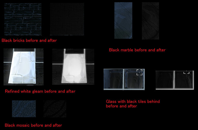
I’ve included some before an after shots of various textures to show the changes.

All areas taken from same location under same conditions:

Notice how with the black bricks you can differentiate each brick. You can see the mortar between each brick. After, it’s about as close to flat black as you can get it.

The white gleam has lost texture, has become “flat”, and looks less white and more grey. It’s also emitting less light to the surrounding areas.

It’s difficult to see the individuals tiles which make the mosaic, a well… mosaic.

The marble looks okay in this picture, but next to other blocks when it’s this dark it’s hard to tell it’s even marble.

One block deep glass with a black rock behind it. Notice before you can actually see the depth of the black block behind the glass. After, it just looks like glass with nothing behind it.

Looking at this example it’s clear things look more black, yes, but almost all detail is lost when next to each other with how dark it is.

To me game has had long time problem with black/dark blocks because it has been used way too much. I hope that black stays as it is that players would start using brighter materials finally :smiley:

I think nights are too dark on nature, it is giving new difficulty to all planets. Dark nights look nice, but there could be variation of that all nights wouldn’t be that dark.

Well then maybe they should not be as common as they are. The developers put all the black and dark rocks out there. So you are saying we should not use them despite the fact they are being provided?

1 Like

I appreciate your opinion and I’m glad you agree that night is a bit dark, but as for the black/dark blocks, anyone should be able to use whatever color they want without having “defective” blocks that need being worked around.

Again, I’m ok with the fact the colors have been corrected and the metallic shimmer has been removed, but again the issue is about the lighting.

People shouldn’t have to arbitrarily discontinue using dark blocks or having dark builds as a “challenge” to use more light blocks. This game is about creativity, so you can pretty much do anything you want, but all colors should be viable and function well with light.

2 Likes

While there are issues I definitely disagree with this. I think the game feels so much more immersive now… It gives it a realism it lacked before when all gleam kicked out the same light. The game has depth now to me.

A lot of reworking will need to be done on a lot of builds and I can understand why people are annoyed about that, but over all the changes are in my opinion excellent (barring a few tweaks needed like the gradient)

5 Likes

If I may push a bit further, can you explain a bit more about how it’s more immersive? Like give some examples how it’s more real and has more depth?

The gleam kicked off the same intensity of light, but the light was the color of whatever color the gleam was. Now the gleam doesn’t really seem to glow that much.

Also, what do you mean about the gradients?

No, I am saying that using dark should be used in moderation :smiley: It is just my opinion where black/dark items are used way too much, so not new issue for me that it seems to be now.

Like I have said earlier lights, reflections and colors are not perfect now but I like how most of stuff look now.

1 Like

sure :slight_smile: for example my forest is full of lights up in the trees, these now seem to give more depth as they don’t just bathe the entire canopy in light… It seems more dappled.

Inside my base underground was a small room that I lit with multicoloured gleam strips. Some were bright colours others darker. Before the update this room would give me a headachr it was so bright, now it looks how I thought it would it’s much darker and feels a lot more natural.

My characters colours even look more… For lack of a better word more realistic. Her eyes look less dead lmao not sure how to better explain this.

The glowcaps I have look really glowy now too, they don’t get lost in the faint gleam light any more.

Edit: plus the gems and tools etc look fantastic and So shiny!! I’m in love with my emerald bow!

4 Likes