Items and Interaction Animations - Gif Collection (warning - large post)

Hello everyone! :slight_smile:

So today I’d like to share with you all the core animations I’ve been doing concerning basic character interactions and items. A lot of you have been eager to follow the progress of Jess’s items starting from the conceptual 2D art work all the way towards the finalized 3D models in the devlog in the last few weeks… so here’s a few things you’ll be able to do with them! :smile:

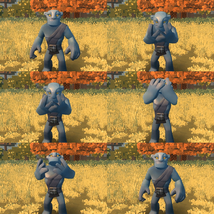
Consume Item

If you encounter any consumable items such as Food, Liquids, Tonics, Balms, Essence, Oils or Gels etc… you can now consume that substance to gain it’s properties shown in an animation style similiar to the full body emotes.
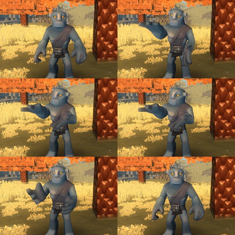
Discard Item

You don’t like it? Get rid of it! :laughing:

I’ve animated a large sweep of the arm so you can drop it on the floor in a variety of directions and angles including backwards!

(I’m really hoping this will solve the annoying issue of dropping an item in front of you and then immediatly walking over it to pick it up again!)
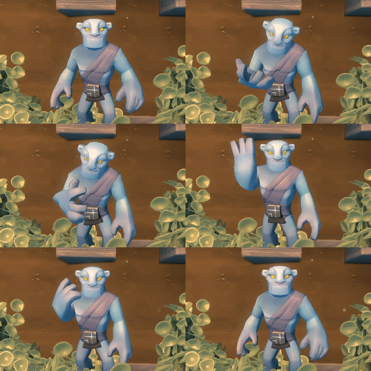
(Note: Depending on the functionality- this may be a little too long/cinematic and thus I’ll have to cut the first part of him looking at the item with disdain. At the moment it’s very emote-like and humorous but may end up being like the blended animations below.)

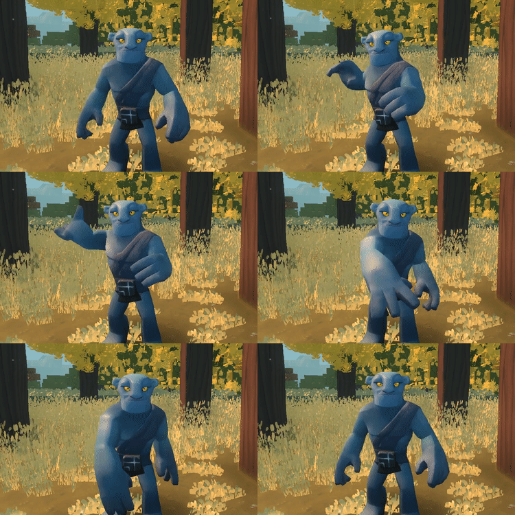
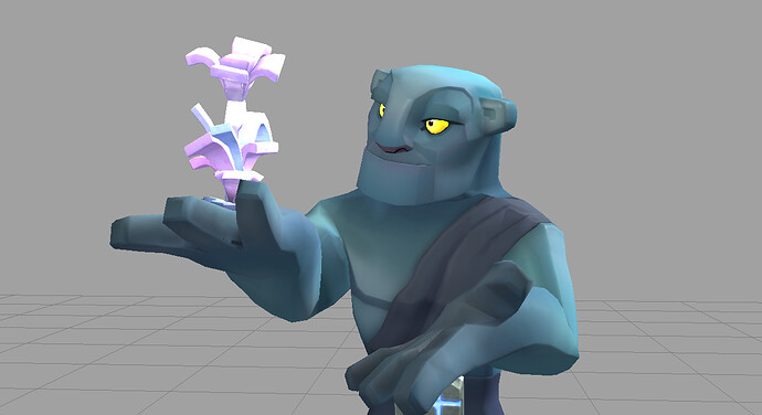
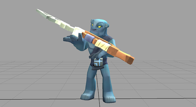
Show Item

Entice someone into a personal trade or simply to impress your mates with what you’ve found! :star2:

The Item will appear in your hand (hopefully) in the correct scale - this particular double hand position will allow you to showcase anything in your inventory from a regular item like a flower all the way to your latest weapon.

Here’s a few examples of the possibilities that I showed the team.

Small generic items - for consistency we could have everything scaled to roughly this size?

Large awkward items - such as a new weapon… scaled as it would appear 100% in-game is an interesting concept too.

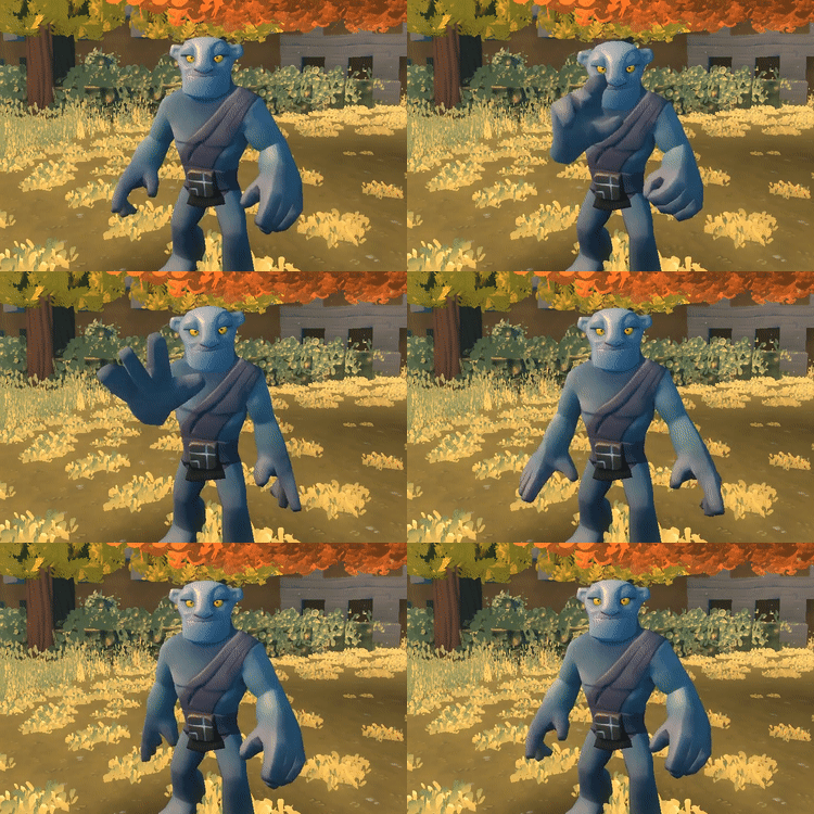
BLENDED ANIMATIONS

So these next two animations had to be carefully done because we will probably have these as blended animations so you can maintain your movements while doing these actions at the same time. This will allow you hopfully throw while you run or open a door while you walk into it.

Blended animations mean that either I’ll export the animation of the ‘Throw’ and ‘Interact’ only from the waist up… or if we decide to keep items in the left hand - export even just from the shoulder node down the rig chain to the fingers only.

To get these looking right (or at least as good as possible) it’s important to keep the rotations in the body to a minium because anything added will only compound visual errors when added to the existing rotations of a run or walk.

Throw Item

So at some point you’ll all notice that we’ll have items like bomb bags and bombs perhaps! (leak???) :boundless:
(perhaps… in any case…)

Here’s the core animation for any throwable items. Since I don’t know if we’re only taking the arm or top half of the body - I’ve put all the action in the arm itself with minimal movement on the body. This is very difficult to do in animation because usually a big action like a throw starts with the action being very visible in the legs and hips (see a full body baseball throw)… however in-game it will work better as a blended anim in terms not only in the functionality but also the look too. :smiley:

Interact

This is an ‘all-in-one’ generic interact animation for doors etc - anything really that needs a touch, push or prod. Again, being a blended animation I’ve made it as front on a possible with as little as I can get away with on the lower body.

With blended animations - the key here is to go straight into action timing wise because the longer the time to blend animations that sometimes don’t work naturally together - the more you can see the transition and it looks pretty awful/buggy. Blended animations are therefore quicker than the full body emotive animations that don’t rely on over-layering animations that are sometimes at odds.
Well, that’s the animation update - as always I appreciate your thoughts and feedback - have a great week!
35 Likes

The show animation would probably need to be 2 hands holding the weapon up if you need to go for the large a bit awkward size.

3 Likes

The blended animations are really clever and look very nice. You did a good job with them! And I love the show-item animation and how you can use it to brag to your friends hahaha. And the discard animation is an excellent solution to the annoying dropping blocks and picking them up issue!

2 Likes

These all look excellent as always! Loving the “toss an item behind you” idea - maybe we could also throw them to get rid of them?

Haha this is a scary thought (and nice leak) - especially if they affect terrain … although I suppose it would be no different to explosive arrows anyway.

3 Likes

Love them, especially the throw over shoulder, and show item. Love the humorous touch :slight_smile:
I want them now…

3 Likes

Looking gooooood!

1 Like

It would be fun if the character tries to show something too large for his hand and gets dragged down by it. Basically ending up on the floor with the hand under said item xD (For the best effect this should be accompanied by a audible “thump” ^^)

All in all nice animations.

3 Likes

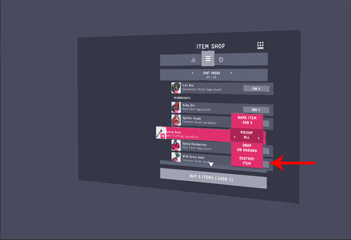
I think @ben already showed how we´re going to get rid of unwanted items:


So I´d assume that items will disappear after that animation anyway?

And with a feature like “Destroy Item” I think that “Drop On Ground” should continue to drop items in front of you since it will (probably) be manly used for quick trades (judging from my experience in Minecraft)


Besides of that the animations are really amazing

1 Like

Ben tells us over and over again that his mockups are just that, mockups. They aren’t functional or final.

And I thought there was a trading interface? That’s already in the game? With currency (something vanilla minecraft doesn’t have), I’m guessing quick drops won’t “mainly” happen (but old habits die hard, of course).

I’m wondering if they’re just placeholder options, as they’re displayed in a shop screen where those last 2 options make little sense.

1 Like

Beat you to the punch :stuck_out_tongue:

1 Like

haha, you seem to be doing that a lot lately :stuck_out_tongue:

1 Like

I think the “placeholder” just relates to the items that are showed in those mockups, might be wrong on this though.

Well quick drops would still be quite handy for quick trades (as I already wrote) e.g. while building together with a friend and he´s lacking a few stone chunks to finish his part of the wall or while you are hunting together with someone and you just want to drop a few slingbow darts for him/her.

I´d interpret this window as the “View your inventory while interacting with a plinth” window, where such an option would make sense.

1 Like

The item in question is listed with some others that have prices listed, and the “action button” for lack of a better term says “Buy 6 Items”. So it doesn’t quite make logical sense (since you typically shouldn’t be allowed to destroy the stock of shops you’re browsing) even if we were to be reading into a mockup, which is hardly too wise to begin with.

1 Like

Exactly, so we better end this (pointless) discussion, especially since all i wanted to say was that the idea of including a “destroy item” and “drop item” function separately is at least present and something to consider.

2 Likes

I love it! Everything looks really good…except the “Interaction” animation. I know you were trying to get a “all in one” with this animation,but I don’t that’s the way to go. I get that you don’t have all the time in the world and I know you’ll work on it,and make it better. But I’ve seen a lot of little things in games,like animations,where the developers were being lazy and it made the entire game look that much more trashy. Now,I’m not saying your lazy,just I don’t think a “all in one” anything will good in the long run.
Other than that,I really like the new stuff,great job.

1 Like

2 Likes

That looks very similar to how I am shoving popcorn in my face right now.

5 Likes

Wich one? First (shovel all in), or second (miss the head and throw it on the floor behind)?

5 Likes

My preference is that we include dropping on ground and the ability to simply destroy an item. My preference is sometimes superseded by the realities of resourcing and so we don’t get to those things right away, but I’m sure we’ll get to it at some point.

5 Likes